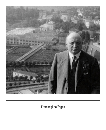
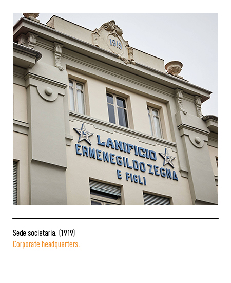
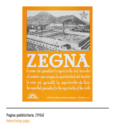
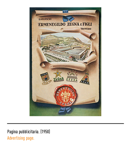
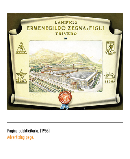
Ermenegildo Zegna founded the textile company “Lanificio Zegna” in Trivero (Biella) in 1910. His approach to fashion was pioneering, above all for his attention to all aspects related to advertising; he was the first to sign the selvedges of the fabrics produced and, subsequently, to make the brand a quality certificate which was soon recognized throughout the world, opposing the habit of fabric manufacturers (from Biella and elsewhere) of not applying their own logo on the fabrics, to the benefit of the wholesalers who acted as intermediaries between the wool mills and the tailors. In the textile sector, it was the first step towards emancipation from that technical-psychological subjection towards the production of “made in England”, also thanks to the autarkic policies of the fascist regime.
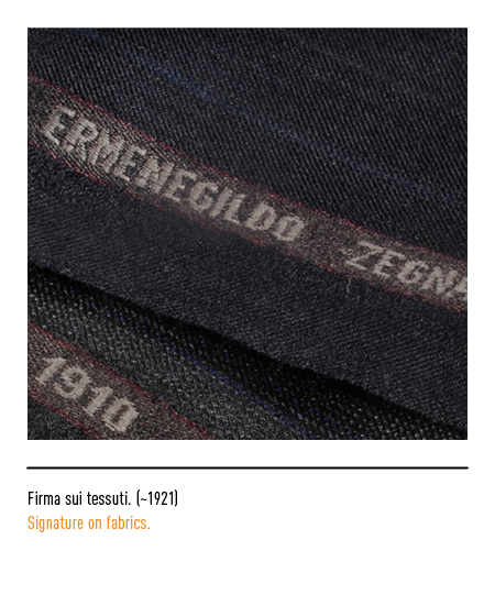
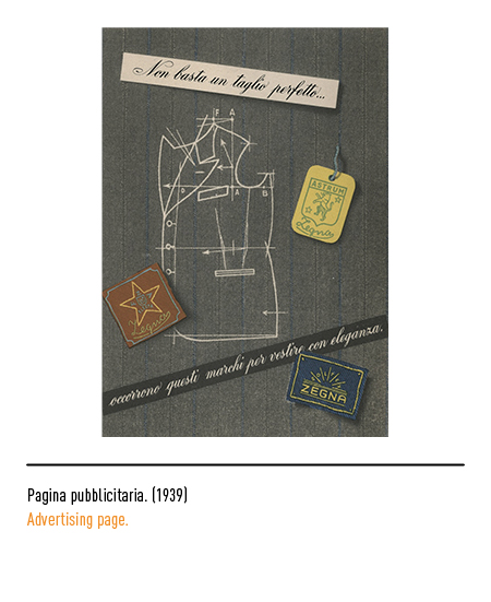
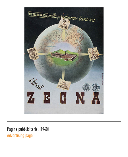
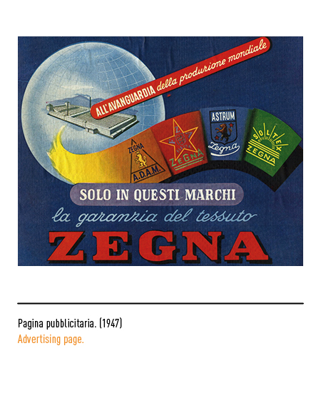
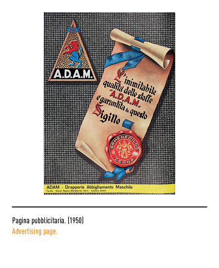
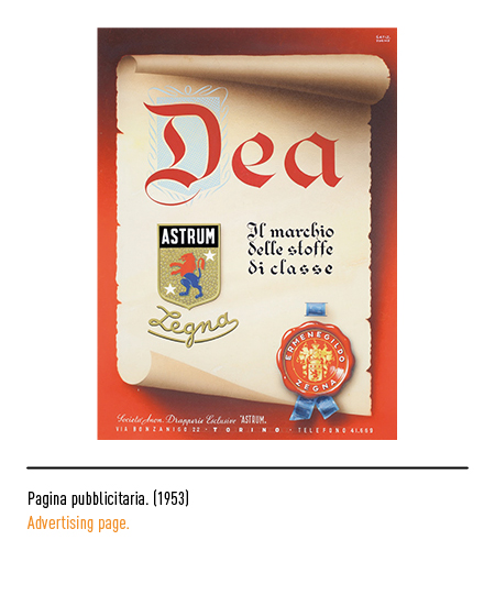
So the founder decided to “sign” every meter of his fabrics with logos that later became well known in Italy and abroad such as “FZA Electa”, “Soltex”, “Adam” and “Astrum”.
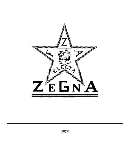
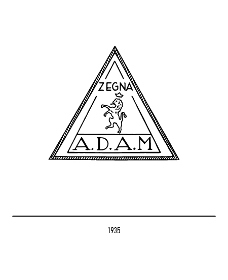
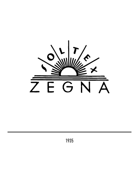
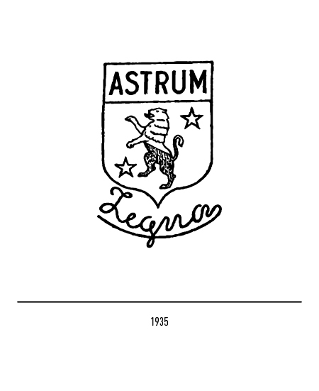
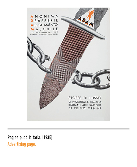
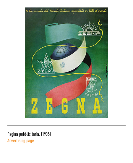
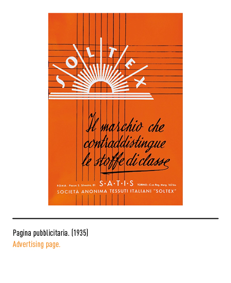
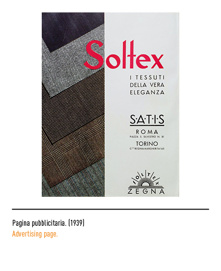
In many advertisements of the 1930s these logos were depicted together, as a guarantee of the authenticity and quality of Zegna fabrics.
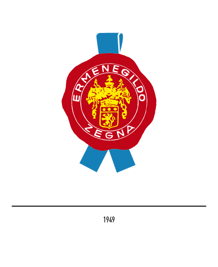
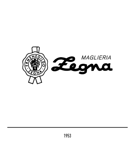
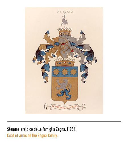
In 1949 the logo appeared in the shape of a red sealing wax seal; due to its strong symbolic and communicative value, it was used at the bottom of diplomas and parchments or directly on fabrics. The golden coat of arms inside was the noble coat of arms of the Zegna family; in fact in 1938 Ermenegildo Zegna, by the will of Benito Mussolini, was awarded the position of “count of Monte Rubello di Trivero”. In 1953, a calligraphic logotype was adopted for knitwear only.
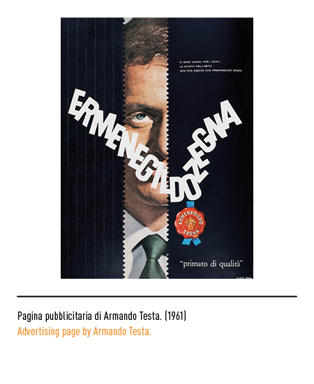
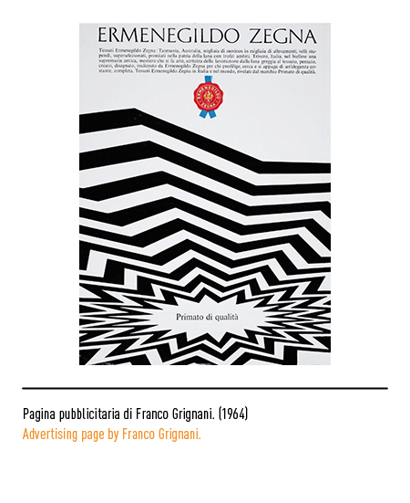
In 1954 the graphic reworking of the family crest, a symbol of excellence and nobility, was entrusted to the Giuseppe Barale studio (Turin). Meanwhile, corporate advertising communication was usually entrusted to the major designers of the time such as Armando Testa and Franco Grignani.
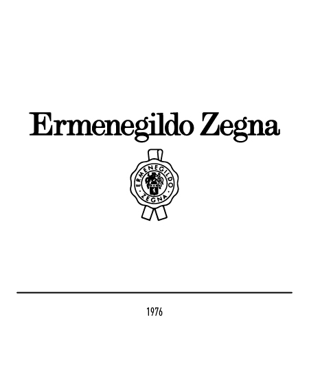
In 1976 the visual communication was entrusted to the logotype composed of a serif character that coexisted with the outline seal; the typeface was developed by graphic designers Gareth Hague and David James.
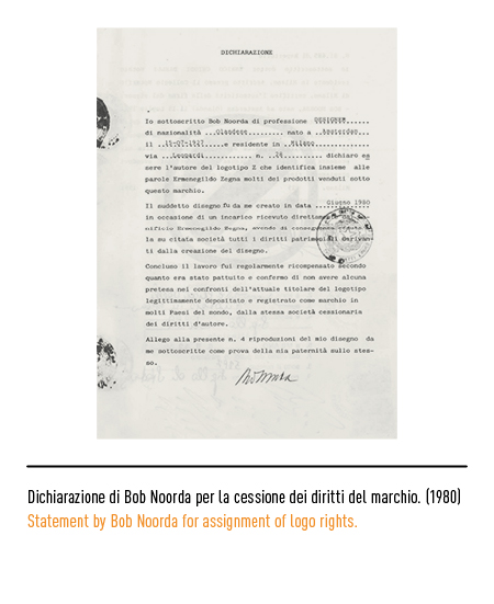
In 1980 the study of the letter “Z” and its corporate identity was entrusted to the designer Bob Noorda.

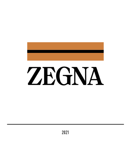
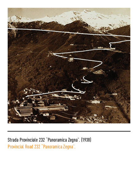
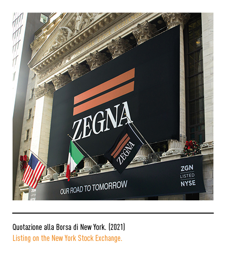
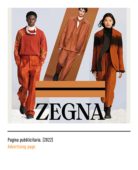
In 2021, in conjunction with its listing on the New York Stock Exchange, the company adopted a historic restyling: the founder’s name disappeared and only the surname remained to celebrate, according to the “one label only” philosophy, the family heritage and look to the future with a new, unique and unmistakable aesthetic; the logo, on the other hand, was designed by the creative director of the maison Alessandro Sartori with the use of a modern font with capital letters and surmounted by two orange bands (a color inspired by the precious “vicuña” fabric) and a smaller black one. The inspiration for the logo was the “Strada Provinciale 232 Panoramica Zegna”, built by the patriarch Ermenegildo himself in 1938 in the mountains of the Trivero region and which, seen from a distance, also has a shape that recalls the initial “Z” . This road is a physical symbol but also an ideal one because that road has always guided the company mission and is intertwined with a constantly evolving vision oriented towards sustainable progress.