VALTELLINA
1 Logos and restyling over time
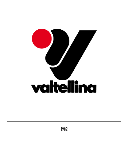
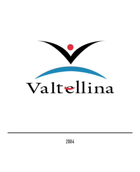
The “Valtellina” logo identifies the mountainous region of Lombardy as a tourist destination but also for the quality of the products and services of all economic sectors; it is owned by the Chamber of Commerce of Sondrio which also manages the licensing procedures. The first logo of 1982 reproduced the initial letter “V” with twists and a red dot; the logotype was composed with a derivative of the Futura font.
The evocative symbol of territorial specificity was updated in 2004 on the occasion of the 2005 Bormio World Ski Championships; an anthropomorphic and dynamic shape with black arms forming the letter “V”.
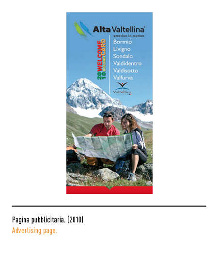
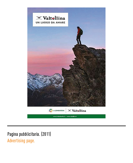
In 2021 the Chamber of Commerce of Sondrio launched a new process of graphic updating of the logo and the related methods of concession with the aim of obtaining a more inclusive logo, modern, legible, easy to use and in line with current aesthetic standards. The restyling for the repositioning of the “Valtellina” tourist destination was activated in view of the 2026 Milan-Cortina Olympics. Therefore, in 2022 the third graphic review, created by the Landor & Fitch agency which designed the Milan-Cortina Winter Olympics logo 2026, with the highlighting of the characteristic curved lines of the landscape that extend along the whole territory, outlining its features and configuring its essence. From a graphic point of view, the brand is outlined through two balanced and distinct elements: symbol and logotype.
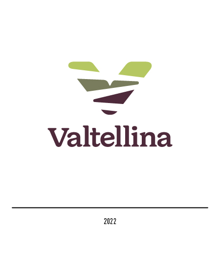
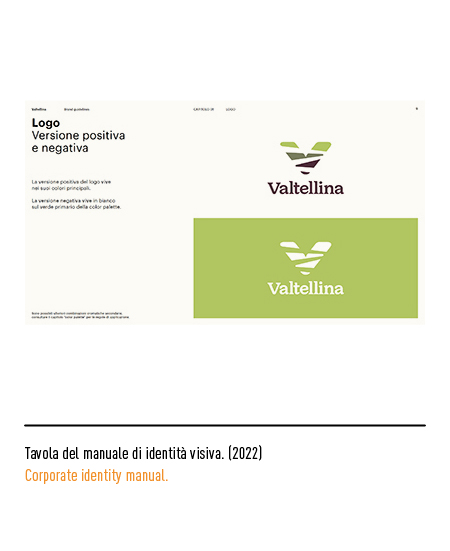
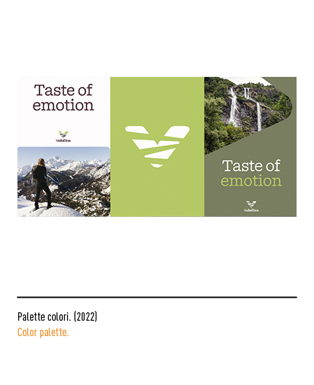
The symbol comes from a visual element common to a large part of the province of Sondrio, i.e. the characteristic curved lines that extend along the whole territory; other elements of the project were: the vocation for the “green”, the excellent agri-food, the multi-experientiality, the curved roads that lead to the Stelvio Pass, the paths and the ski slopes, the living mountain, the hospitality but even the marks left on the snow by skis. Even the “Valtellina” logotype, composed with the Doyle font, takes up in detail the curved lines already present in the symbol. The colors focus on the shades of green, which recall the multifaceted colors of nature, and end with the tones of amaranth, identifying the local agri-food offer.