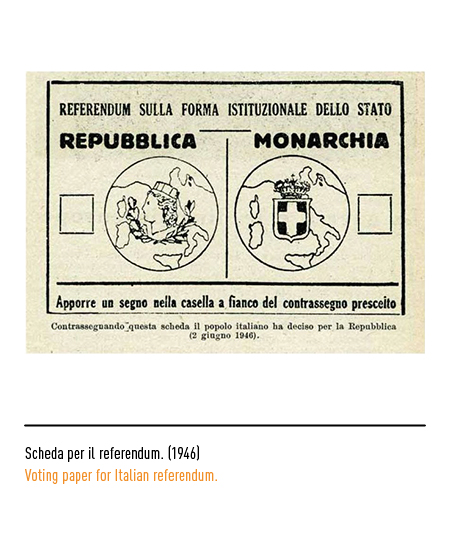
In the card for the 1946 referendum, the Republic was represented by two leaves of laurel and oak with the turreted head of Italy in the center and the outline of the peninsula in the background. With the birth of the Republic, the Presidency of the Council of Ministers will appoint a Commission in charge of studying the new emblem of the state. In 1946 he decided to launch a competition among Italian artists reserving the right to choose the five best who would be rewarded with a fee of 10,000 lire for each; only to be then invited to submit a new paper for the final choice. The notice of competition recommended that “the emblem itself must first of all meet the criteria of simplicity, having to be easily intelligible and easily implemented both as a seal, as a watermark, and as a state coat of arms. Therefore, symbols referring to individual political parties are to be excluded, since the concept of the emblem must be inspired by the unity and harmony of the Fatherland. It was therefore decided to introduce the star of Italy among the symbols, excluding the allegorical personifications and drawing inspiration from the sense of the land and the municipalities “.
The star is one of the oldest objects in our iconographic heritage and has always been associated with the personification of Italy on whose head it shines radiantly; so it was represented in the iconography of the Risorgimento until 1890 in the famous “star” of the united kingdom. The competition was answered by 346 competitors with 637 sketches; the results were judged to be disappointing. The most varied, and often bizarre, symbolic representations arrived: from dances of dolphins surrounded by ears to turreted heraldic shields, from medieval carriages with victory trumpets to rudders, from Phrygian caps to anvils and chimneys. Therefore the Commission decided to fix a theme and to propose its development in a timely manner, relying on a small group of artists that the competition had highlighted; the result was a progressive reduction of the sphere of autonomy and the stiffening of the iconographic elements.
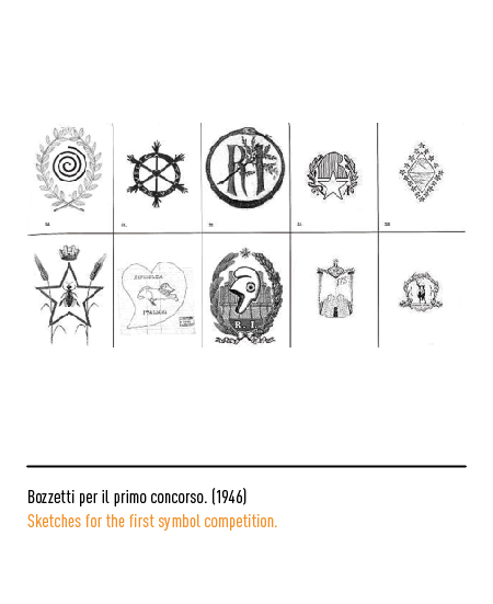
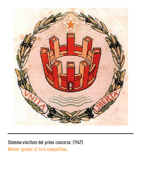
The Commission first selected 25 authors, then selected 5 (Alfredo Lalia, Cafiero Luperini, Publio Morbiducci, Paolo Paschetto, Virgilio Retrosi) to whom it imposed the following criteria: “1) as the main element, a turreted wall with open door that has the shape of a crown, but also the appearance of a noble building, and is therefore both a sign of sovereignty and a living image of the constructive attitudes and traditions of civilization of which it must be a symbol. For the representation of this element – while leaving, of course, the creator the maximum freedom – it will be advisable not to neglect the rules of the technical-heraldic regulations: possibly making sure that the entire enclosure and towers are all visible. 2) The coat of arms must be completed at the bottom (at the tip) by the figure of the sea, in homage to the position and natural destiny of the Italian peninsula and, at the top (at the head), by a radiant five-pointed star. 3) It will also be possible to study, if, and in what way to introduce in the coat of arms the two words that represented the program of the Risorgimento which, as such, are inscribed on the front of the Vittoriano, but which are not of less relevance today: Unity, Freedom ” .
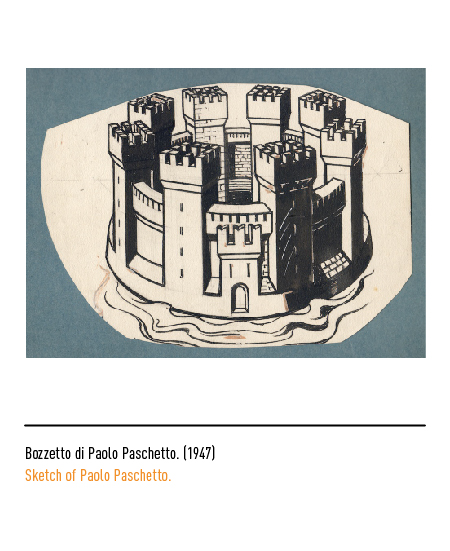
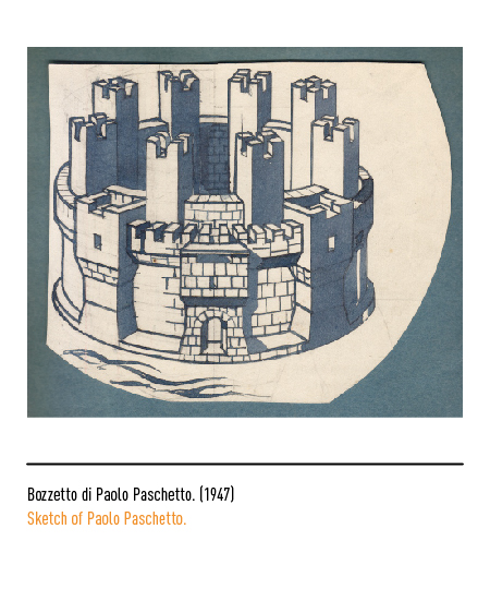
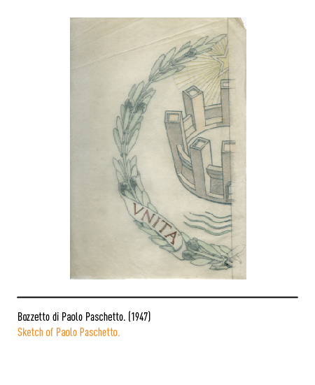
In 1947 the Commission examined the new drawings produced by the five artists and chose one of the three drawings by Paolo Paschetto; professor of ornamentation at the institute of fine arts in Rome from 1914 to 1948, he was a polyvalent artist passing from woodcut to graphics, from oil to fresco, from religious painting to landscape. Until the final approval of the sketch, the prescriptions became meticulous: the wording “Italian Republic” inside and outside the emblem, first requested, was then considered superfluous; the rays had to come directly from the star; the sea had to occupy a limited space with three detached and more robust strips; it was necessary to vary the shape and decrease the size of the plates on which the words “Unity and Freedom” were reported; the perspective of the turreted crown had to be more raised. These changes were made by the artist Paolo Paschetto in close contact with Cambellotti, one of the most influential members of the Commission. The emblem chosen, exhibited with the sketches of the other 5 fi nalists in a specially organized exhibition at the International Artistic Association in via Margutta in Rome, was not convincing either for the press (one of the most lively comments called it “tub”) or for the Presidency of the Council itself.
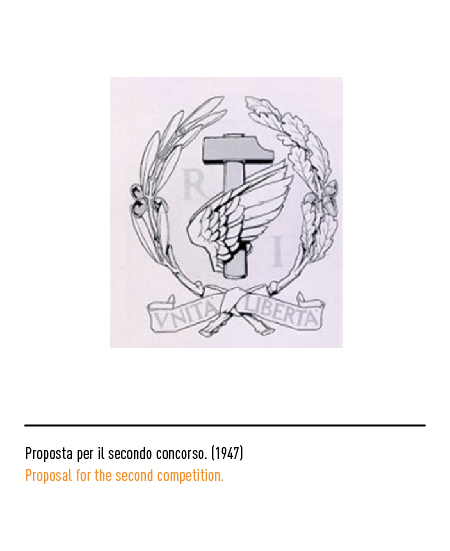
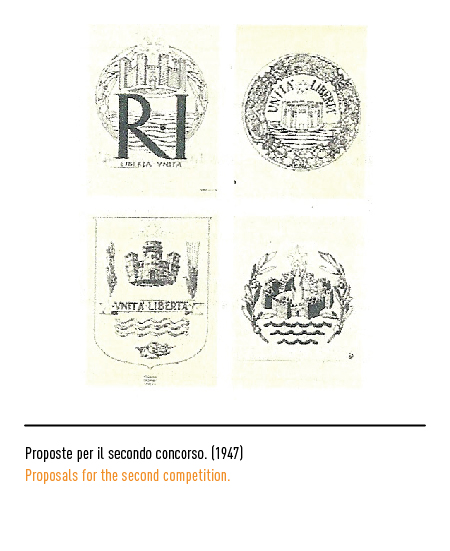
In 1948 a new competition was launched for other sketches; 197 drawings by 96 artists were received who, according to the Commission, “can be grouped, in terms of inspiration, into six groups, including the development of the following concepts: bees, shield with turreted crown, gear wheel with star, eagle, tower with lighthouse , star”.
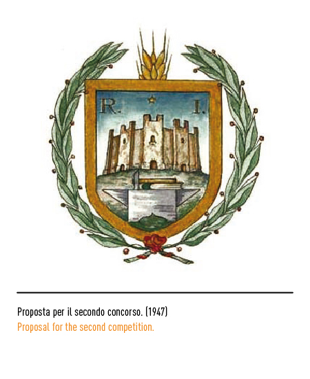
The Commission, initially selected 12 designs deemed best, unanimously chose the one created by Paolo Paschetto, that is, by the same artist who had been chosen by the previous Commission. A curiosity: initially, for the heraldic office the two branches had to be of laurel and oak because they had a symbolic meaning of eternal glory. At the last moment, however, in the coat of arms the laurel was replaced with the olive tree to communicate the sense of peace but, for some, it could have a funereal meaning of “eternal” peace.
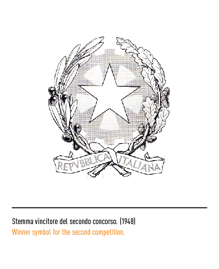
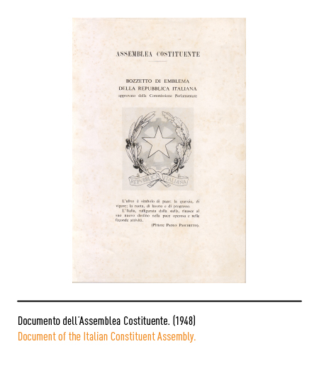
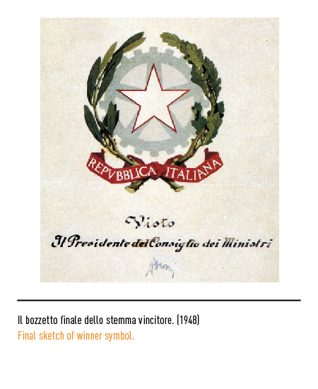
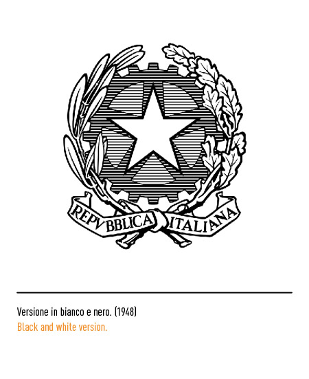
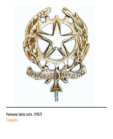
The Constituent Assembly approved the coat of arms, defined as follows: composed of a five-spoke star in white, edged in red, attached to the axes of a toothed steel wheel, between two branches of olive and oak, linked by a red ribbon , with the writing in white in capital font “Italian Republic”. For some, the emblem of the Italian Republic has the aplomb of the symbols of the great states while for many graphics it is simply a sign of difficult application: it does not have the gift of synthesis, it has problems of legibility in the reductions, no coordination, it needs a radical redesign and confirmation comes from the attempts hitherto unsuccessful to replace or modify it.
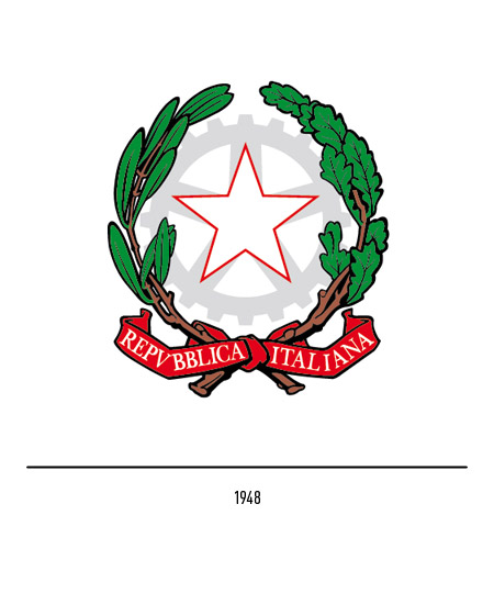
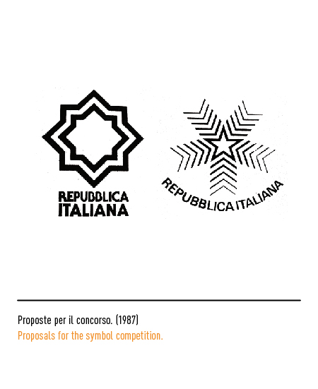
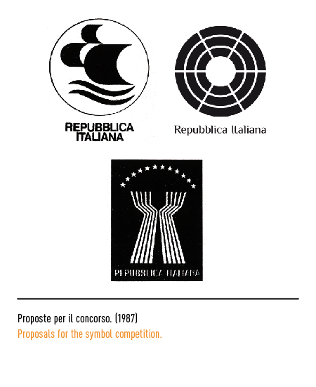
In 1987 an attempt was made to innovate the symbol of the state by launching the competition with a prize of ten million lire. Of the 239 projects received, 114 greatly embarrassed the qualified jury, which also included Portoghesi, Testa, Eco: boots, sails, tricolor men, Swiss valleys and Waldensian valleys, a stereotypical and predictable repertoire that triggered the easy irony of journalists. No one was chosen and the old emblem of Paolo Paschetto remained.