


JUVENTUS
1 Logos and restyling over time


The first corporate coat of arms of 1905 was two-tone and included flourishes inspired by the nineteenth-century Turin city coat of arms; then above a white belt on which was written the corporate motto based on a phrase of the first century, in Latin, attributed to the Christian theologian Paul of Tarsus: “Non coronabitur nisi qui legitime certainverit” and that is, “He does not receive the crown unless who fought according to the rules ”.


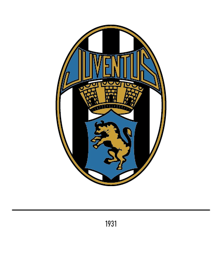
In 1921 this logo was made less rich in elements: only the oval shield with the seven black and white stripes was extrapolated, the emblem of the Turin city and the name “Foot-ball Club” were added to emphasize the primary activity. Like other Italian football teams, Juventus also adopted the inevitable zebra as a symbol due to the evident chromatic similarities; indeed, this animal was inspired by the icon designed by the journalist Carlo Bergoglio in 1928, who proposed the image of a rampant zebra “for ancient nobility” looking to the west. A coat of arms with the zebra appeared in 1929 with, strangely, nine black and white stripes but it was short-lived because in 1931 the bull borrowed from the city coat of arms returned; this logo was characterized by the blue background where both the bull and the club name were written in gold.


In 1940 the backgrounds of the shield and of the word “Juventus” also became white. In 1959 the first yellow-gold star was sewn on the shirt following the tenth Italian title, as it will happen in 1982 for the two stars linked to the twentieth championship.


In 1971 there was a restyling of the logo with the return of the blue background for the shield and the writing; the whole was surrounded by a gold-colored line. In 1979 the club adopted the black silhouette, with white diagonal stripes, of a zebra in a rampant position as its corporate emblem; it was an excellent optical art solution.


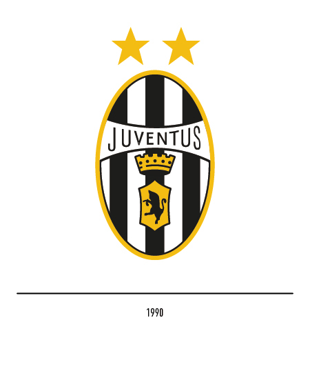
In 1990 the logo was modified again and the traditional logo was returned with the variant of the white background for the word “Juventus” and of the black bull on a yellow-gold background for the emblem; with the elimination of the blue, the logo became totally black and white.


In 2004 Juventus entrusted the Interbrand agency with the positioning and restyling project of its logo; his change is an important step in a wider project aimed at bringing the name of the most successful team in Italy to express its potential even outside the playing field. Starting from the existing logo, a long and careful study of the graphic elements has allowed us to arrive at a solution of great personality, in balance between past and future. The graphic treatment is based on an airy contrast between black and white; the Juventus name is more legible, thanks to a clear and modern font, and is underlined by a yellow graphic line which constitutes the light point of the logo. The link with the city of Turin is maintained through a contemporary reinterpretation of the city’s heraldry. Several considerations have led to the elimination of the stars from the composition: they do not represent an element of identity but a sporting merit susceptible to changes over time and with an exclusively national value.


To pursue the goal of conquering new markets, of making Juventus a popular logo not only among football fans but also among children, women and the new generations, in 2017 the Interbrand agency presented the new logo: the stylized J of the name, the stripes of the shirt, the optical illusion of the victory shield and a new lettering. The project is characterized by the “Black and white and more” concept to connote diversified and innovative experiences aimed both at Juventus fans from all over the world and at those who are less close to the world of football today; a clear intention to expand into new markets, including eastern ones, and consequently create that international identity that makes Juventus a real logo.


