


INDESIT
1 Logos and restyling over time
The history of Indesit began in 1953 with the name Spirea, the rosacea plant that grows in Southeast Asia for the production of refrigerators. In 1956 it changed its name twice: first to Indel (INDustria ELettrodomestici) and, then, to Indes (INDustria Elettrodomestici Spa). Its logo consisted of an oval surmounted by a crowned shield in which the acronym lived.

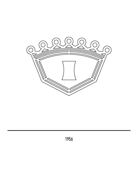


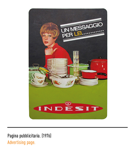
In 1961 the company changed its name to Indesit, with the suffix in the denomination to denote national production; the logo did not have punctuation. In 1987, when it was bought by Merloni Elettrodomestici, the logo underwent a restyling by the agency Landor Associates; in a black rhombus with rounded edges there was the initial with the red dot and the lowercase lettering without thanks.




In 1998, in relation to a strategic repositioning operation, Wolff Olins designed the new logo consisting of an original lettering and a graphic sign obtained by merging the letter “i” with the typical knob of household appliances; all in the typical light green color. This restyling has transformed an outdated logo and has led to great results from the very first application times.


