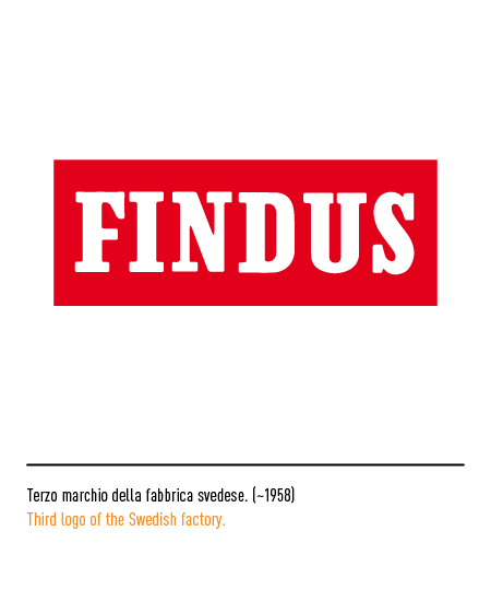
Findus is a company, originally born in Sweden for the production of jams, which produces frozen food for retail marketing. The company name derives from the contraction of “Frukt Industrin” (fruit industry) to emphasize the company’s specialization in the canned fruit and vegetable sector. The first logo, typical of the early twentieth century, depicted a woman with a cornucopia, a sign of abundance, inside an oval. In the 1950s, the white logotype, composed with a serif character, was inscribed inside a green shield; then the logo was simplified with only the white logotype on a red rectangle.


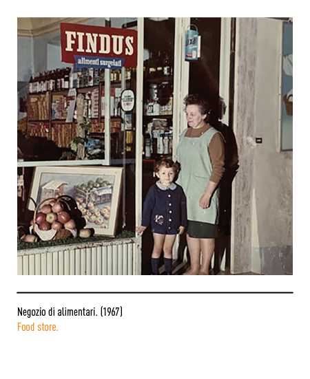
In 1964 Findus arrived in Italy with the construction of the Cisterna di Latina plant. At the time, the frozen food market was still in its infancy; with its evolution, Findus’ offer has expanded from ready-made dishes to vegetables, from meat to fish and semi-finished pasta, so much so that it has become the industry leader in Italy. The first “Italian” logo bore, compared to the Swedish original, the addition of a blue box with the words “frozen foods”.


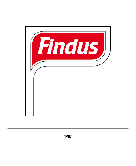
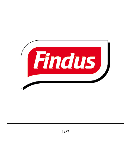
In 1971 the logo underwent a restyling with the characteristic flag shape, to emphasize the marine origin of the products, with the company name inside, composed with a stick font on a red background. In 1985 Unilever took over the company entirely, dealing with the sale of frozen foods also abroad through the English company “Birds eye” and the German “Iglo”. The same flag shape will be taken up again in the 1987 logo, more dynamic and modern because it is composed with the Crillee “italic” font; sometimes only the internal red form was used.


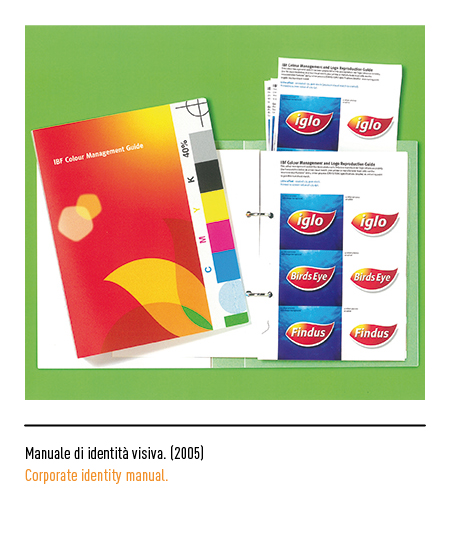
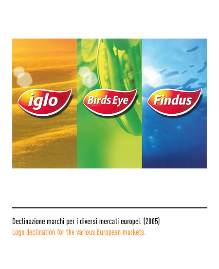
The “Birds eye”, the “Iglo” and the Findus will have a new coordinated logo in 2005, created by the Carter Wong Tomlin agency in London; it is the formal evolution of the previous logos and represents a red leaf with the sun inside, a symbol of vitality, nature and dynamism.


In 2011 the new logo will be presented, designed by the JKR Global agency in London: a restyling of the old one to which two outlines, blue and green, are added, so as to evoke the shape of a fish.


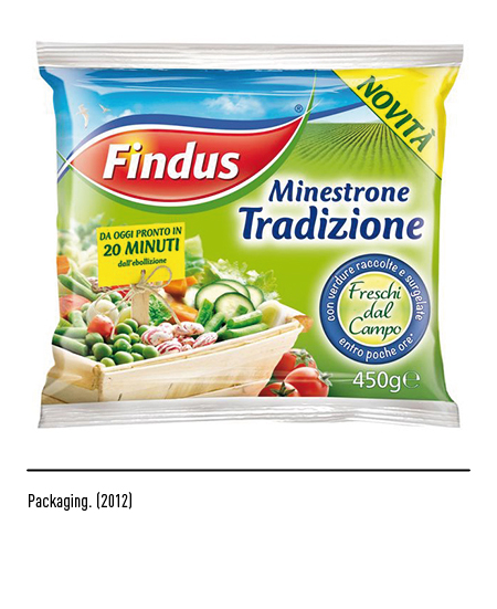
In 2014 a further restyling with the essentialization of the red form and a softer typeface; It is a turning point for Findus, which is reflected in the new communication campaign “The flavor of life” for a social responsibility program. All the packaging of Findus products are proposed again with the logo in the center and the famous Captain in an unprecedented “green” guise as a guarantor of eco-sustainability for the entire range of products, going beyond the “boundaries” of his logo linked to only sea products.


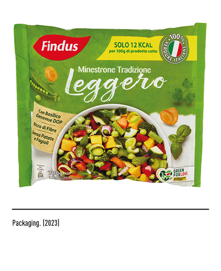
To consolidate its leadership position in the Italian market, promoting sustainable growth and maintaining high quality standards, in 2023 the logo underwent a light restyling with the pure red shape, without highlights.