DIADORA
1 Logos and restyling over time
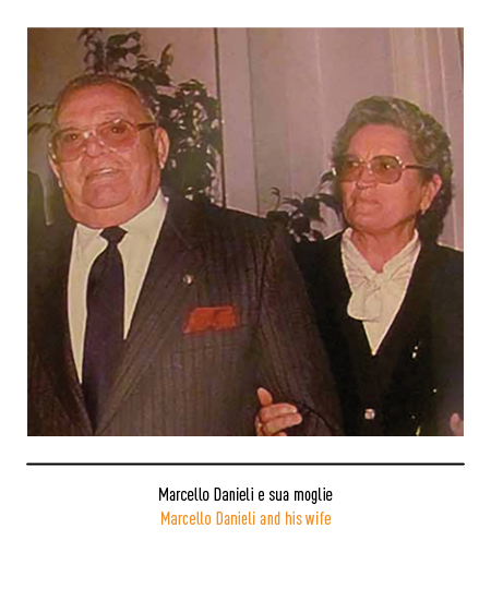
The origins of the company date back to 1948 when Marcello Danieli and Rinaldo Menegon created an artisan workshop in Caerano di San Marco (Treviso) for the production of mountain and work boots. In the foothills, as early as the First World War, a thriving footwear industry had developed, mainly aimed at making military footwear for soldiers at war. In the first decade the company sold footwear without a brand yet; at the beginning of 1967 the two founding partners decided to separate and Marcello Danieli founded his own company, the “Calzaturificio Diadora”. The chosen name came from the Greek “διά δωρέα” (dia-dorea) with the meaning of “sharing gifts and honors”, which reflected the philosophy of the brand with values such as respect and sharing as well as offering the best design and of the highest quality. Another etymological version is linked to the suggestion of the name given by a representative of the shoe factory; he was originally from Zara, the Dalmatian city ceded to Yugoslavia during the Second World War, whose ancient name was precisely “Diadora”.

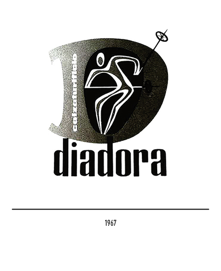
The first logo depicted the letter “D” inside which lived a stylized skier and the logotype in lowercase letters. In the 1960s the conversion of production towards the world of sport took place, not only in winter; in fact that decade marks the explosion of professional sport and Diadora is the first Italian company to develop a new concept of sports marketing which translates into the choice of hiring highly appealing champions as testimonials. Sport becomes a phenomenon of custom and its products cross over from competitive practice to leisure time, helping to shape the taste of the time in the new “lifestyle” market.
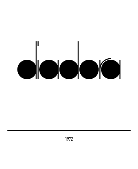
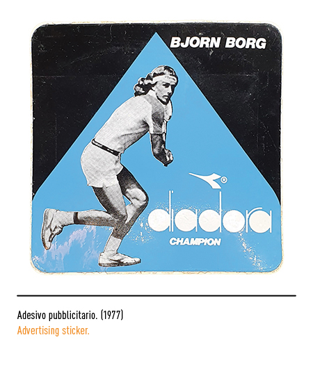
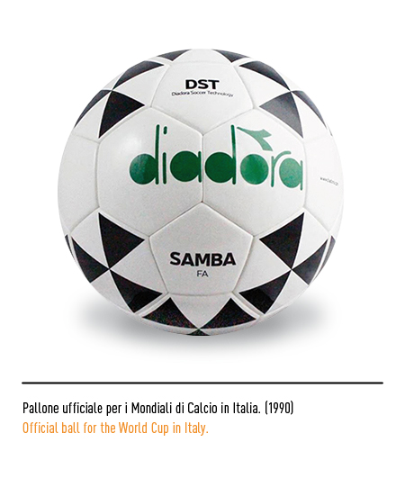
In 1972 the logo, designed by former employee Sergio Gallina, was called “five balls” because it was made up of five circles that formed the lowercase letters, recalling the symbol of the Olympics. In 1973 a frieze was added to the logo, designed by the graphic designer Bruno Garbuio, that is, a silhouette in the shape of a bird or an arrow that reflected the free spirit of the brand. Diadora is the undisputed protagonist in international competitions thanks to partnerships with world-class champions; in fact what made Diadora’s fortune were sports sponsorships, in particular with Montreal 1976, for tennis and football. The turning point came with the sponsorship of Bjorn Borg, a Swedish tennis player considered one of the best players in the history of tennis. In the following years, many athletes from many disciplines wore Diadora, confirming the positive trend of the Italian company.


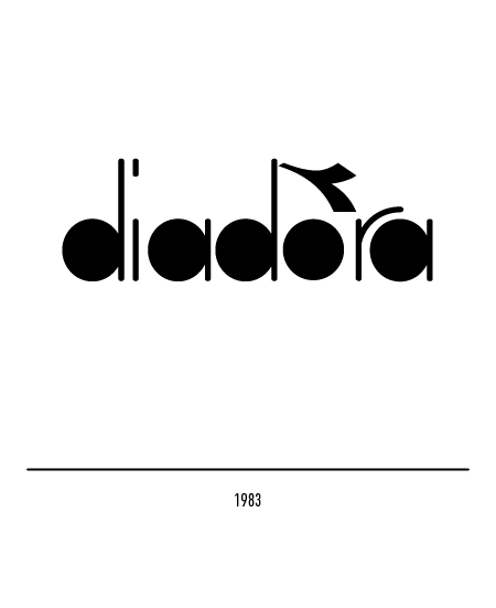
To improve rendering and reading, the logo in 1983 underwent a restyling with rounded edges and a greater distance between the letters.


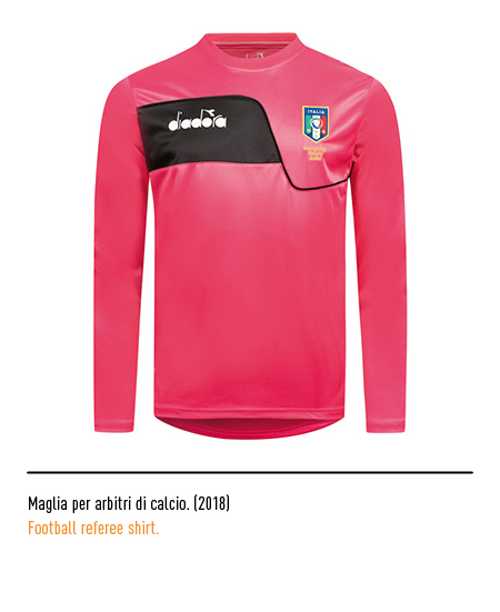
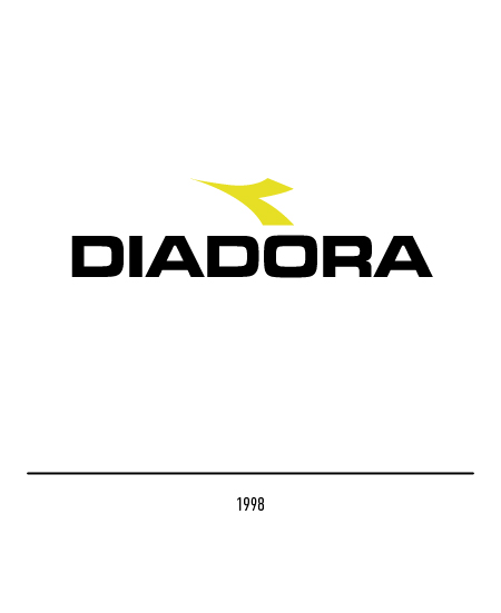
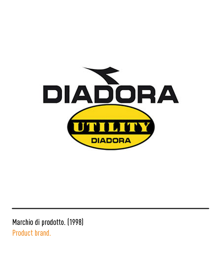
In 1998 the logo underwent a restyling with the use of the uppercase character “Eurostile extended bold”; the yellow color is also adopted for the symbol. In the same year, a new intuition allows Diadora to capitalize on the experience gained in the sports market and to go back to its origins through the recovery of work footwear fifty years after its foundation: “Utility Diadora” was born for the production of safety footwear for high technology. In 2009 the company merged with Invicta, a Turin-based company famous for backpacks, and was subsequently acquired by the Geox group with the aim of enhancing the brand’s enormous potential.


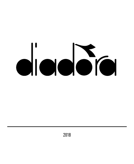
In 2018, to celebrate 70 years, the logo used in 1983 was dusted off.