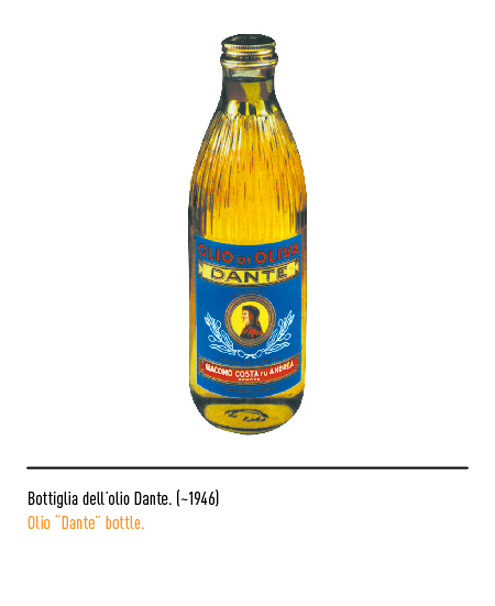
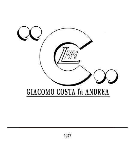
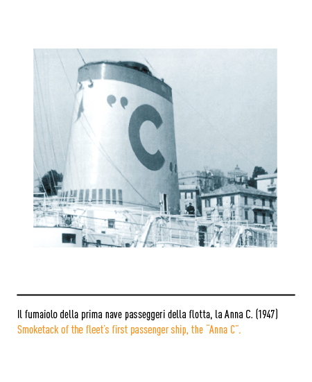
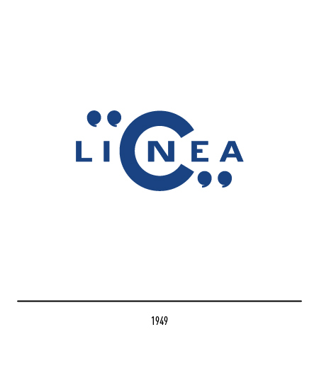
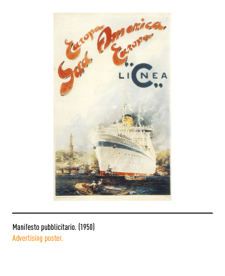
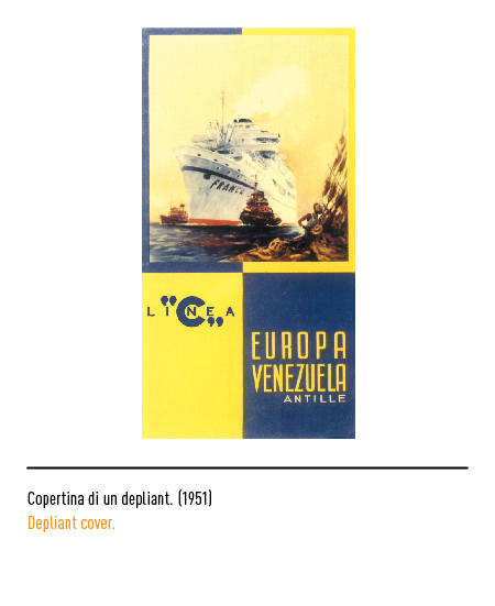
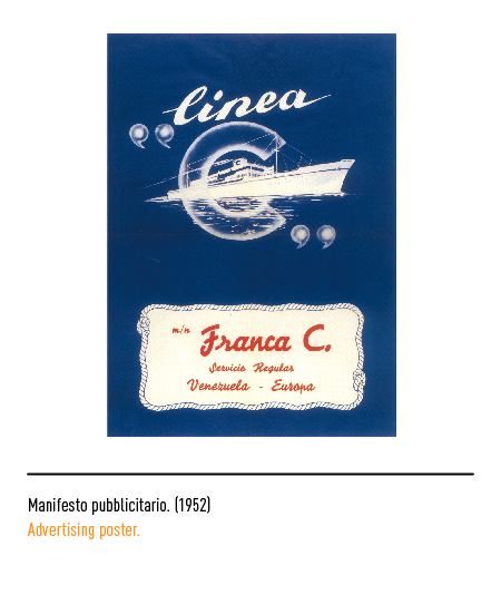
In 1947 the company took the name of “Line C” and the blue letter painted on the funnel of the motor ships was curiously enclosed in quotation marks. The updating of the ships followed the progressive transformation of users, so much so that the migratory flow was running out while the tourist one was consolidated; therefore, the austere third-class accommodations were transformed into hotel-type cabins and new services were created: cinemas, swimming pools, air conditioning. At the same time, mercantile activity also continued.
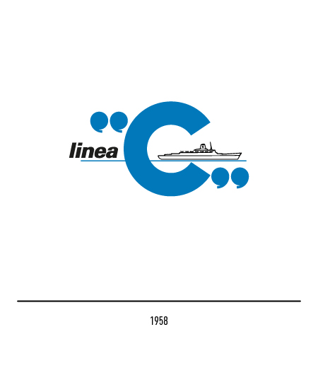
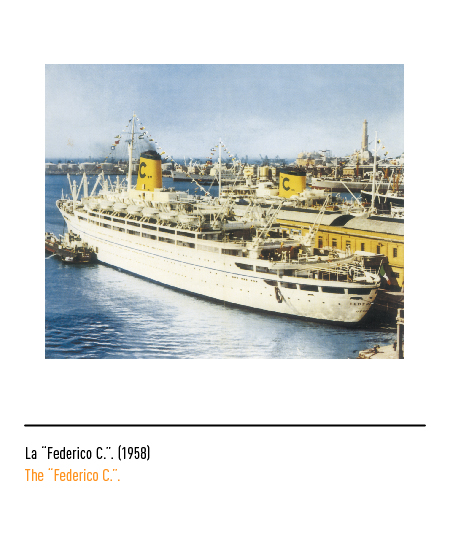
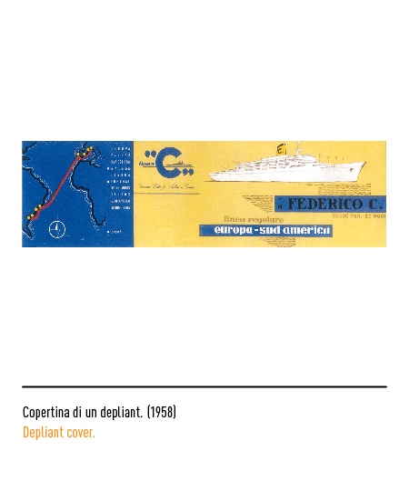
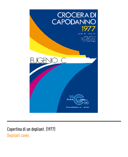
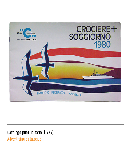
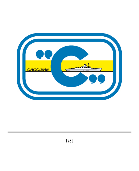
In 1958 the logo was modified and the profile of the “Federico C.” was introduced, the first real cruise ship; this ship profile remained unchanged for many years. At the end of the seventies, the company decided to concentrate its activities in the passenger and cruise ship sector with respect to the merchant one and, with the emergence of air transport, only in the cruise ship sector. In 1980 the logo was inscribed in a double frame which also featured a yellow band and, for the first time, the word “cruises”.
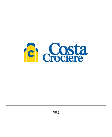
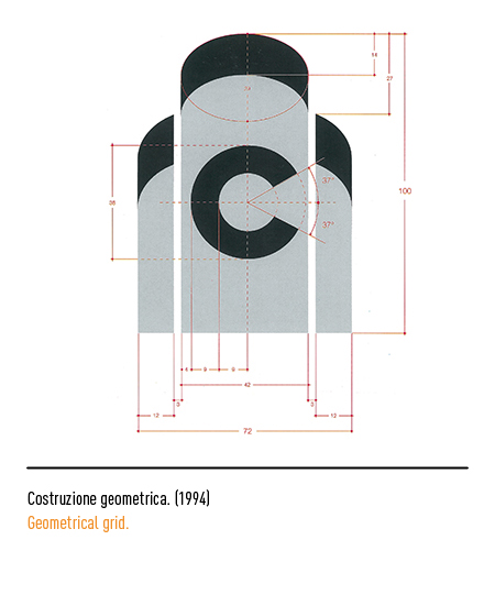
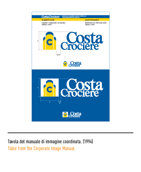
In 1986 the name “Costa Cruises” was officially born but only in 1994, in relation to a modernization process, Piero De Macchi carried out the restyling of the logo: the quotation marks and the frame were eliminated and the letter “C” in blue appeared on one of the three yellow funnels, typical of the latest ships; the lettering was composed with the graceful Mc Carron font and with different weights.
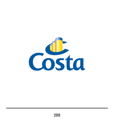
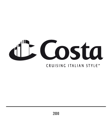
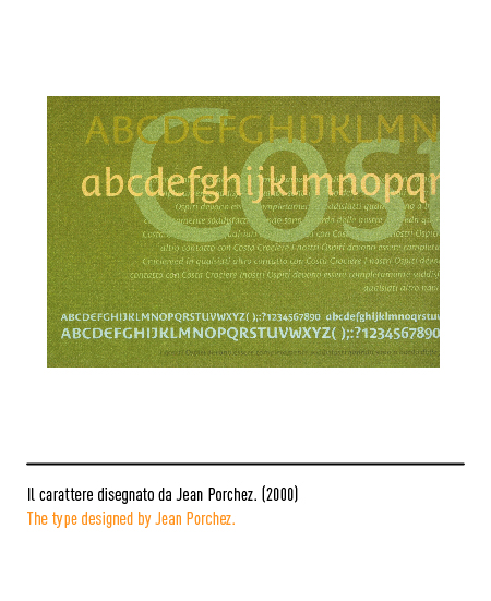
The Genoese company enters the third millennium with a development program that allows it to maintain its European leadership despite the increase in competition. Therefore, in 2000 the restyling of the logo was thought of which was created by Landor Associates: the three funnels embraced by the letter “C” and the lettering specially designed by Jean Porchez appear.
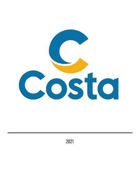
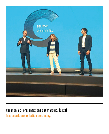
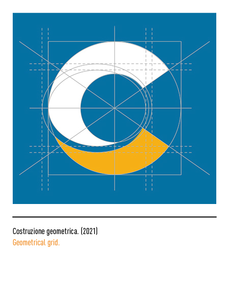
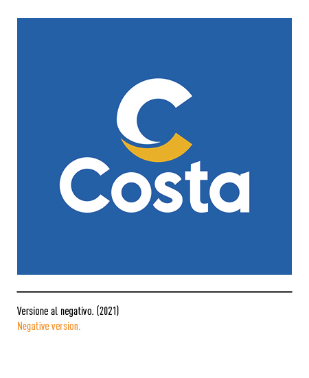
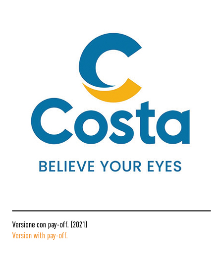
In 2021 Costa laid the foundations for its new positioning: building “the best way to explore the world, ethical, sustainable, engaging and enriching the traveler” by completely reshaping the offer of the Italian company. The project for the new corporate identity was entrusted to the ArteficeGroup agency; we started by redesigning the historic capital letter C, present on all Costa ships for over 70 years, elevating it to the icon of the company’s new promise and evolving its semantic role thanks also to the new pay-off “believe your eyes”. The logo symbolizes the union of two different elements in an enveloping and sinuous embrace: the earth, represented in the lower part of the yellow symbol, and the sea, the blue upper part, which come together in the same unique experience.