

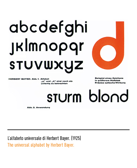
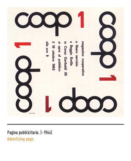
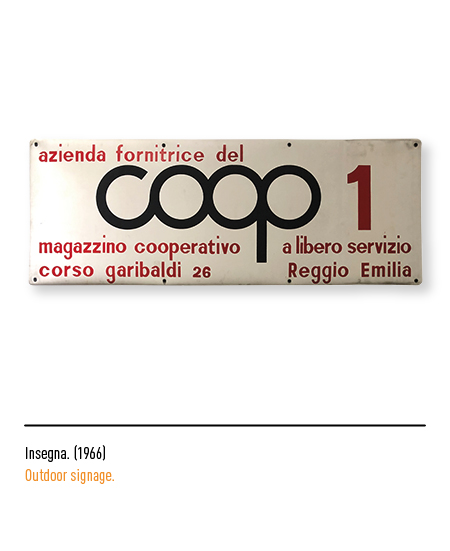
In full economic boom, the need emerged for Coop to give itself new perspectives to keep up with the times; therefore, the need was felt to adapt one’s visual identity to modern communication techniques. In 1963 Albe Steiner redesigned the logo deriving it from the “universal” alphabet of Herbert Bayer; to better convey the idea of cooperation between people, he minimized the spacing between the four letters in order to cancel any separation and to visually represent the meaning of cooperation. This logo appeared, for the first time, as the sign of the first “self-service warehouse” in Reggio Emilia.
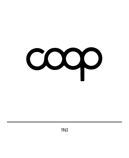


At the beginning of the seventies there was a restyling of the Steiner logotype: the letters were enlarged in the strokes and the junctions of the letter C and the letter P were improved.


Then in 1985 Bob Noorda made the restyling with minimal but effective interventions: he greatly enlarged the strokes using the same crooked cut for the letter C and the letter P.


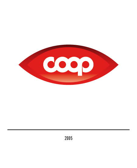
In 2005 another restyling entrusted to the Advance agency: the logo is inscribed in a red figure in the shape of an eye; even the packaging is renewed and captivating.