CINZANO
1 Logos and restyling over time
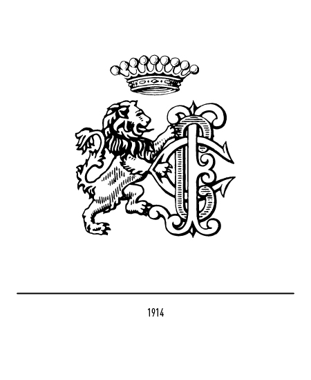
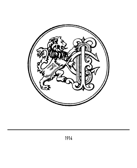
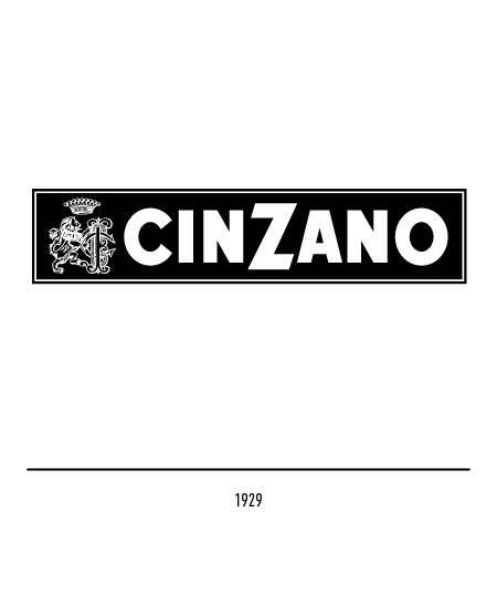
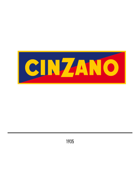
In 1929 the rectangular logo with the lion and the writing in bat characters was deposited characterized by the letter “Z” higher than the others. In 1935 the logotype alone was written on a rectangle made up of two red and blue diagonal elements.
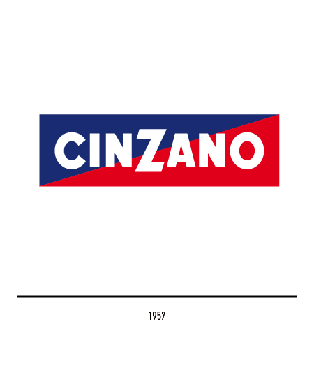
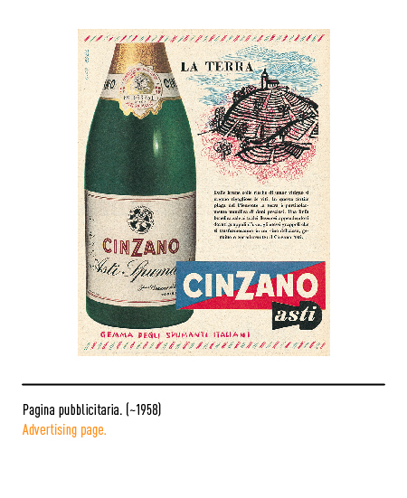
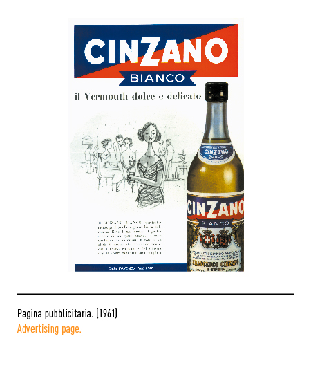
In 1957 the restyling was entrusted to a young Massimo Vignelli; with this brand the company has become the largest international producer of vermouth; in the 1950s the labels curiously showed the rampant lion facing left.
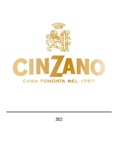
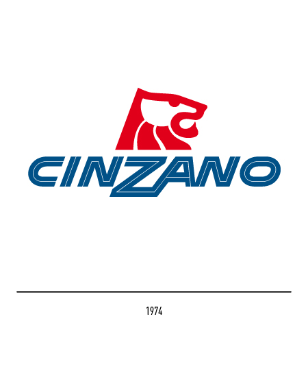
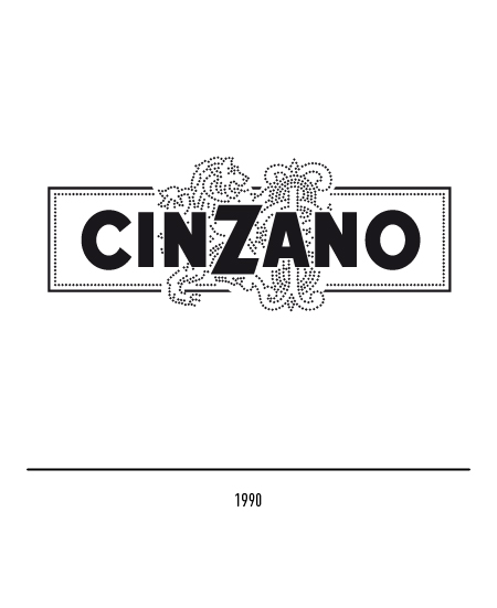
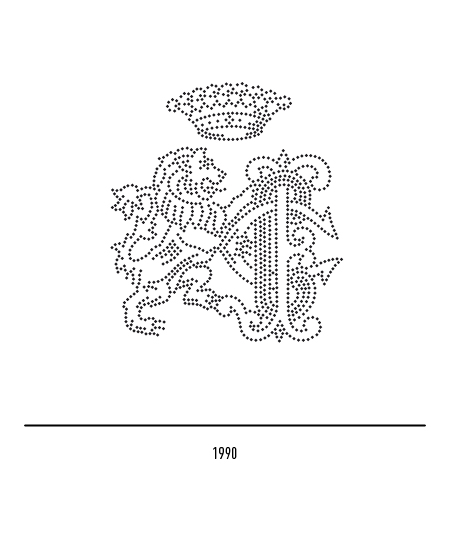
In 1974 the visual communication was entrusted to a logo, designed by Landor Associates, which took up the heraldic, albeit stylized, lion. Since 1990 Maurizio Di Robilant has implemented a graphic update operation using the lion in a more modern version with the gold-edged logo.
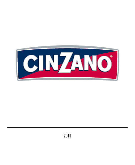
In 2010 the Lumen agency was entrusted with the restyling of the logo: the new proposal reinterprets the tradition and Italian character of the logo in a modern key with the rounding of the rectangular frame.
In 2022 the company rethought the restyling of the logo, highlighting the year of foundation in the pay off as a reference to the long company history.