BENETTON
1 Logos and restyling over time
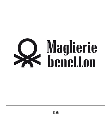
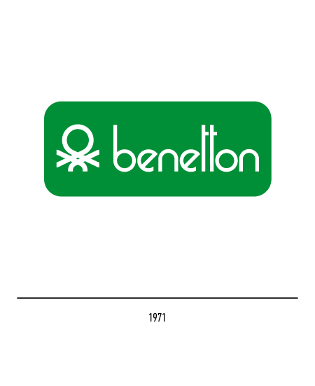
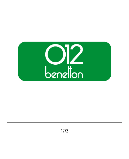
In 1971 Franco Giacometti and Giulio Cittato made changes to the logo: the only surname “Benetton” inside a rectangle with rounded edges. The logo for the children’s line “012” was also designed in 1972.
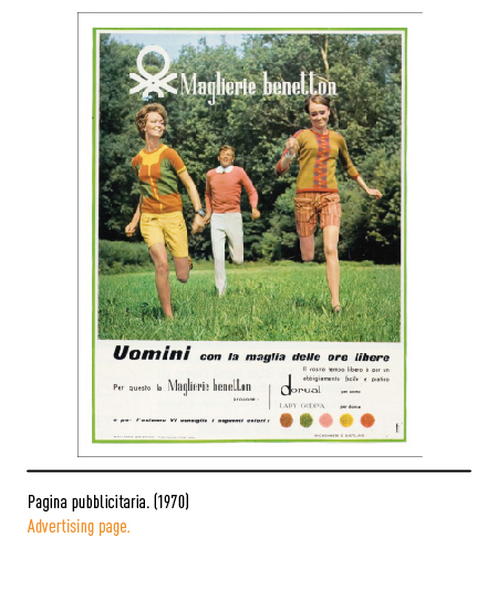
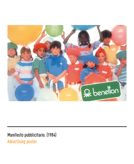
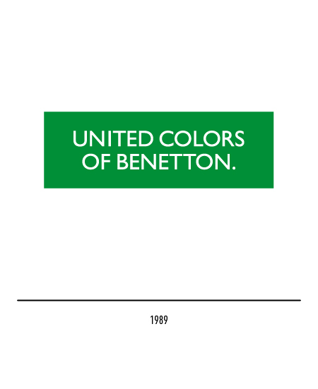
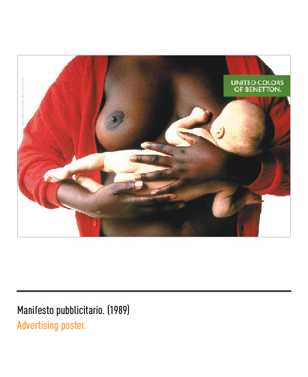
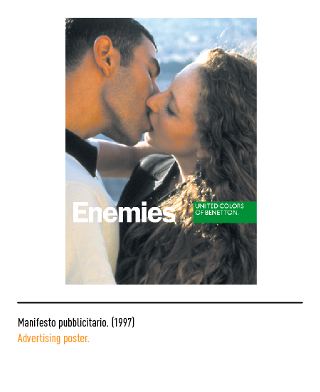
In the first advertising campaigns the product was still clearly visible while others were the discourses that were beginning to assert themselves, first of all that of the integration of races since the photographer and art director Oliviero Toscani insistently used models of all nationalities. A slogan appeared in 1989, “all the colors of the world”, which will become the headline for the advertising campaigns of the Eighties and then evolve towards the “United Colors of Benetton” logo designed by Bruno Sutter, art director of the Eldorado agency who he took care of the creation of the catalogs.
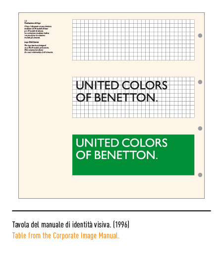
In 1996 Massimo Vignelli made a slight restyling: from the centered writings placed in the center of the green rectangle we passed to the left flag writings placed at the top left.
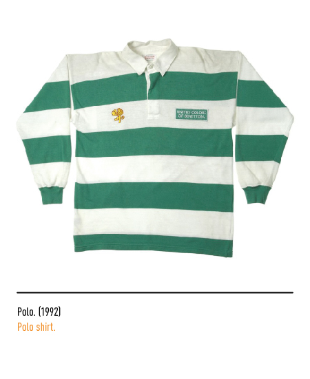
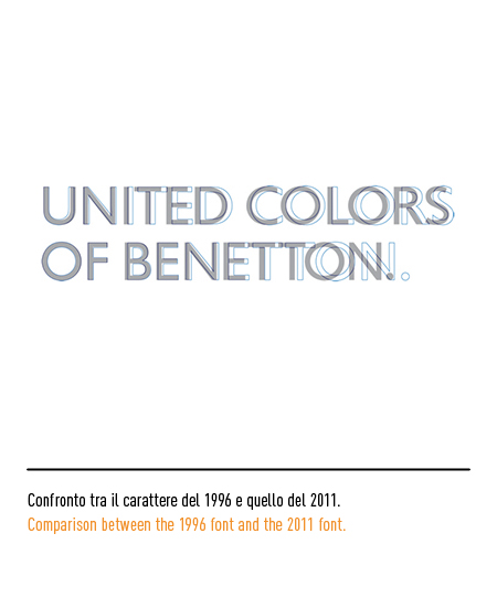
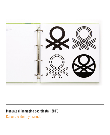
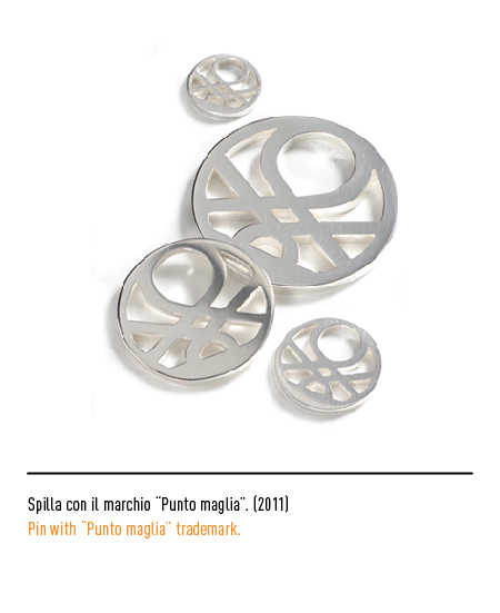
In an increasingly competitive market, Benetton records the need to rethink visual identity; in 2011 the Pentagram agency will be in charge. The core of the new identity remains the familiar green label with only the typographic restyling of the “Benetton Sans” based on the “Gill Sans” chosen in the Eighties. Pentagram suggested that the company revive its classic “knit stitch”, a sign that it enjoyed great recognition despite having fallen into disuse in the early nineties.


