BARILLA
1 Logos and restyling over time
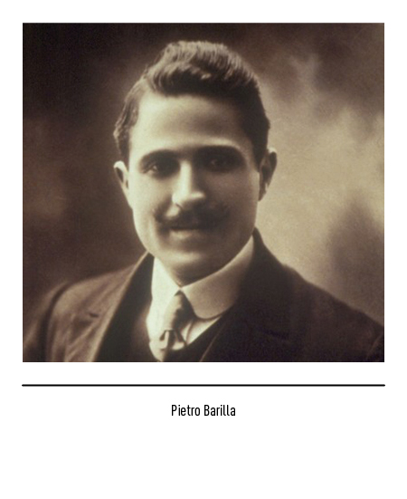
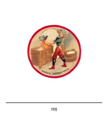
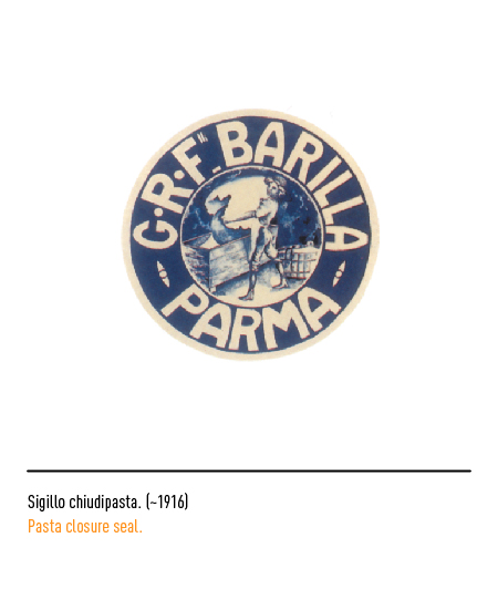
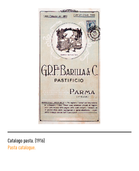
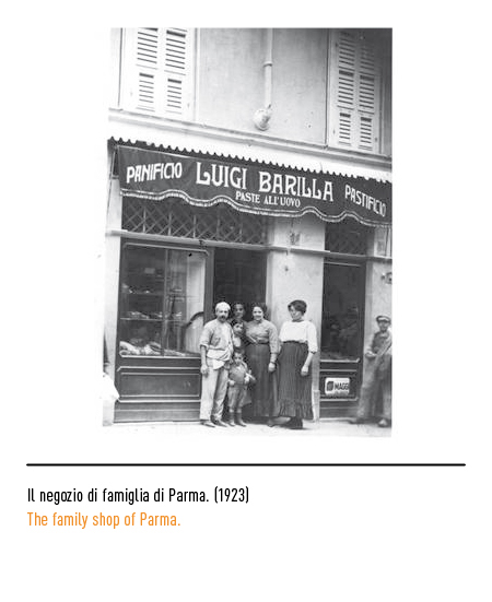
The company was founded in 1877 by Pietro Barilla who, descended from a family of bakers documented starting in 1576, opened an oven in Parma for baking bread and a small workshop for the processing of pasta. In 1910, with the construction of the new factory for egg pasta, there was a strong need to define the Barilla identity: the first logo, designed by the sculptor Emilio Trombara, depicted in a circle the boy boy, “al putén” in Parmesan dialect, which spills the yolk of a gigantic egg into the pan full of flour; the egg is the focal point of communication, a sign of abundance and life, and in the logo it was magnified to enhance its meaning at first sight.
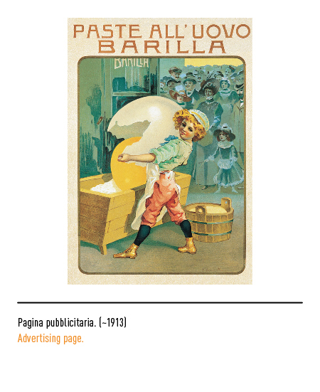
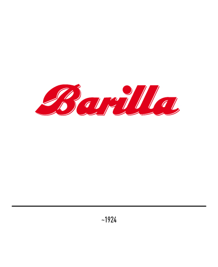
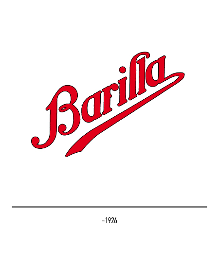
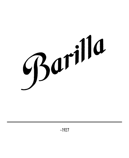
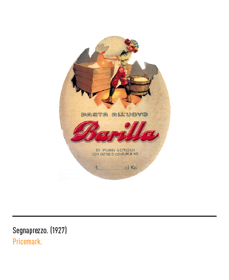
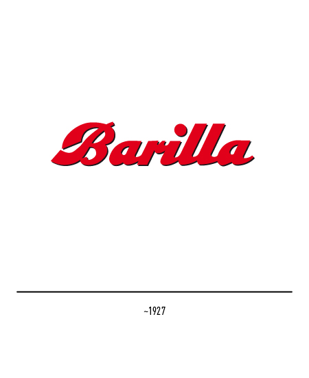
This logo was used until the 1930s on headed cards in combination with various Barilla logos: those in liberty style with sinuous characters and those with solid and square characters, testimony of the twentieth century style.
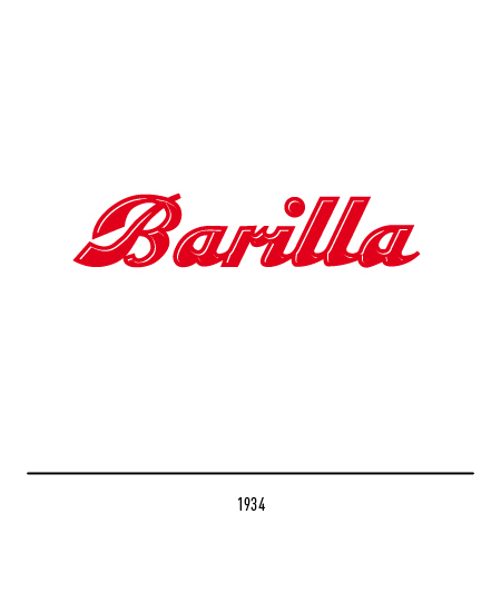
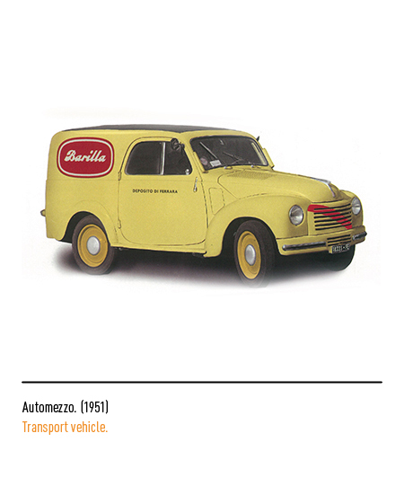
In 1934 Giuseppe Venturini eliminated the boy boy leaving only the “verbal” logo cut out like tin and, in 1949, he inscribed it within an edged oval. During the reconstruction period, Barilla first in Italy moved towards the industrialization of bread production, the mechanization of pasta processing and a well-equipped commercial organization.

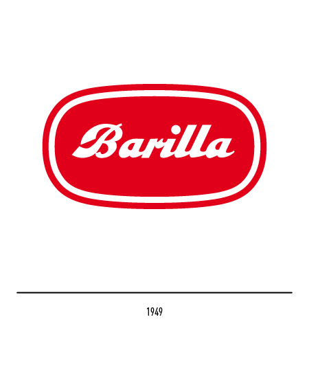
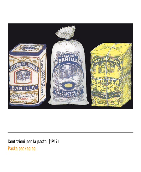
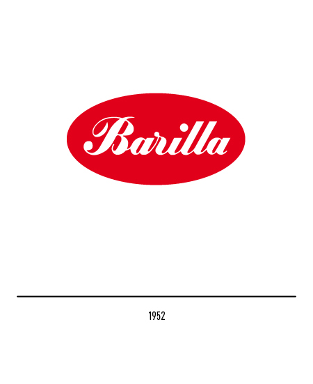
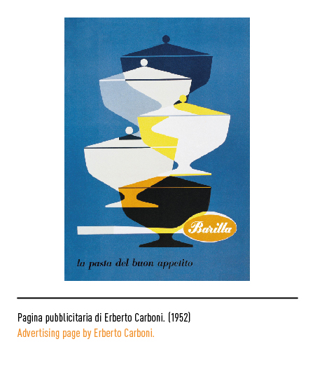
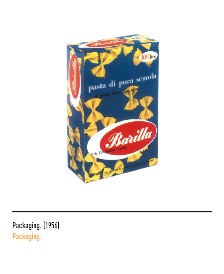
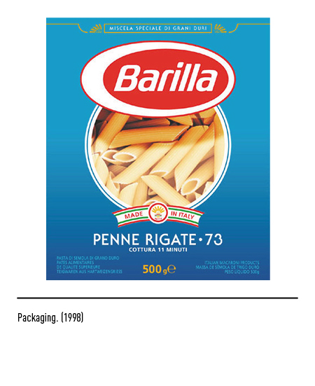
In 1952 the company suspended the production of bread to devote itself exclusively to the production of semolina and egg pasta; Erberto Carboni designed a new logo framed in an oval, in positive and negative, with a still cursive and calligraphic font but lighter and more elegant. Barilla was, at that time, the first company to adopt standard carton packs for the entire production of pasta until then sold in bulk.
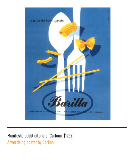
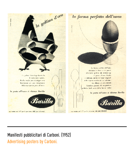
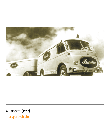
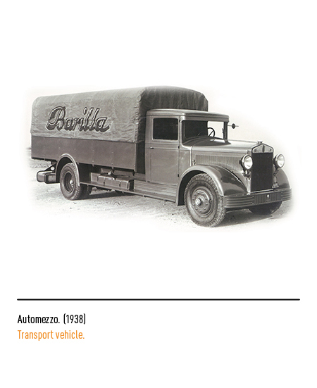
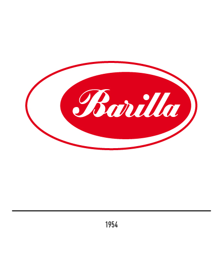
Erberto Carboni made a slight restyling to the logo in 1954: an asymmetrical frame which, for some, represented the light and red of a hard-boiled egg cut in half and, for others, the characteristic “white nail”. In 1960 Barilla became a joint stock company and was on the way to becoming the first Italian food industry and the first in the world for the production of pasta. Carboni renewed the entire corporate image by also studying the packaging, press campaigns, trade fair stands and means of transport.
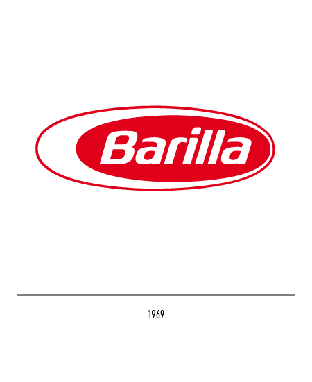
The Barilla logo with very flattened ellipses and stylized lettering was developed in 1969 by Lippincot & Margulies of London.
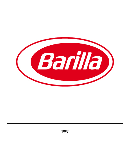
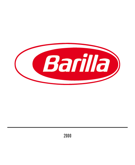
In 1997 Gio Rossi made a slight modification to the logo, aimed at balancing its structure and making it less horizontal. In 2000, thanks to Future Brand, the Barilla logo was slightly revised to give more proof of authenticity and simplicity; the Barilla logo has become more crushed.
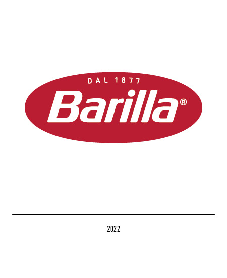
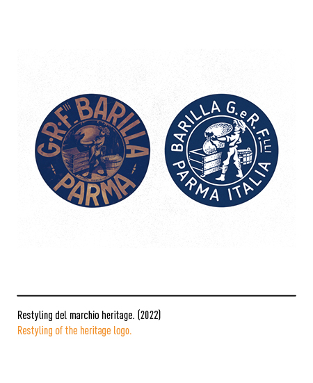
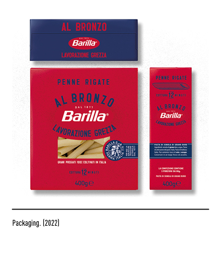
In 2022, for the 145th anniversary of the company, a new brand identity materializes mainly in the new brand in which the year of birth is highlighted and with a more impactful red background. Another novelty concerns the packaging, which in Italy returns to being blue and no longer blue as in recent years. The Robilant Associati agency signs the visual identity. The stamp also stands out on the front of the pack, a restyling of the very first sign that the Barilla pasta factory adopted as the packaging of its products back in 1877, when it all began. The white oval disappears, a historical reference to egg pasta, which today would be a partial representation for a reality that has become a 360 ° Food Company on a global level.