ARISTON
1 Logos and restyling over time
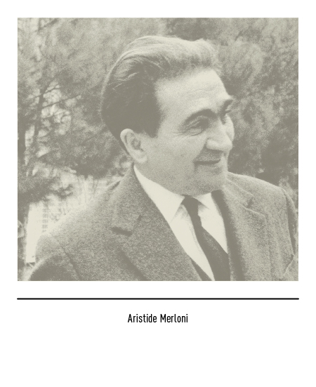
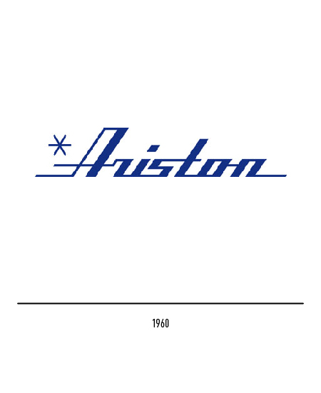
Aristide Merloni created in 1930 in Fabriano (Ancona) a small artisan workshop for the construction of scales. In 1954 it diversified its production by building liquid gas cylinders and water heaters which were followed, in 1960, by household appliances with the Ariston logo. This name had a double origin: on the one hand, the reference to the name of the founder and, on the other, to the Greek term which means “the best”.
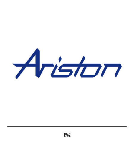
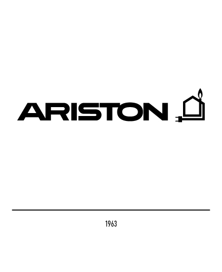
The first logo was designed in 1963 by Vittorio Antinori who, to reaffirm his vocation for domestic products, depicted the graphic symbol of the house with an electric plug and the gas flame.
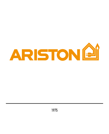
In 1975 “Merloni Elettrodomestici” was born, a multinational leader on the European market which also incorporated Ariston. A restyling of the logo was carried out by Bob Noorda, which consisted of doubling the orange line.
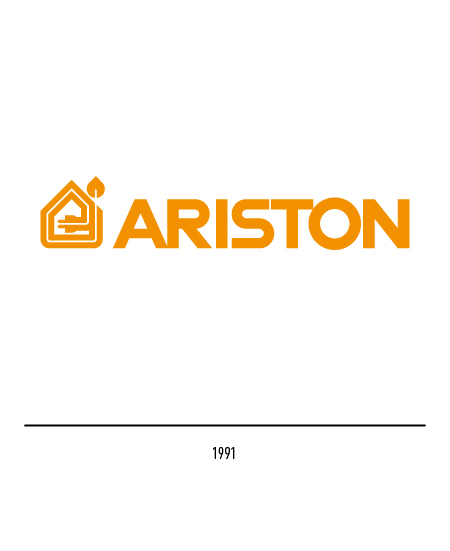
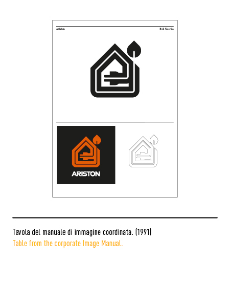
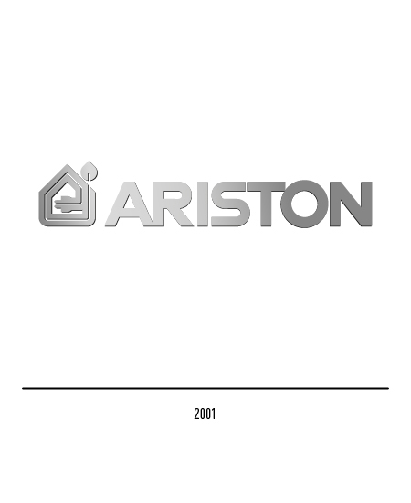
The idea of modifying it again was motivated by the acquisition of Indesit in the Merloni group in 1990: the time had come to update all the logos to strengthen the concept of group identity but also to make them more graphically modern but without distorting them. The 1991 logo, also by Bob Noorda, was further essentialized, becoming more compact and stylized, especially in the flame, and the lettering was reconfirmed; note that the house has been positioned to the left of the logotype. In 2001 the logo was revived with the metallic effect.
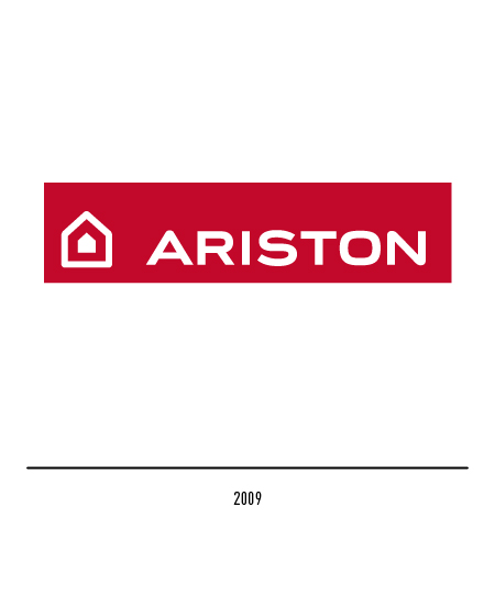
In 2003 a further restyling essentializes the house with a few features. In 2009 the logo, developed by the CBA Design agency, was made more modern and dynamic: the graphic elements were positioned within a red rectangle in order to give a distinctive and precious tone, in harmony with the warmth that the brand wants to convey.