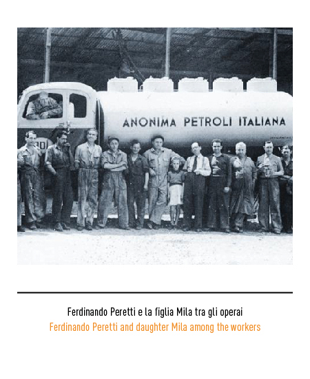
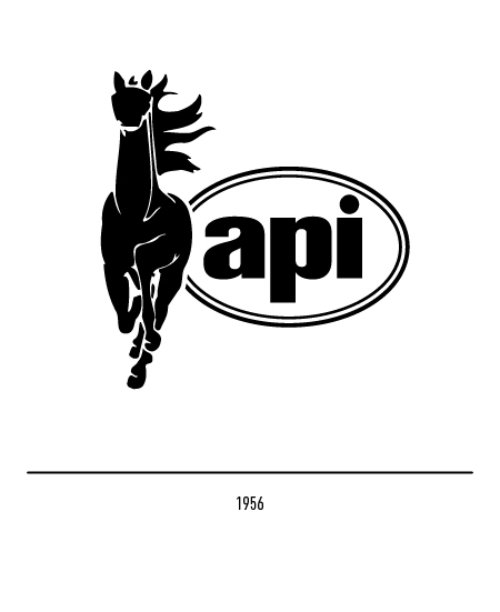
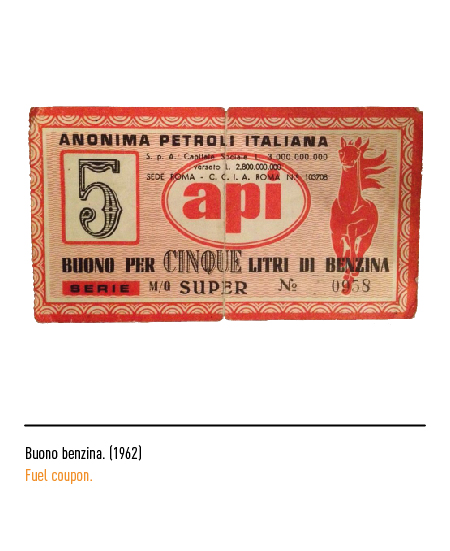
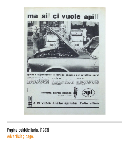
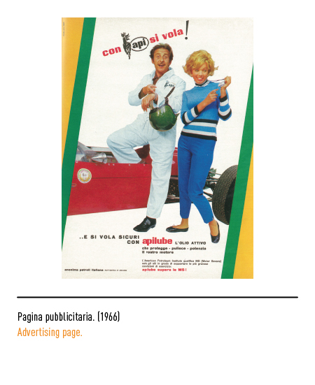
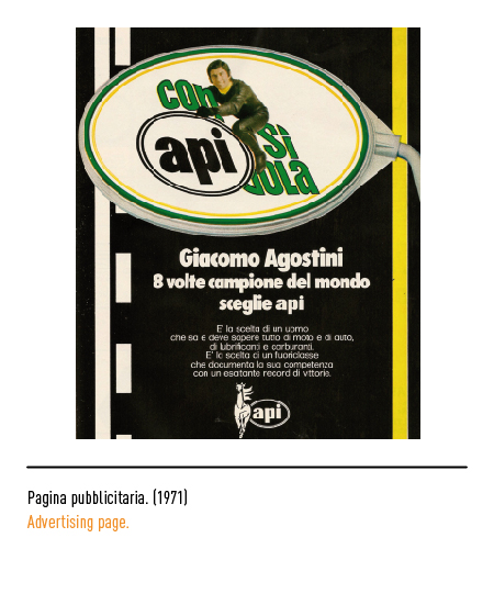
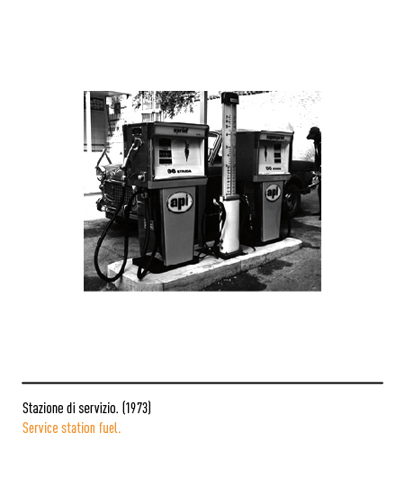
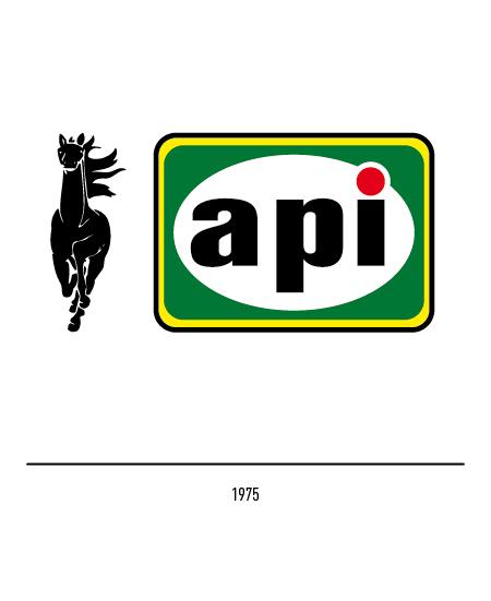
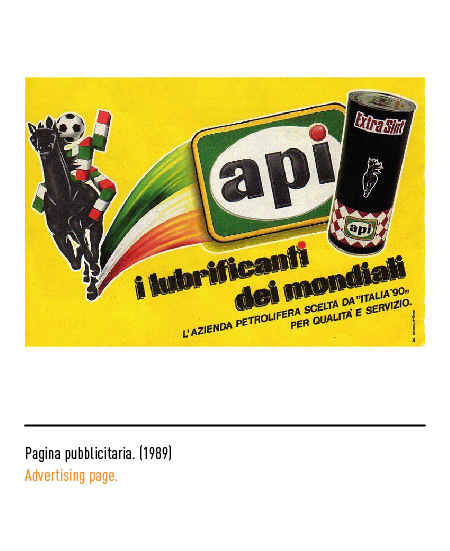
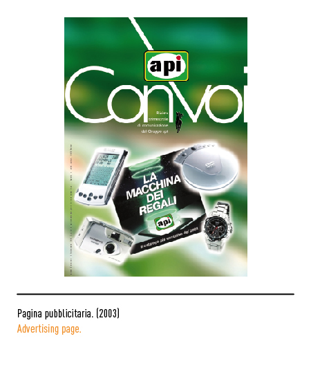
The Anima Petroli Italiana, also known by the acronym of “api” written in lowercase, was founded in Ancona in 1933 by Ferdinando Peretti with the aim of marketing and distributing petroleum products on the local market. In addition to traditional activities in the oil sector, he has added important projects in the field of electricity production from similar and renewable sources. The first logo of 1956 depicted a black horse in motion, a symbol of energy, with the logo inscribed in an oval.
In 1975 these two elements will be separated and the logo will be inserted inside a rectangle with rounded edges and colored with black, yellow and green.
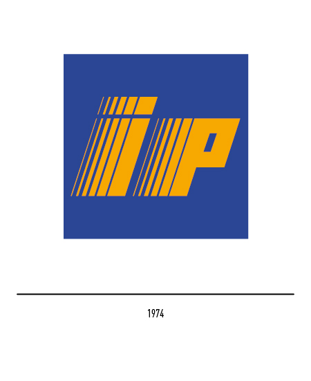
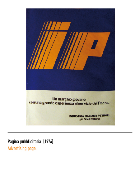
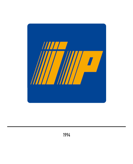
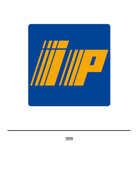
At the same time, IP (Italiana Petroli) was born in Genoa in 1974 from the acquisition by Eni of the Italian activities of Shell; the design of the logo was entrusted to Walter Landor of San Francisco (USA) who opted for a blue square with the two orange letters that progressively replicated to the right, creating the sensation of movement, of energy.
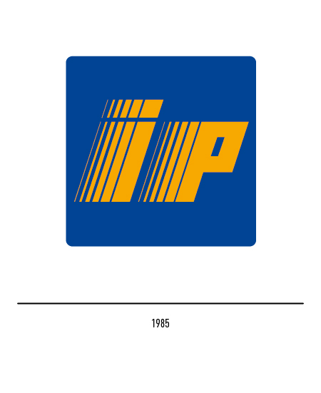
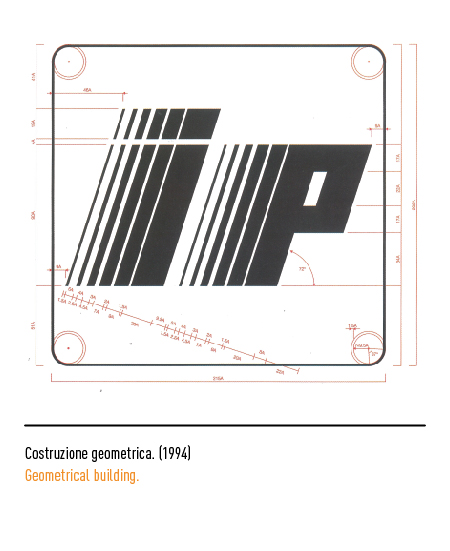
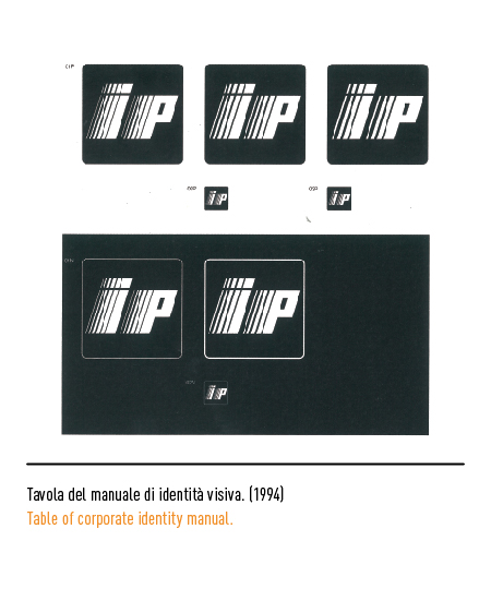
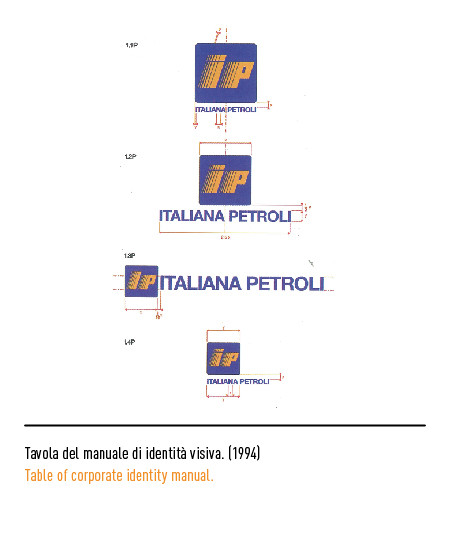
In 1985 there was the redesign of Bob Noorda which confirmed the general layout with small variations in the inclination of the letters and the rounding of the corners of the square. Then in 1994 a further restyling entrusted to Ino Chisesi: the geometric reconstruction of the letters is fundamental to avoid losing the first thickness in the strong reductions. Three different versions of the logo were conceived for these problems: 5, 4 and 3 thicknesses; the one with only 3 thicknesses became in 1999 the official logo with which the company consolidated its image as the second Italian reality in the distribution and marketing of petroleum products.
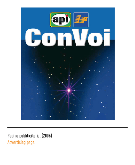
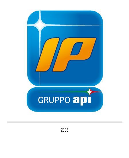
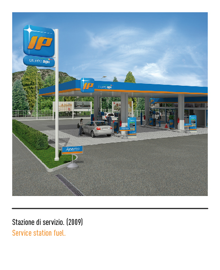
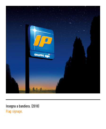
In 2005 Api acquired IP from Eni, which was merged by incorporation in 2007; during this time the two logos appeared together in the communication. In 2008 the Api group decided to rebrand the entire distribution network by unifying the entire common network under the new “IP Gruppo Api” logo. From the market surveys it emerged that the IP logo was perceived as a young and dynamic logo while the Api logo represented tradition; the creative process led to the choice of the expression “Api Group” as an identification of business value and IP as a commercial logo. The logo project is entrusted to Landor; the creative choice is based on the idea of capturing Italian energy through an iconographic spark that lights up the sky-blue background like a star that points the way to the future. The new identity visually maintains the colors of IP as a strategic choice dictated by the greater distance of the IP colors from those of the competitors; the yellow and black of the API distributors were easily confused with the colors of AGIP, the Italian leader in diffusion. The orange logo is confirmed with letters tilted to the right but with softer letters.