


amadori
1 Logos and restyling over time
The company’s roots lie in Romagna in the 1930s, when the Amadori family, led by Ondina and Agostino, along with their sons Adelmo, Arnaldo, and Francesco, began trading poultry and farmyard animals locally. The turning point came in the mid-1950s: Francesco and Arnaldo recognized the sector’s potential and expanded the business with livestock farming, and later with feed mills, hatcheries, and slaughterhouses. Thus, in 1969, they created one of the first integrated supply chain industries in Cesena.


The first logo, from 1969, featured the words “Amadori Avicolture” with two large interlocking “A”s and the abbreviated terms “Fratelli” and “Azienda Agricola”. In the absence of graphic design rules, the recognizable packaging label, featuring the head of a stylized chicken within a circle with the red “Pollo Amadori” logo, became the company’s symbol.


In the 1970s, distribution became national and the brand underwent a transformation: the family surname appeared on a flowing green shape that recalled the Romagna hills and accentuated the stylized chicken icon; the tagline “sapore di Romagna” also appeared. The first Amadori television commercial aired with this brand in 1979.

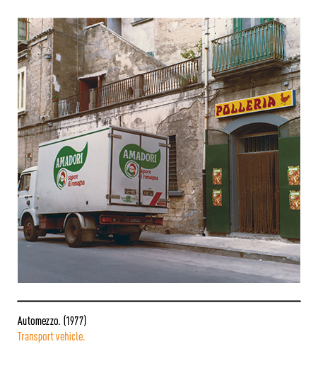

In 1981, the production hub was established in Abruzzo, and Amadori took its first steps toward product innovation by offering its first branded products without a payoff. In 1987, the brand underwent a slight redesign: the chicken icon was redesigned in a cartoon style for a more effective and modern overall design.


In 1996, designer Gio Rossi was commissioned to redesign the brand: the green background took center stage, featuring two trees at the top, and the golden lettering “Fratelli di Romagna” appeared, emphasizing the company’s family roots and connection to the region. In 1999, founder Francesco Amadori appeared in company commercials for the first time, and in 2000, with a commercial directed by Alessandro D’Alatri, the successful slogan was born: “Parola di Francesco Amadori”.


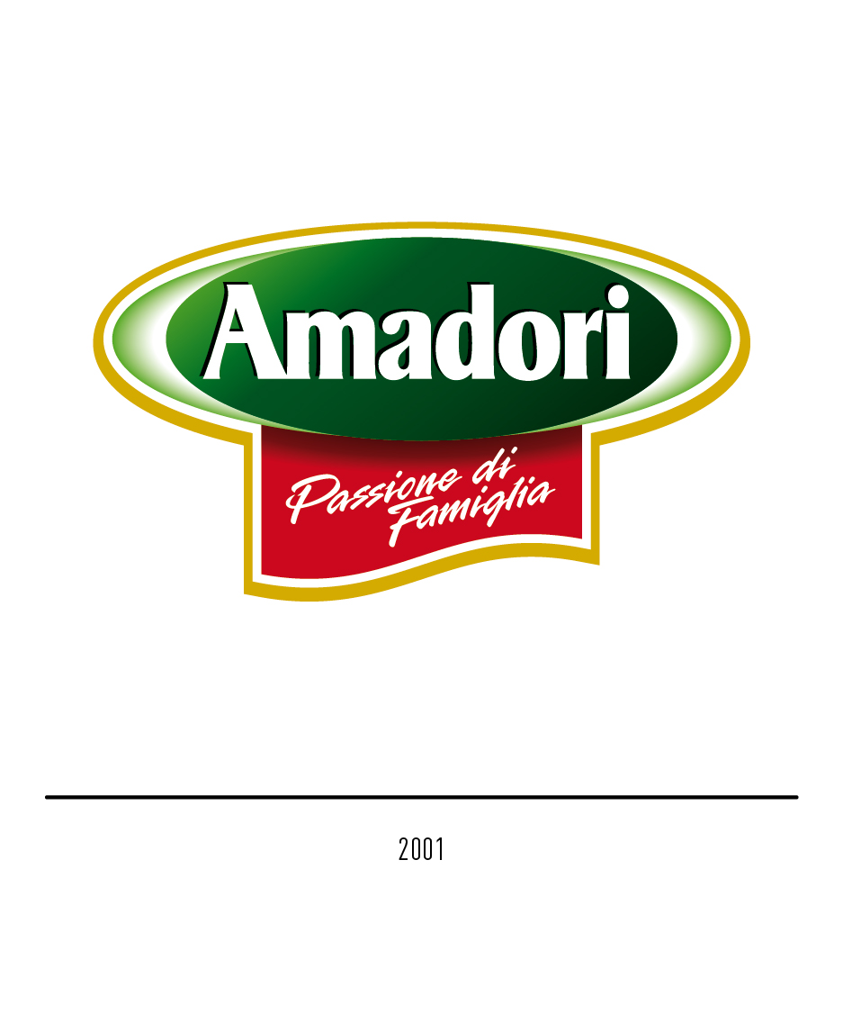
In 2001, Francesco Amadori’s idea led to the birth of the “Il Campese” project in Puglia, featuring free-range chicken, subsequently raised without the use of antibiotics. For that occasion, the new brand was unveiled, eliminating the historic chicken icon to highlight the brand name and its founding values. The Amadori logo changed font and appeared in a green oval, along with a red scroll with the new tagline “Passione di famiglia” (Family Passion). The entire composition was inspired by the outline of a chef’s hat.


In 2015, Francesco Amadori handed over control of the company to his sons Flavio and Denis. 2023 marked a significant new milestone in the history of Amadori, which, after 22 years, revamped its brand to adopt a visual identity that updates the brand’s core identity, continuing its success story and projecting it toward a future of new goals. The logo, designed by the Turin-based agency Goodmind, has been stripped of many graphic elements, making lightness and simplicity its strengths. The choice was to focus entirely on the distinctiveness and strength of the name, through the personality of the character, or rather, the recognizability of the lettering, which remained the sole protagonist and retained green as the primary color. Even the dot of the letter “i”, deliberately red, was a reference to passion and, together with green and white, evokes Italianness. The new brand is “free” from any graphic constraints, just as Amadori’s offerings move more freely across the entire protein spectrum, including plant-based proteins.


