ALPITOUR
1 Logos and restyling over time
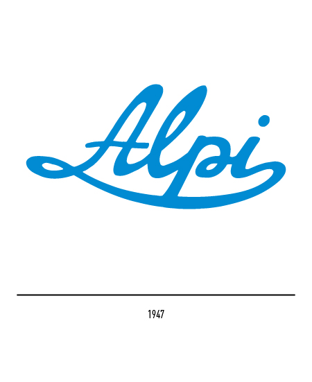
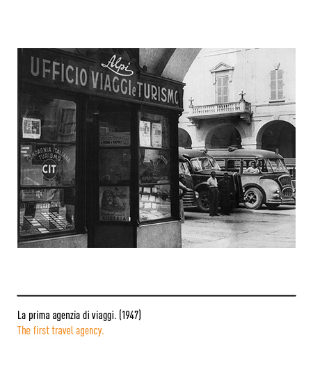
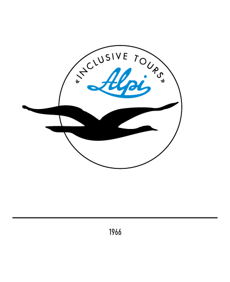
It is 1947 when Mr. Lorenzo Isoardi opens his travel agency in Cuneo with the name “Alpi”; he established himself as a tour operator by introducing, first in Italy, “inclusive tour” programs to European capitals and, later, special flights to the most inviting seaside destinations in the Mediterranean. He transported Italians by bus and train to the most significant events of the time such as the Holy Year in Rome and the Nice Carnival; in 1951 the “Alpi” obtained the representation of the LAI (Italian Airlines). The first logo of 1947 consisted of the calligraphic inscription “Alpi”; in 1966 it was placed in a circle with a seagull and the words “inclusive tours”, that is “all-inclusive trips”. The metaphor expressed an analogy between the free life without constrictions of the bird and the service offered to its customers.
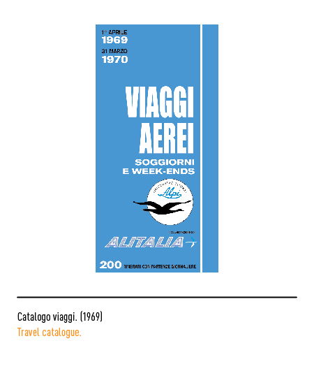
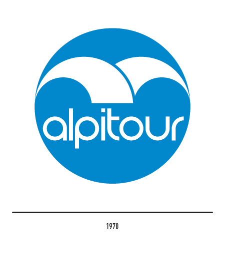
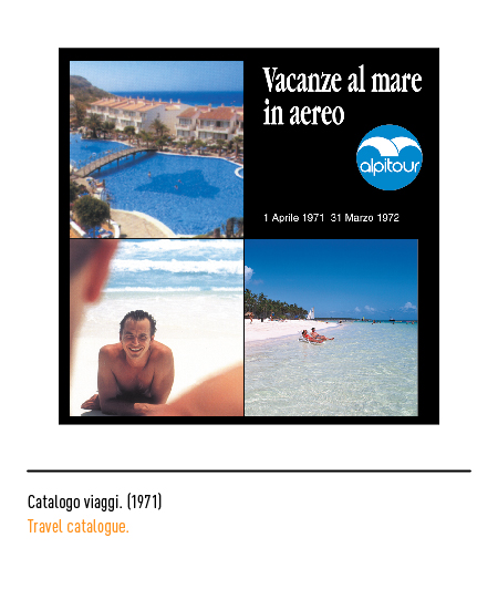
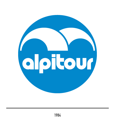
In 1967 it became “Alpitour” but, only in 1970, Sergio Dabovich made the restyling of the logo: the insertion of the stylized seagull on a blue circle with lowercase lettering. In 1984, the same author made a small change, especially as regards the lettering.
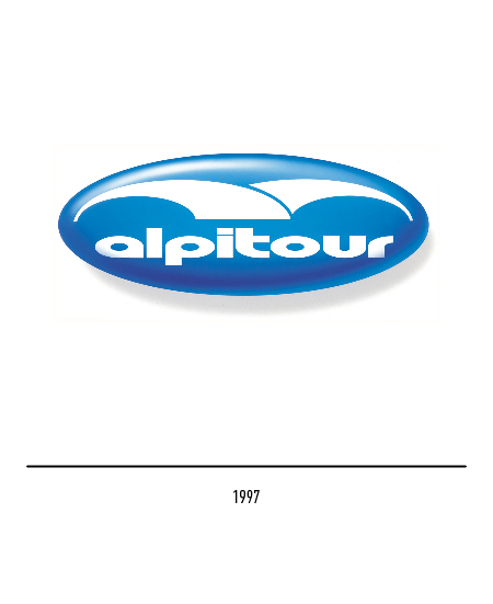
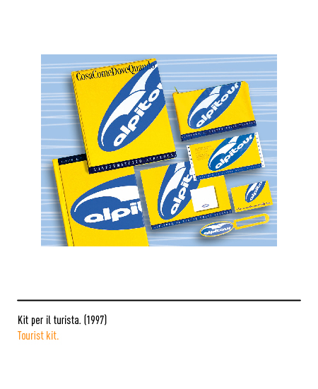
In 1997, for the fiftieth anniversary, Federico Dabovich made a change to the logo: it appears oval and chiaroscuro, as if it were a plate.
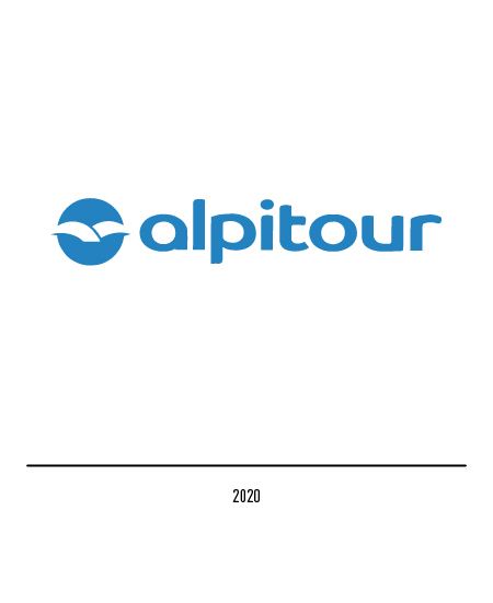
In 2020, together with the revival of the blue circular shape of 1970, Alpitour presents an optical illusion solution that makes the white seagull “visible” with a further stylization. The logo, which is always small, has a more modern character.