ALFA ROMEO
1 Logos and restyling over time
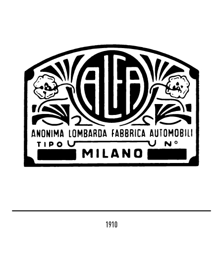
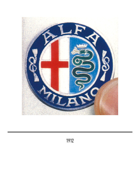
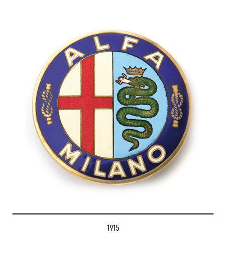
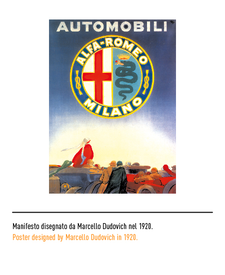
Alfa Romeo’s attention to its image is significantly demonstrated by the graphic evolution of the logo which, from the very beginning, adopted the two heraldic insignia of Milan at the time of the Municipalities; in 1912 the logo, created by the cartoonist Romano Cattaneo, was made up of the city coat of arms of Milan, a red cross on a white background by Giovanni da Rho, and the Visconti snake linked to the Lombard tradition. For some, the latter was the biblical snake on a blue background with a child in its mouth decorating the banner of the Milanese crusader expedition; it was Arnolfo II who put “the viper that the Melanese encamps” of Dante’s memory on his military insignia after winning in battle a Saracen knight who boasted of “eating Christians” (see Ferrari). For others, it was the bronze image of a snake that was brought to Milan in 1002 and immediately reproduced on a column of Sant’Ambrogio. The logo had these elements inscribed in a circular band with two Savoy knots and the writing “Alfa-Milano” with a graceful character.

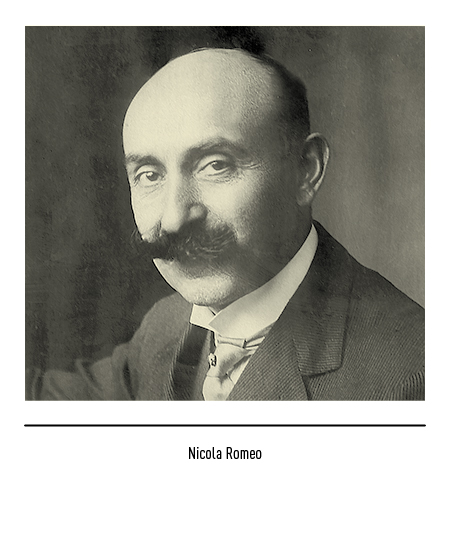
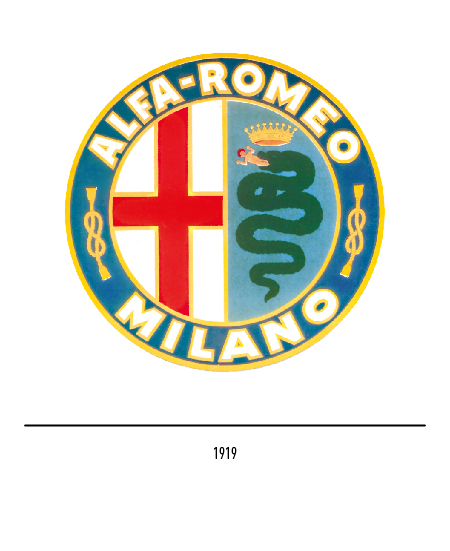
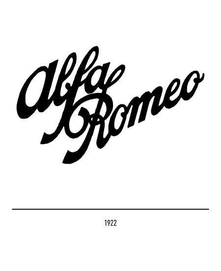
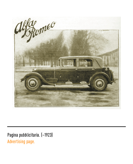
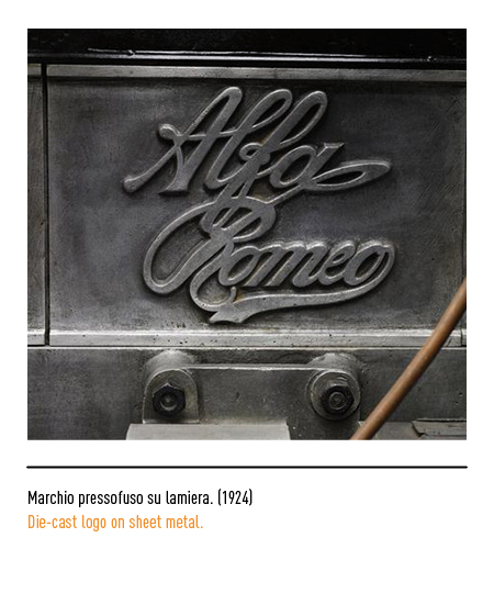
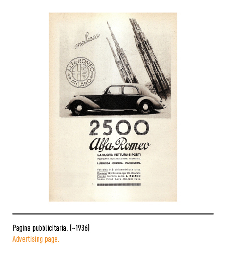
In 1919 the logo appeared with the definitive wording in stick font “Alfa-Romeo Milano”, following the acquisition of the Alfa by the Neapolitan engineer Nicola Romeo in 1915. In 1922 the logo made its first appearance on the car radiator calligraphic “Alfa Romeo” arranged on two lines even if it will later be proposed in the one line version.
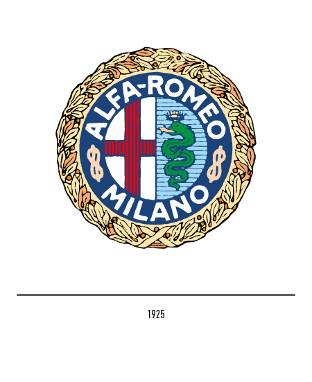
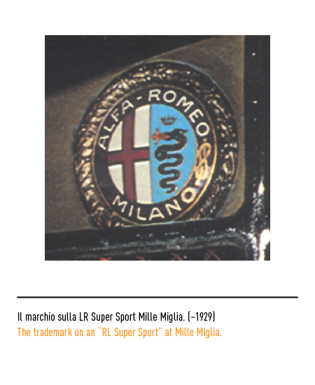
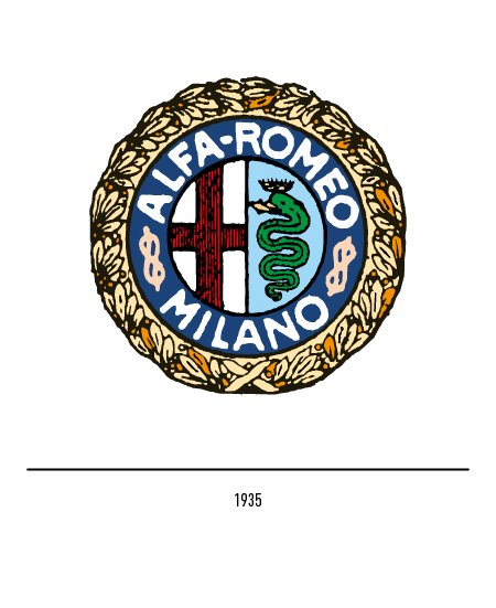
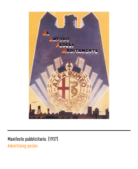
In 1925 the Alfa Romeo brand appeared with the laurel wreath that marked the victory in the first World Automobile Championship with the “Alfa P2” car. Two curiosities: from the first circular logo the snake seemed to twist on itself near the head but in a logo of 1935, strangely, the snake showed a regular trend; in an advertising poster of 1937, in the Fascist era, the autarchic wording “Milan-Naples” lived in the logo and here the snake returned to twist!
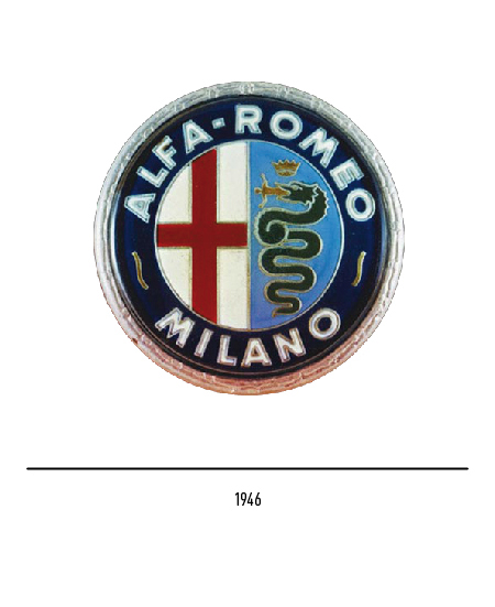
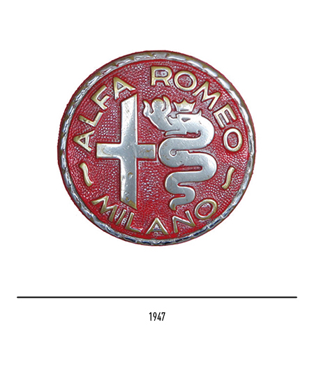
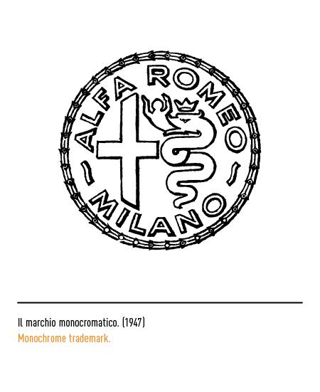
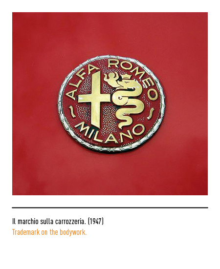
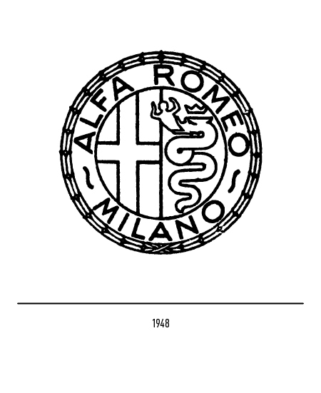
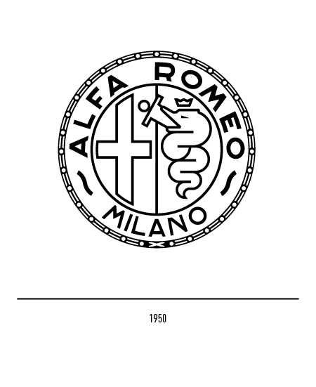
In 1945, with the fall of the monarchy and the proclamation of the Republic, the Savoy knots gave way to two wavy lines; later, in the absence of strong constraints, there were several “free interpretations” of the Alfa Romeo logo: from 1946 to 1950 the child was placed in an inclined position and the laurel wreath less evident.
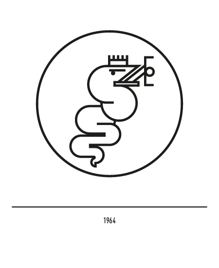
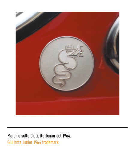
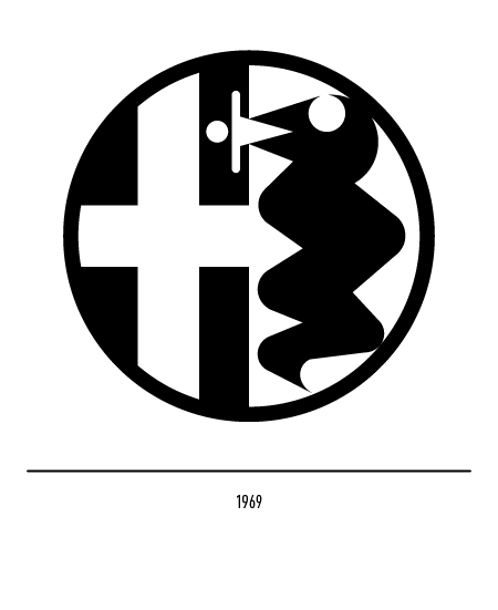
In 1964 the stylization of the Visconti snake facing right appeared on the Giulietta Junior; in 1969 an unlikely synthesis operation essentialized the snake and dehumanized the child.

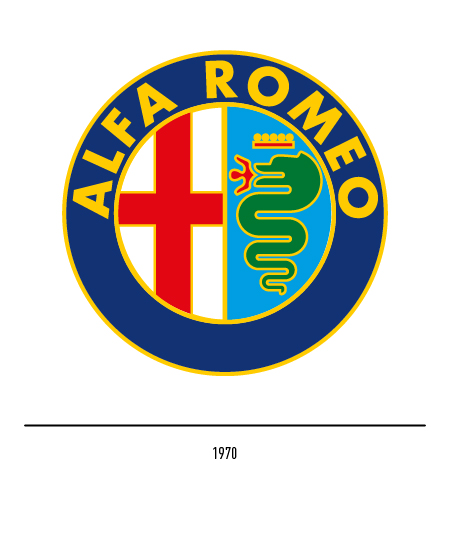
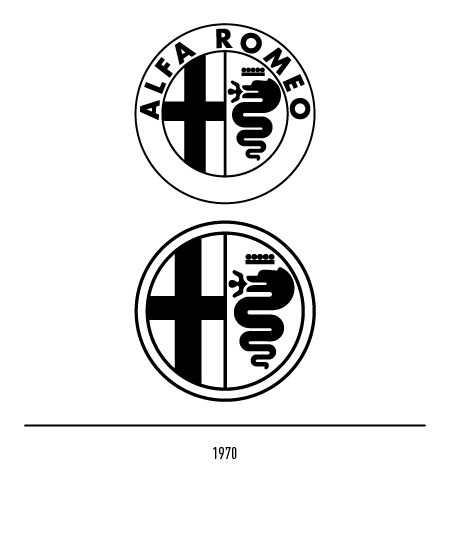
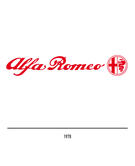
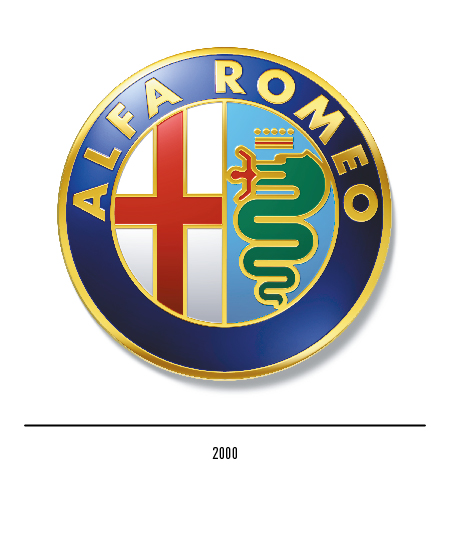
Starting in 1972, with the autonomy of the Alfasud factory in Pomigliano d’Arco (Naples), the word “Milan” disappeared from the logo and only two Milanese symbols remained surmounted by the words “Alfa Romeo” composed in Futura. The logo was designed by Pino Tovaglia who redesigned the previous ones in the color and monochromatic solution. In 2000 the logo underwent a modernization by Maurizio Di Robilant.
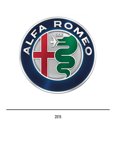
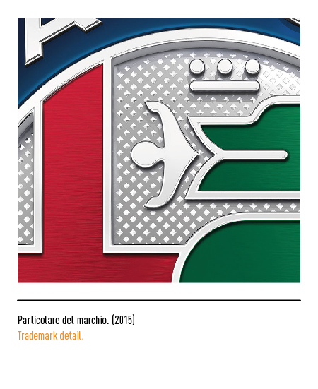
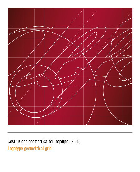
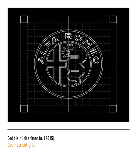
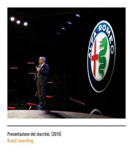
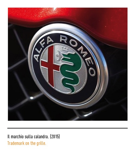
In 2015, on the occasion of its 105th anniversary, Alfa Romeo presents a renewed version of its historic and legendary logo; this also coincides with the launch of the new Giulia and the reopening of the Automobile Museum of Arese. The task for the restyling was entrusted to Di Robilant Associati, historical partner of the Fiat group. The new logo represents the celebration of the historical identity of the logo with an impulse towards contemporaneity and elegance. The outer ring in midnight blue enhances the exclusivity of the house while the use of chromed steel in the profiles and logotype, composed with the retouched ITC Blair font, emphasizes modernity and technological vocation; on the whole, the usual elements remain untouchable, both the cross and the snake, even if the latter is more prominent and proud. These icons no longer live on the white and blue background but on an unprecedented single chrome background, enriched with a texture that simulates the embossed engraving. This new color replaces the gilding of the Pino Tovaglia logo of the seventies. The crown has also been essentialized.