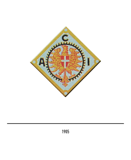
The history of ACI is closely linked to that of our country precisely because of the intertwining of economic and social growth with the development of motorization. The Aci, acronym for “Automobil Club d’Italia”, was born as a free association of motorists in Turin in 1905; the first logo, in the shape of a rhombus, depicted a golden eagle with the Savoy cross, all inscribed in a toothed wheel.
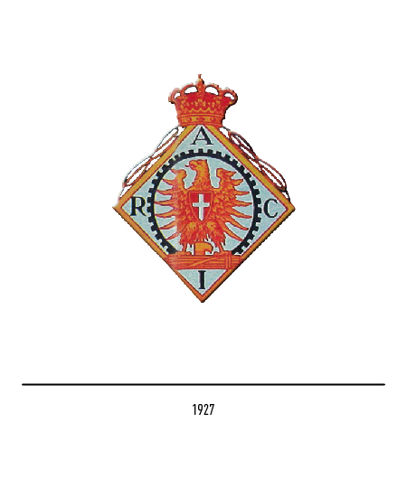
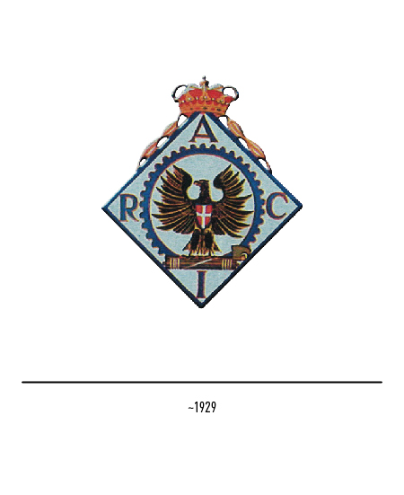
In 1926 it will be elevated to a non-profit organization by state law and will be transformed into Raci (Reale Automobil Club d’Italia); therefore the new acronym and the royal crown appear in the logo. The following year, the PRA, the Public Automobile Register, was established, whose management is attributed to Raci together with the distribution of vehicle license plates.
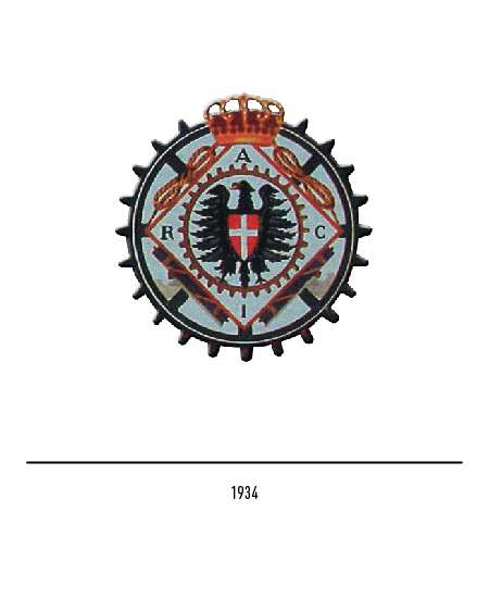
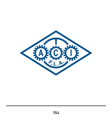
In 1934 the logo gets rid of the rhombus and the toothed wheel is predominant. In 1946 the Raci is transformed back into Aci after the referendum; in the essentialization of the logo, the crushed rhombus with three toothed wheels and a steering wheel reappears.
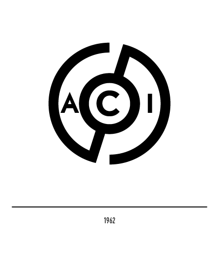
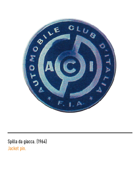
In 1962 another restyling: the only three letters of the acronym and a steering wheel with the name arranged in a circle.
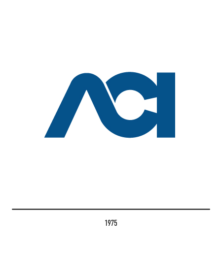
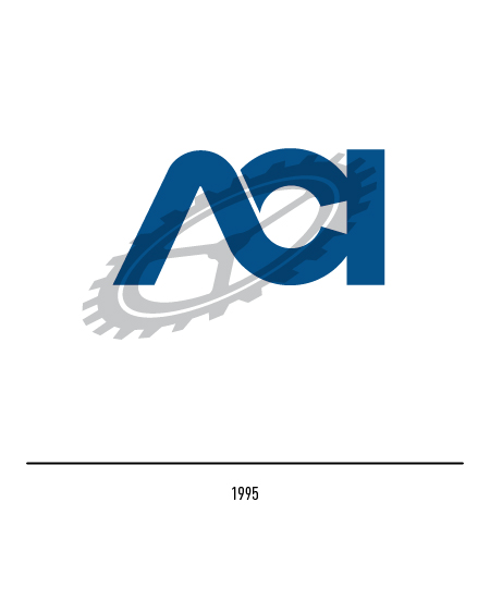
In 1975 the new logo was adopted with only the blue letters in an original composition; this logotype has become over time a signage icon for all Italians. In 1995, on the occasion of the ninetieth year of its foundation, a restyling was carried out with which the cogwheel, the other historical symbol present in the first logos, was superimposed on the logotype.
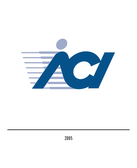
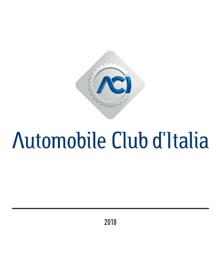
To celebrate the centenary, in 2005 the new logo designed by Bob Noorda is presented; the three sloping letters with graduated lines express dynamism while a point is added to the first letter to visualize the silhouette of a driver. To celebrate one hundred and five years of history and reaffirm the desire to grow further, in 2010 there is yet another restyling of the Inarea agency; precisely to underline the value assigned to the history and tradition of the club, the new logo brings together in the same composition the three strong elements of its iconographic tradition: the historical logotype of 1975 together with the cogwheel and the rhombus. In particular, the logotype breaks the symmetry of the implant because it is connected to the toothed wheel through a slight curvature of the letter “I”.