TISCALI
1 Logos and restyling over time

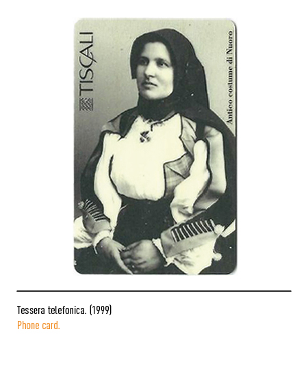
The first trademark was made up of a texture, typical of Sardinian textile craftsmanship, in shades of purple and the trademark in capital letters with the partial overlap of some letters. The company, listed on the stock exchange in 1999, experiences a period of expansion throughout Europe and then focuses again on the Italian market.


To compete on the national and European market, in 2004 the company decided to adopt a new brand, conceived and developed by the American agency Pentagram; is based on one of the first characters that were seen appearing on personal computer monitors: the lowercase OCR-A. A tribute to the pioneering spirit of the first era of computers and an expression of the challenge that Tiscali continued to support in its daily business. The green dot, a characteristic element of the brand, is a clear reference to the Internet; in fact, the Tiscali commercial of the time, “ADSL Senza Canon”, used as its protagonist the point (or “dot”) which, taking up the style of the first video games, transformed and fought against animated warriors discovering the promotion. At the end of the battle, the point winked at consumers and returned to position itself close to the Tiscali brand.

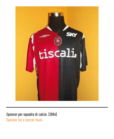
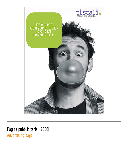
In 2009, a rebranding operation shows the same purple logo with, instead of the green “dot”, two dots of the same color; a reference to the punctuation mark, the colon, which precedes a dialogue or an in-depth study.


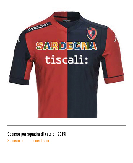
In 2017 Tiscali rethought its new visual identity, consistent with the new mission: to bring ultra-broadband everywhere, both in fiber and with the proprietary wireless network; this made it possible to bring the fast connection even to places difficult to reach by cable. The new brand combines advanced technology with the “taste of handmade”. Graphically, the rigor of an essential style is combined with the originality of a brush stroke; the letter T is a quick gesture, it is the result of a manual brush drawing, subsequently digitized, while the logotype is composed with the uppercase Gotham typeface. This letter is inserted in a shape with irregular roundness like stones.


After the experience of foreign ownership and the subsequent return to Italian hands, in 2019 Tiscali returns to purple, the color that for years has distinguished it in fixed and mobile telephony, with a new graphic sign within the same stone shape : two oblique lines. Tiscali is currently one of the leading telecommunications companies in Italy and offers its customers, individuals and companies, a wide range of communication services.