The history of TIM largely coincides with that of Italian telecommunications and the companies that formed it; the latter played a key role in the take-off and, subsequently, in the development of our industrial and economic system. Although the first telephone call was made in Milan in 1877, only forty years later would companies with interests in telephony be formed. In the meantime, an electrochemical company was founded in Pont Saint Martin (Aosta) in 1899, which in 1918 would take the name SIP, an acronym for “Società Idroelettrica Piemonte”. At the time, the company did not have a real logo intended as a precise and unchangeable sign; the official name was often accompanied by symbolic elements such as the symbol of electric current, according to the taste of the time. Only after the First World War did the company diversify its activity by moving from the electrical sector to the telephone sector, gaining hegemonic positions; the great financial crisis of the 1930s required a rescue intervention by IRI which involved the spin-off of SIP’s telephone activities and, in 1933, the creation of the group’s holding company, STET (Società Torinese Esercizi Telefonici).


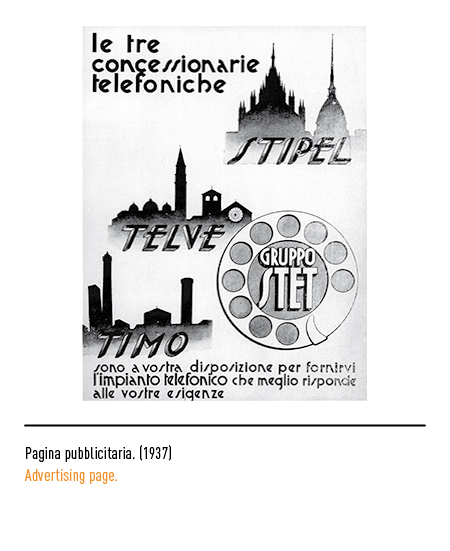

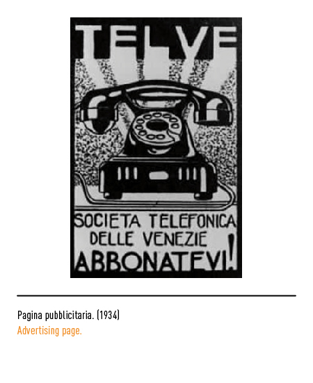
STET initially took control of the three telephone companies: STIPEL (Inter-regional Telephone Company of Piedmont and Lombardy); TELVE (Telephone Company of the Veneto) for the three Veneto regions; TIMO (Telephones of Middle Eastern Italy) for central-eastern Italy.




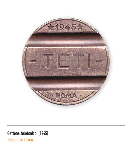
STET then also took control of the companies: TETI (Società telefono Tirrena) for Liguria, Tuscany, Lazio and Sardinia; SET (Società Esercizi Telefonici) for continental Southern Italy and Sicily.

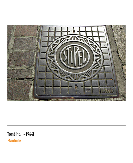
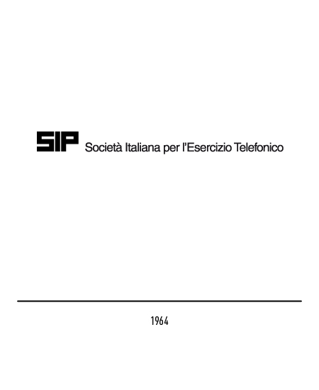
In 1964, during the “economic miracle” and with the nationalization of the electricity sector, the time came for the merger of the 5 concessionary companies of the telephone service into the SIP which changed its name to “SIP, Italian company for telephone operations” . The first brand of 1964 was characterized by strongly squared letters and the name composed in Helvetica; this logo, in truth, was not formalized so it coexisted with other free interpretations for almost twenty years.



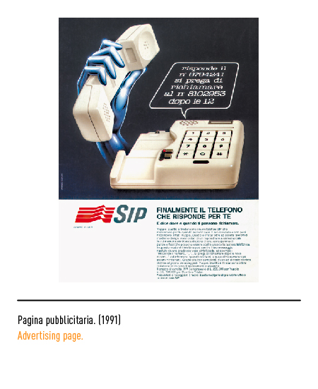
In 1983 the new logo was composed, as can be seen from the registration document, “… by a wavy red tetragram seen in perspective that introduces the word SIP in gray arranged laterally”. It was the progression and superimposition of similar traits that expressed the concept of communication; this logo was created by Landor Associates and expressed, in a dynamic and modern way, the technological reality of the company projected towards the future.

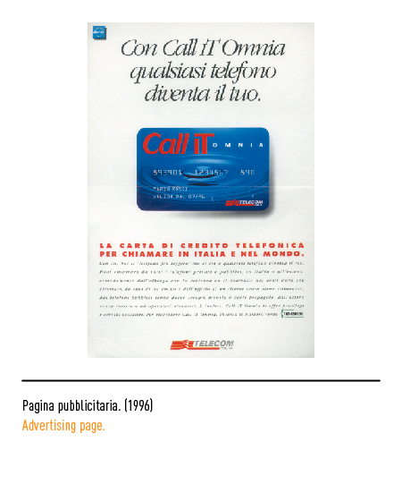
The reorganization of the sector created the conditions for the establishment in 1994 of “Telecom Italia” as the only integrated operator of telecommunications services in Italy through the merger of the companies of the IRI group operating in the sector (SIP, Italcable, Iritel, Telespazio and SIRM). The logo, designed by the internal communication department, kept the graphic sign and presented the logotype composed in Helvetica. In 1995 there was the creation of TIM (Telecom Italia Mobile) whose logo was designed by Area Strategic.


In 1998, the restyling of the TIM logo alone was carried out by Landor Associates with the elimination of the capital letter and the insertion of the acronym in the typical oval of the keyboard.

In the first months of 2003 the logo underwent a new restyling, curated by Annamaria Testa and Paolo Rossetti: the Meta font to which optical corrections were made, a darker gray and the transformation of the tetragram into a trigram. The reinterpretation of shape and color, rather than a real change, has characterized the desire to renew itself and improve its readability without wanting to radically change a logo already established and known all over the world.


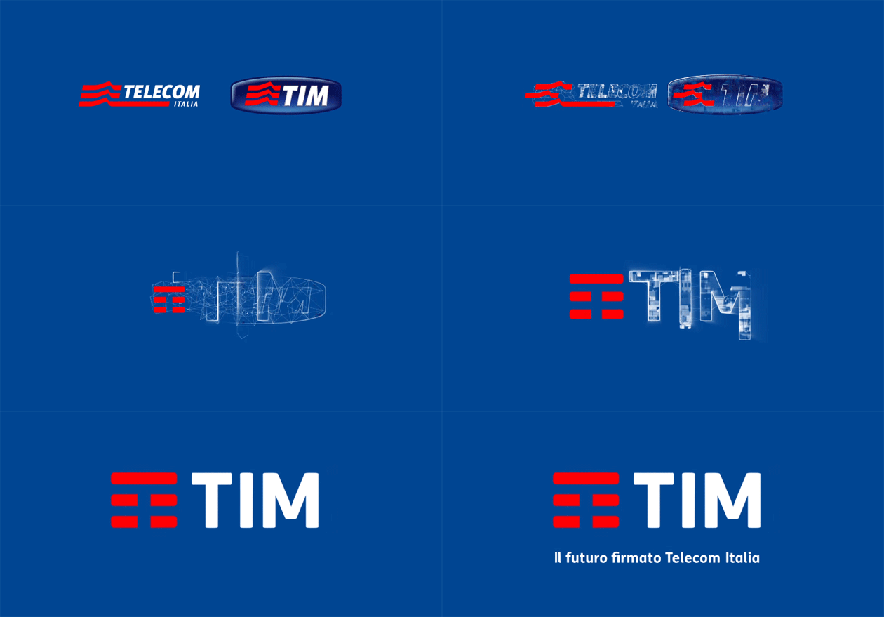
In 2016, the new logo was presented, the result of the merger of the know-how of Telecom Italia and Tim into a new commercial entity, called “Tim”; a synthesis operation that sealed the fixed-mobile convergence enabled by the Internet, new devices, technology and digital platforms. The logo was conceived in collaboration with Interbrand; in addition to retaining the three basic colors, the oval has disappeared, allowing the logo to live freely. The waves of the previous tetragram synthesized the transmission of an analog signal and, with the advent of digital, were considered obsolete; therefore the synthesis led to the creation of an icon of only three horizontal lines in which, with appropriate optical subtraction, the initial letter of the logotype is perceived.