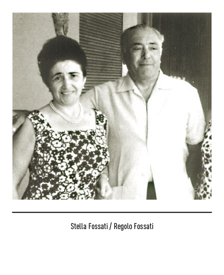
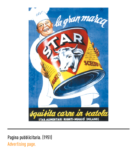
Company founded by Regolo Fossati in 1948 in Muggiò (Milan) for the production of canned meat, meat extracts and broth preparations. The official name of the company was “Star”, acronym for “Stabilimenti Alimentari Riuniti” even if it corresponded to the English translation of the name of Stella, wife of Mr. Regolo. The only son, Danilo, transformed the small company into an industry of national importance when he managed to convince Giovanni Nughes, a brilliant chemist, to sell the exclusive formula for the production of stock cubes to Star. It was an intuition relating to the substitute for meat broth, a prohibitive food for the daily possibilities of the postwar household budget.
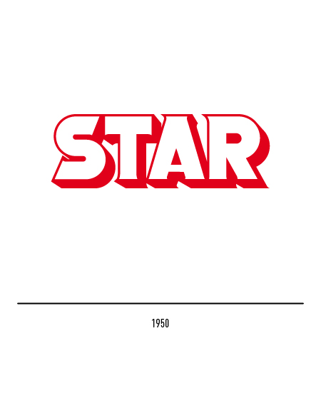
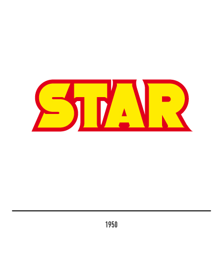
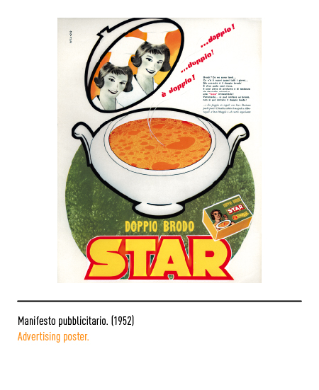
The graphic designer Gino Pesavento in 1950 designed the first company logo: it was made up of imposing letters, slightly graceful and framed; in 1952 he also designed the packaging for the “double Star broth” which featured the famous little woman on the package.


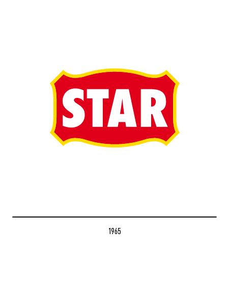
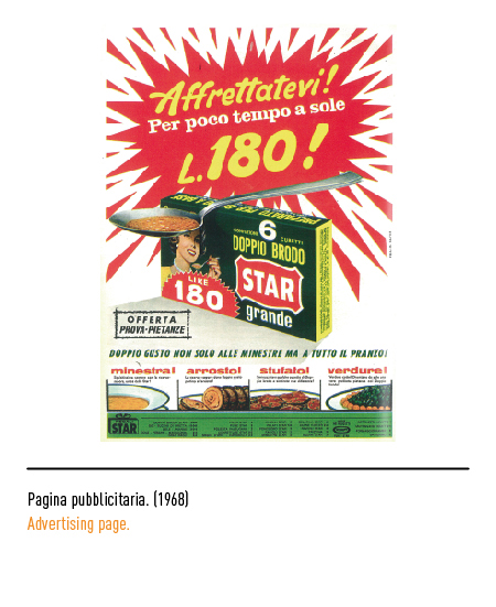
In the 1960s, the Star was able to interpret the evolutionary dynamics of domestic private consumption and the underlying trends of the Italian food industry; in 1965, in full economic boom, Augusto Maestri renewed the logo using a character devoid of grace and inserted in a frame similar to that of the old restaurant signs, as if to suggest a feeling of familiarity and warmth. In 1971 the evolution of needs and products led Star to an alliance with SME, the large public food finance company owned by the IRI group.


In 1988, for the sake of modernity, the logo was further enriched: red represented the dominant color of the company and green that of its leading product, the nut, and together they recalled the all-Italian tradition of Star; there was also a band of the same colors in which the word “food products” lived. The following year the alliance with the Danone group was consecrated.


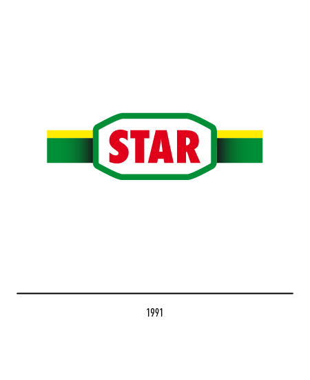
The importance of branded products and the control of their diffusion posed new problems in terms of visual identity; in 1991 Landor Associates was entrusted with the restyling of the logo: the red lettering on a white background, designed to ensure high legibility, and the evolution of the frame, now designed with a green thread shaped at the corners, which develops in horizontal by means of a yellow and green bichromatic band. The word and the frame appear slightly raised from the band thanks to the effect created by a shadow tone.

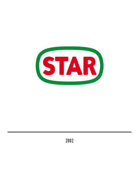
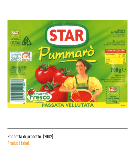
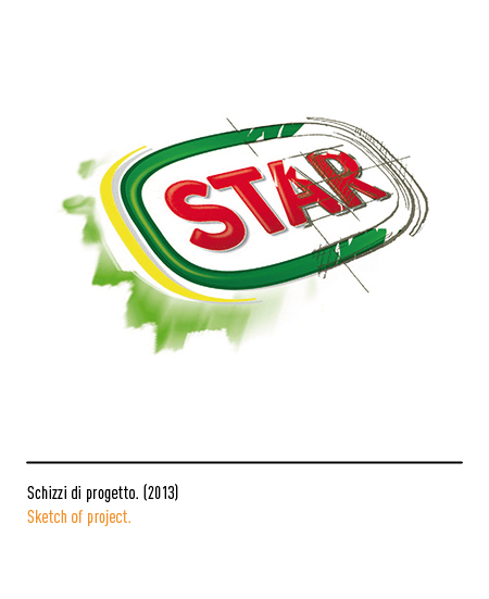
In 2002 the logo underwent another restyling: the two-tone band was eliminated, the frame is softer and the lettering, always stick, rounded at the ends.


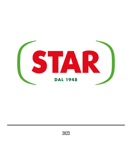
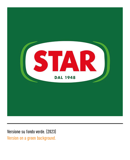
In 2023, coinciding with its 75-year history, the company entrusts the restyling of the logo to the Smith Lumen agency, explaining the relaunch plan with the fundamental objective of placing the consumer increasingly at the center of entrepreneurial activity. Therefore the logo bears the year of its foundation and appears less weighted with the side elements, now in green.