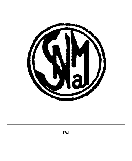
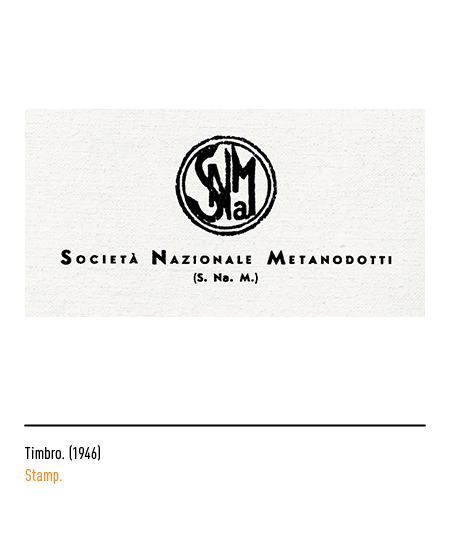
The history of Snam began in 1941: the National Methane Body (established in 1940) together with Agip, “Regie Terme di Salsomaggiore” and “Società Anonima Utilization and Research of Hydrocarbon Gases” (Surgi) gave life to the “National Pipeline Company” ( Snam) for the construction, operation of pipelines, distribution and sale of gas. The first logo of the company is a round stamp with the acronym made according to the style of the time. In times of war, methane becomes fundamental energy for Italy: a huge quantity of steel, despite the needs of the war industry, is used for the construction of the first methane pipeline that carries gas from the Salsomaggiore (Parma) wells to Lodi and Milan.
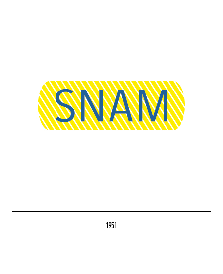
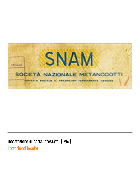
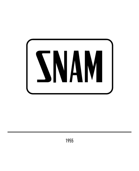
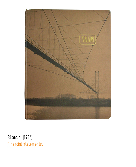
After a decade, in 1951, the logo bears the capital blue writing inside a rectangular shape with oblique yellow stripes. In 1955 it changed further: a rectangular line with rounded corners with the stylized SNAM inscription.

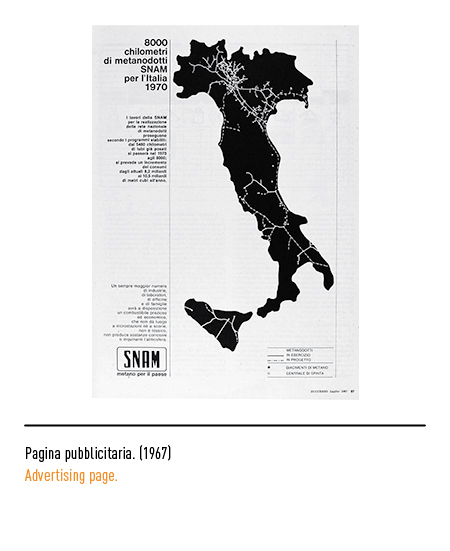
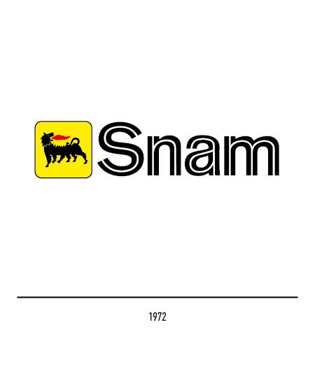
The company has gravitated within the Eni group since the 1960s; since 1972 the Snam logo has been affected by the changes that Eni introduces in its visual identity.

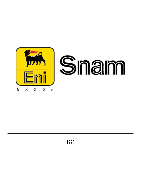
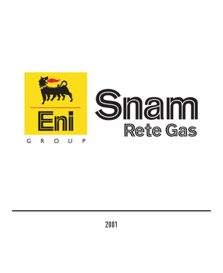
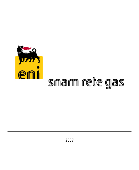
In 2000, following the Letta decree on the liberalization of the gas market, Snam was incorporated into Eni, where the procurement and sale of natural gas converged; those for transportation and dispatching are instead transferred to the new company “Rete Gas Italia” whose logo conforms to the standard adopted by all the companies of the Eni group. In anticipation of its entry on the stock exchange, in 2001 “Rete Gas Italia” was renamed “Snam Rete Gas”; the new naming combines the history of the Snam name, protagonist of the development of methanisation in Italy, with the new specific activity of the natural gas transport company, emphasizing the continuity of values and skills, the culture of safety and protection of the environment. In 2009, with the restyling of the Eni logo, the Snam brand also changed, adapting to the graphic standards of the parent company.
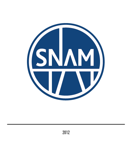
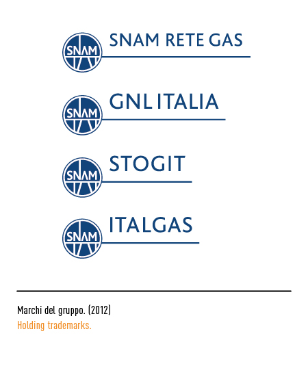
In 2012, with the introduction into the Italian legal system of the Third Energy Package of the European Union, the company is also called upon to redefine its corporate identity; therefore it changes its name from “Snam Rete Gas” to Snam. The new logo project is entrusted to Inarea who reinterprets the historical logo of 1941 by adding the color blue, traditionally chosen to indicate the natural essence of methane gas; there is a reference to the infrastructural networks, typical of the Group’s business, but the very idea of the network is also evoked, which translates into the values of reliability, competence and concreteness of the new logo. Snam therefore assumes the role of a Corporate company that controls 100% of the four operating companies focused on the management and development of their respective businesses.
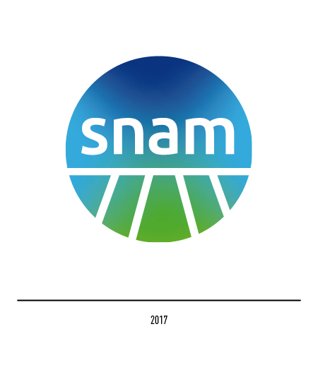
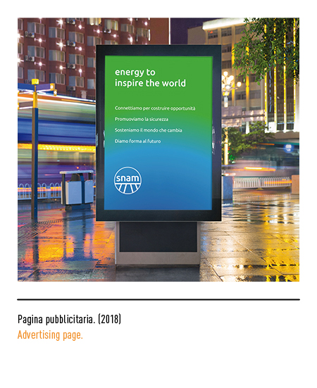
After the completion of its 75th year, in 2017 Snam relaunches its brand identity, renewing the logo and values that will accompany the company in its future challenges, from the construction of infrastructures to guarantee stable and safe energy supplies to the development of gas as a renewable source. The logo project, still entrusted to Inarea, remains intrinsically linked to Snam’s tradition, underlining the characteristics of sustainability and environmental compatibility of natural gas through the color green. The introduction of lowercase characters gives the logo a more friendly and dynamic tone; rays radiate from the base of the logo which are the expression of a technology that brings well-being and balance.