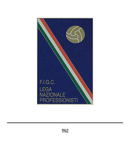
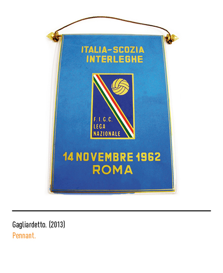
The “Serie A”, the top division of the Italian football championship, was created in 1898; the first leagues were structured on a single elimination system. In 1905 the championship was rethought and renamed “First category” introducing the regional preliminaries as well as the round trip formula. In 1929, with the semi-professionalization of Italian football, the single group championship was played. After the war, in the presence of 16 Serie A and 11 Serie B delegates, the “Lega Nazionale Professionisti” was formed; the first logo of 1962 featured a blue rectangle, the diagonal tricolor, the leather ball and the words “FIGC Lega Nazionale Professionisti”.
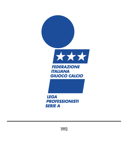
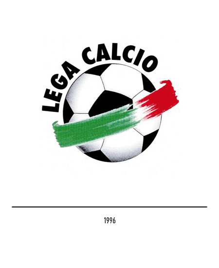
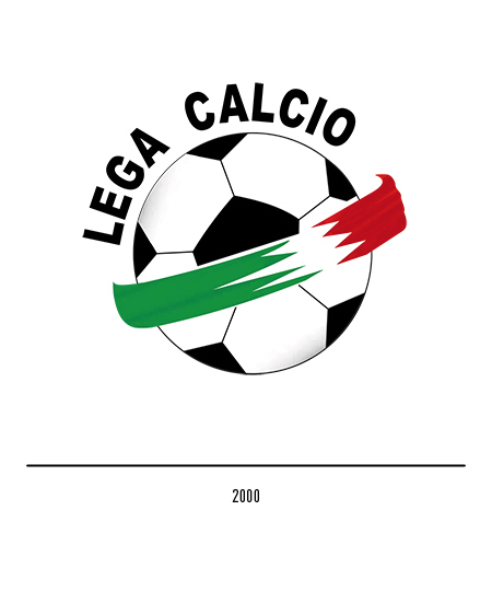
Following the competition for the logo of the “Italian Football Federation” launched in 1992, the “Lega Calcio” in 1993 also adopted its own declination only with blue and different words. In 1996 the logo changed by presenting the centrality of the ball around which the tricolor band with chiaroscuro colors rotated; in 2000, in order to make the logo consistent for all applications, the tricolor of the logo will be vectorized.
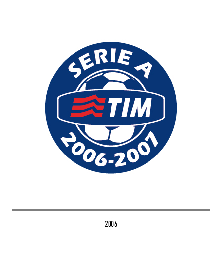
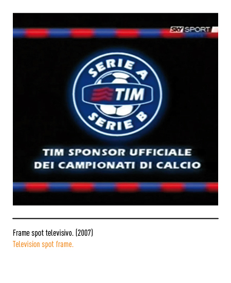
Starting in 2006, the logo showed the ball topped by the “TIM” logo, then the acronym for mobile telephony only as the main sponsor of the “Lega Calcio”, with the word “Serie A” around it and the various dates of the Championship. In the following four years the top league was always called “Serie A TIM” thanks to the renewal of the partnership, the longest-running sponsorship of a sports league.
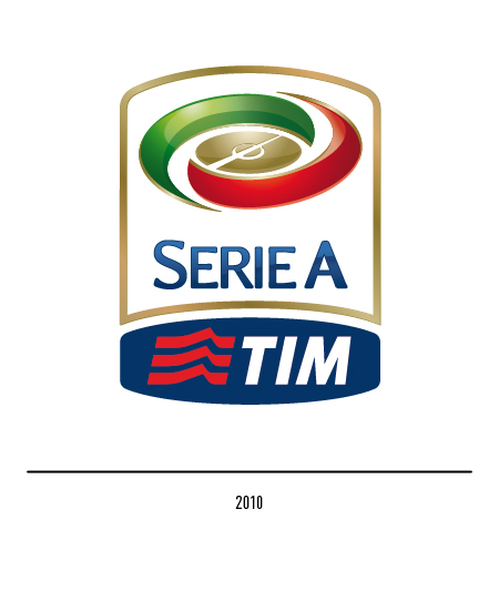
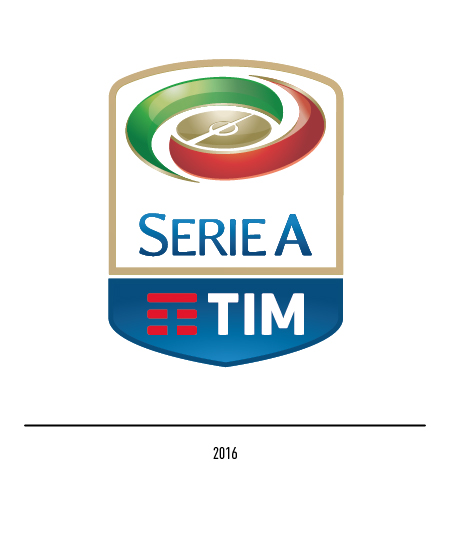
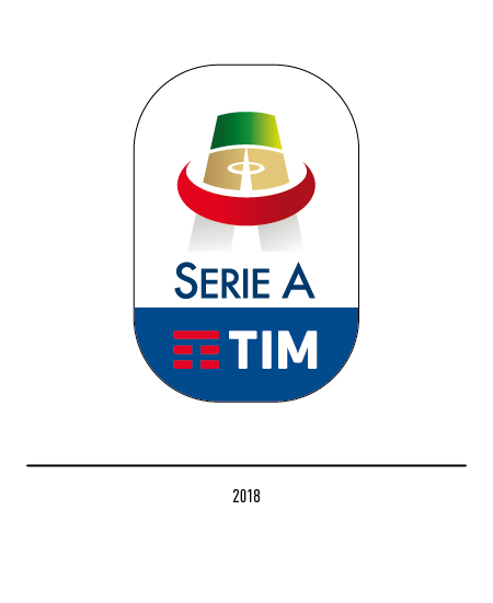
From July 2010 the clubs of A and B reached an agreement to create two separate leagues; therefore the “Serie A TIM” brand was presented with the synthesis of graphic elements: the TIM brand, the center field in gold and two elements, red and green, placed in a spiral. In 2016 the TIM logo underwent a restyling so that of the “Serie A” had to adapt in the composition, especially for the tip of the shield and for the new chromatic references. In 2018 the “Serie A” logo underwent a restyling with the graphic elements forming a large letter “A” whose horizontal stroke was a red element similar to an orbit, read by others as a red crescent.
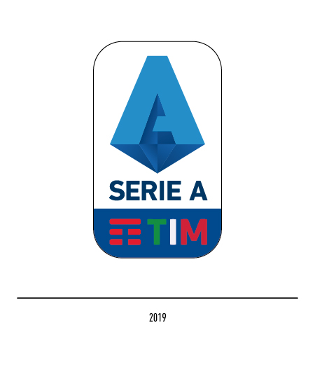
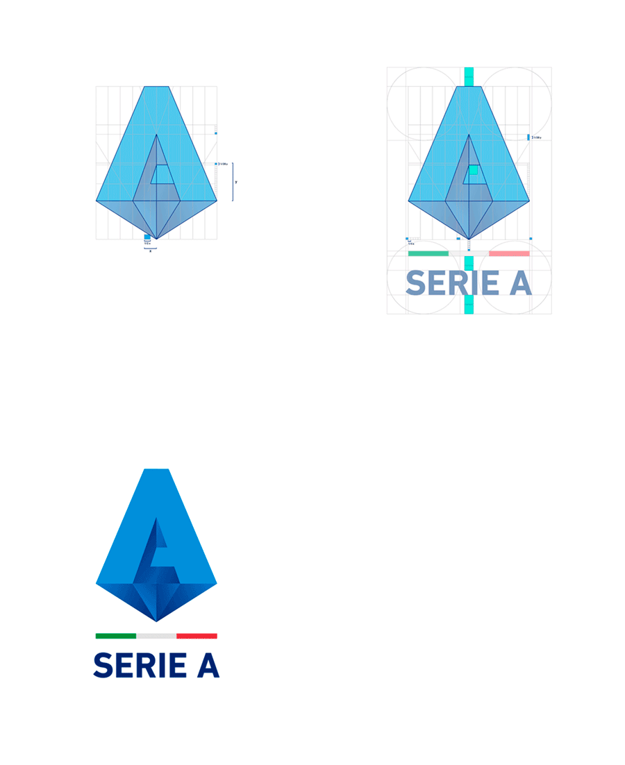
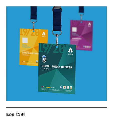
In 2019, a detailed restyling plan of all the logos of the various “Lega Calcio” series and to respond to the new challenges in terms of recognizing the “football” product on international scenarios, led to a new, more stylized and iconic logo. As a symbol of one of the most beautiful championships in the world, the three-dimensional letter “A”, blue like the national team jerseys, was identified as a universally distinctive element; its representation as a multi-faceted diamond increases its graphic value. The TIM logo presents the coloring of the three letters with the national colors. The agency that took care of this rebranding is the “Ragù Communication” of Rome.
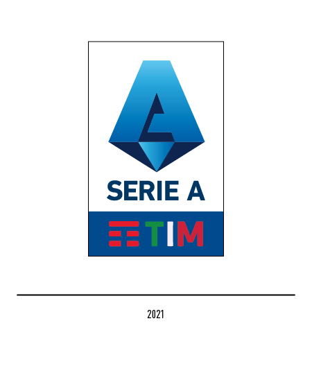
In 2021 the “Serie A” changed its look again by presenting a new logo; the design takes up the previous one but highlights more the contrast between the colors that go from shades of blue to a more marked contrast of light blue and blue. In line with the new strategic positioning, the “A” has been kept strengthened in its centrality in order to symbolize the teams and champions of our Championship.


