PIRELLI
1 Logos and restyling over time
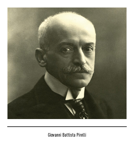
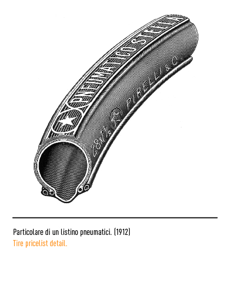
In 1872, the engineer Giovanni Battista Pirelli set up “Pirelli & C.” for the production of articles in elastic rubber. The production, initially limited to simple items such as plates, belts and tubes, extended in a few years to all kinds of rubber products for technical, industrial and scientific applications. Subsequently, the manufacture of insulating wires and cables for electrical applications began, while the rubber sector of the factory produced “pneumatic gaskets for cycles”.
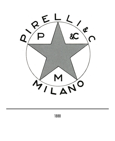
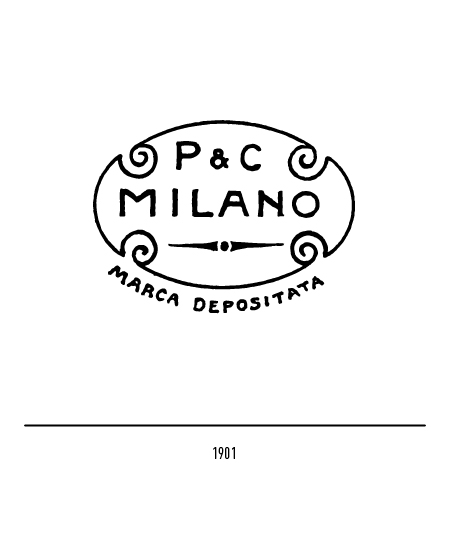
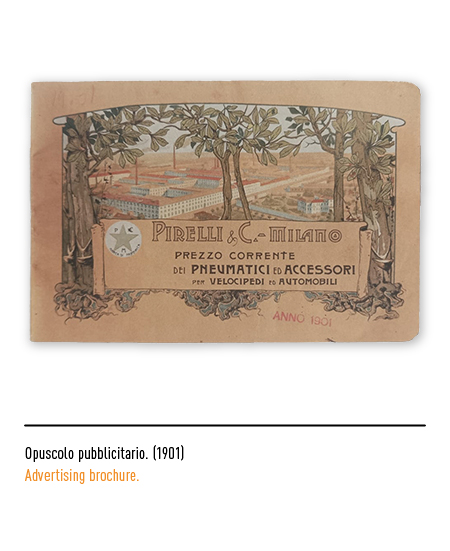
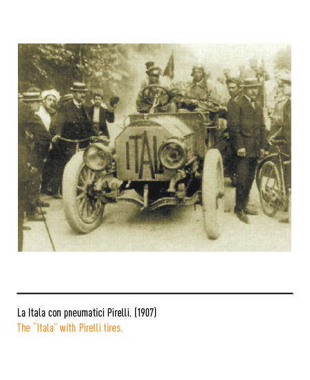
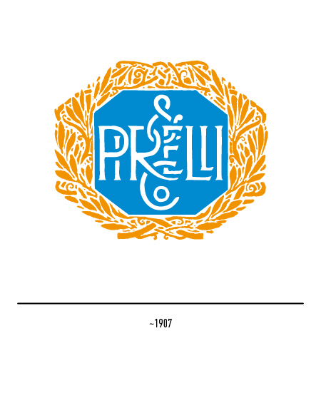
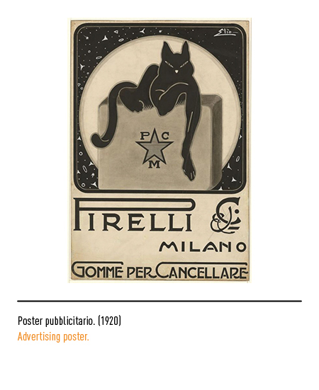
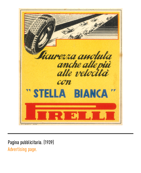
In 1888 the company deposited its first logo, the famous “star” that marked tires and the entire production for years. In 1901 another oval logo was filed with only the writing “P & C Milano” and liberty friezes. In both cases, these were logos whose purpose was to declare the authenticity of the product, not to advertise the company themselves. The tire market was a market on which there were several competitors, some of them very strong; in order to establish itself, an intense “advertisement” was required that would confer identity and give prominence to the industrial product. In fact, in 1907, Pirelli supplied its tires to the “Itala” of Borghese and Barzini who won the 16,000 km car raid between Beijing and Paris, almost all of them “off-road”; for this record a logo with a laurel wreath was created.
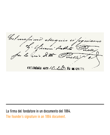
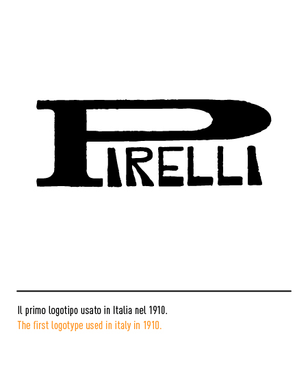
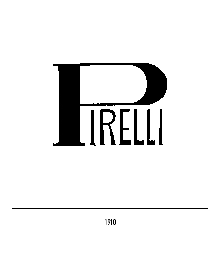
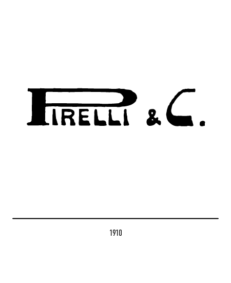
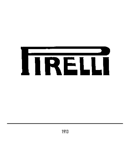
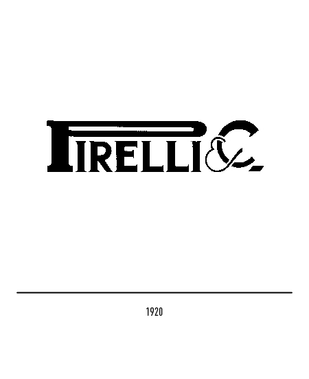
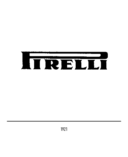
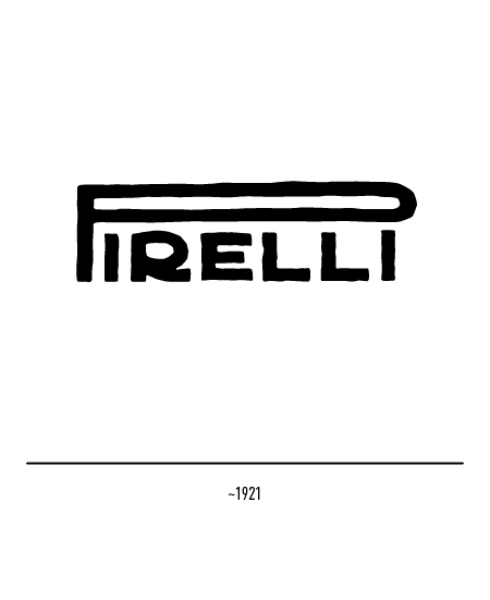
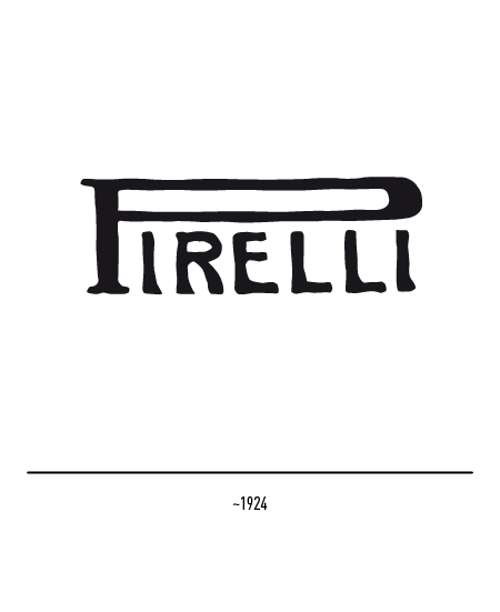
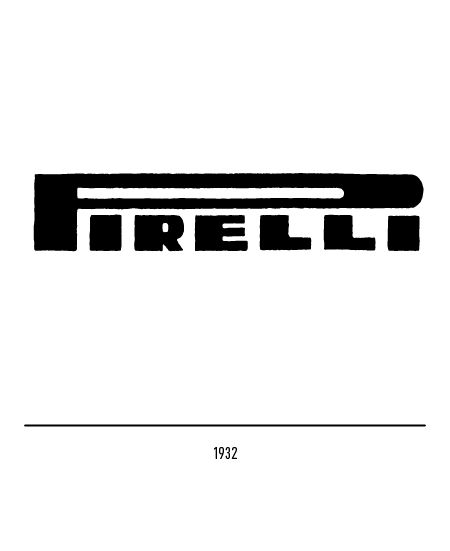
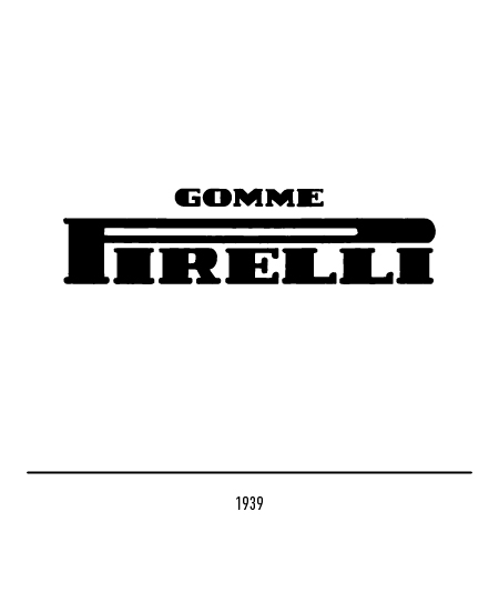
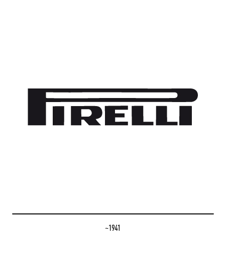
The dilated “P”, which “canopy” the other letters, was born in 1908 in New York; who invented it is not known but the elongated shape of the letter “P” was already a characteristic feature of the signature of Giovanni Battista Pirelli, as in a document signed by him in 1884. The graphic lengthening of the handle of the “P” alluded to the elasticity of rubber.
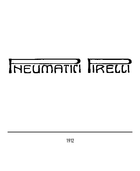
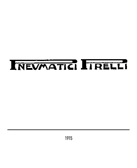
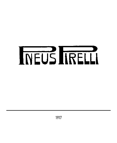
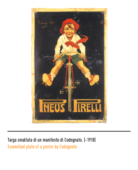
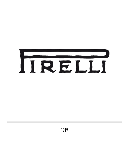
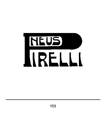
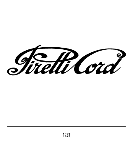
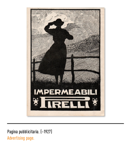
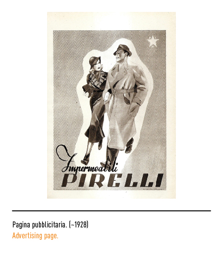
The institutional logo was, however, for a long time, anything but stable, passing through a series of calligraphic and decidedly graphic variations: it was affected by the floral and ornate taste in the way of posing as a capital “P”, it stretched, lengthened, intertwined fluttering with the words destined to coexist with it in the advertising space, as in the 1923 “Pirelli Cord” logo.
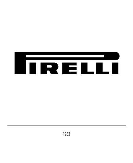
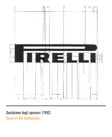
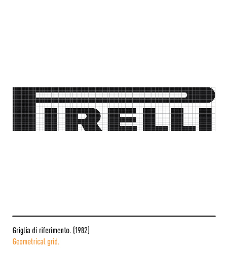
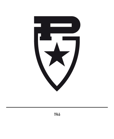
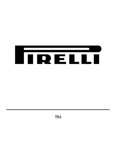
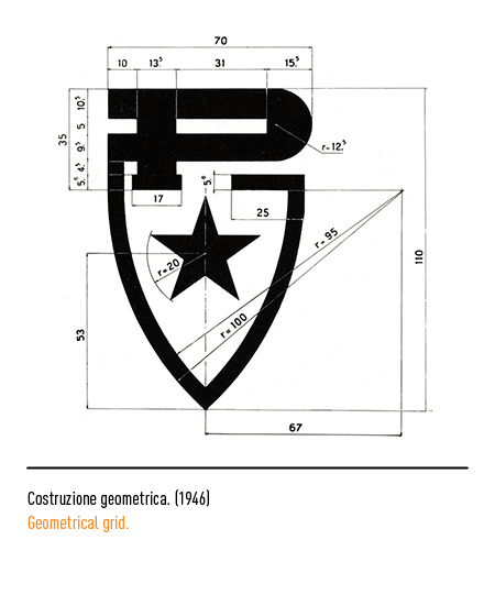
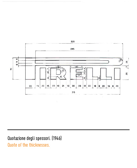
In 1946 a logo-shield was designed, which was used until the early 1970s. From that date, a fruitful image work began involving world-class graphic designers and artists to enhance the logo. Inevitably, the graphic aspect of the name was varied and therefore required a rule. The value to be applied to the “P” and the thicknesses of the other letters was also established.
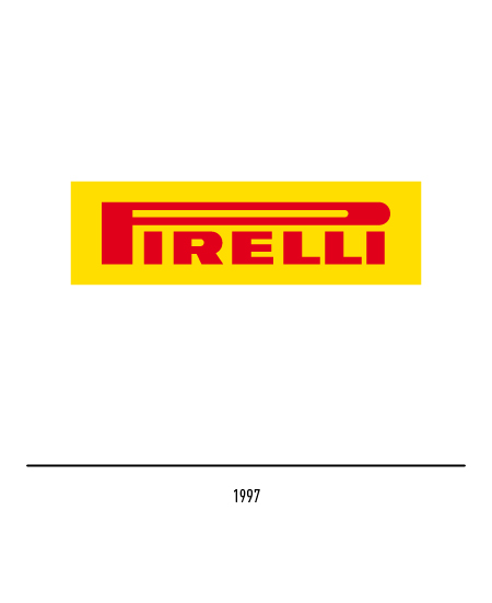
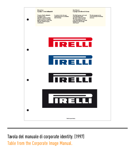
In 1982 Salvatore Gregorietti was commissioned for the restyling and, for the uniform use of the logo, the user manual of the logo was drawn up with the correct design of the letters “R” and “E”; in 1997, however, Pierluigi Cerri created the bilingual manual from which the right chromatic references are highlighted.