PIAGGIO
1 Logos and restyling over time
The history of Piaggio is linked to the vast naval, rail and aeronautical transport sector. It was founded in Sestri Ponente (Genoa) in 1884 by Rinaldo Piaggio as an artisan company for the processing of wood for naval furnishings; all the most important ships, launched by the Ligurian shipyards, had internal furnishings signed by Piaggio. After a progressive expansion, in 1901 it undertook the construction and repair of railway vehicles and then passed, in Finale Ligure (Genoa), to the aeronautical industry where it gained world fame between the two wars. In 1916 the production moved to the industrial complex of Pontedera (Pisa).


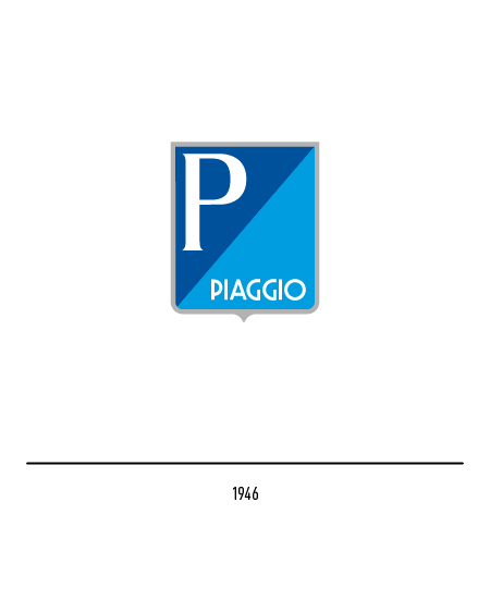
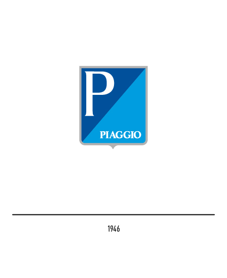
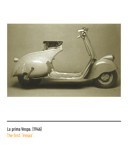
After Rinaldo’s death, his son Enrico took over who in 1946, after the destruction of the plants due to the war, began the reorganization of the industrial structure, specializing above all in the construction of motor scooters, a product that will have a wide diffusion. In fact, the construction of the first examples of the “Vespa” started in Pontedera, conceived in 1946 by the aeronautical designer Corradino D’Ascanio. The 1946 first logo depicted a shield divided transversely into two fields: the letter “P” appeared on the blue and the Piaggio logo on the blue made up of different characters, both sticks and graces; for the second it depicted the initial letters of the founder with a stylized bird.



In 1964, the historical company was separated into two others: “Piaggio & C.” for vehicles and “Rinaldo Piaggio Industrie Aeronautiche Meccaniche”.


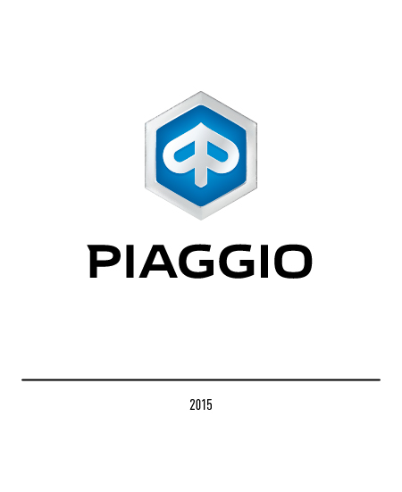
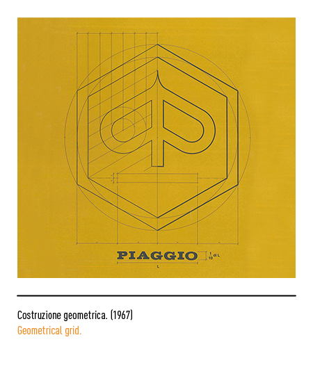
In 1966, following a public competition for the new logo, the one in which a white spike on a blue background stood out inside a hexagon, although it was possible to read two mirrored letters “P”. The most romantics read in this symbol the stylization of an insect with spread wings whose shapes were naturally attributed to a “wasp” or a “bee”; the indirect reference to the two insects, namesake of the company’s best known products, was sealed by the hexagon that recalled the cell of a beehive.


In 1993 Giovanni Brunazzi carried out the redesign of the logo which started from the need to redefine the corporate image: the previous identity was strongly preserved and work was done on the lightening of the weights and frames, to reach a result of greater readability even in small dimensions. In fact, the word Piaggio has “left” the logo, thus making the symbol and the logo linked by a more modern and functional relationship. In 1999 the logo was chiaroscuro and combined with a more modern and sans serif lettering.


In 2015 another restyling, done by Interbrand, makes the hexagonal frame more evident while the typeface used has the temples with the same thickness.