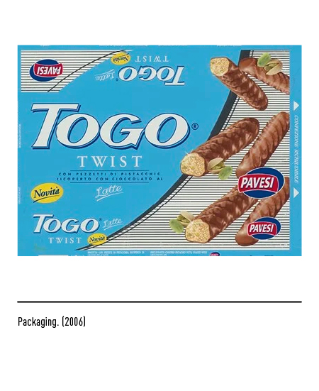
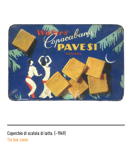
In 1937 Mario Pavesi, after a period of apprenticeship as a baker, founded the “Biscottificio Mario Pavesi” in Novara, although it was only in 1948 that the business became industrial. In that year the first logo was designed by the founder himself; simple but effective with his initials inserted in a shield to give a touch of tradition and the name Pavesi in stick font with the words “Biscottini di Novara” to emphasize the company’s basic specialty.


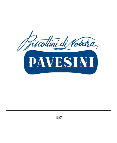
In 1952 they were renamed with the name “Pavesini” accompanied by the calligraphic inscription “Biscottini di Novara”: an effective synthesis of all the elements that characterized the young company. The shape of the biscuits was invented and patented in 1948 by the founder to differentiate his from all the other Novara biscuits; the shape of the new logo reproduced that of biscuits, a graphic choice made by a young Bob Noorda.

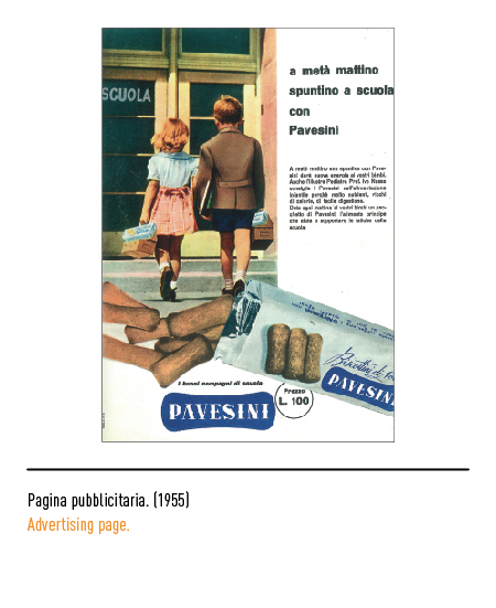

Some variations on the theme followed until the return of the name “Pavesi” in 1956, justified by a certain necessity: if it is true that the “Pavesini” were the leading product, it is equally true that Mario Pavesi’s company now produced a vast assortment of biscuits for which each of these had a name that required a very strong and recognizable surname, “Pavesi”, in fact; the surname was inserted in a blue rectangle. Meanwhile, the “Pavesini” product logo underwent a restyling in 1958.


In 1959, the creative collaboration with Erberto Carboni began, which summarized all the positive values of the previous logos in a single, extremely modern, clear and prestigious graphic expression. This logo (in blue, red or outline) has marked not only the products and advertising campaigns but also all the Autogrills scattered on the Italian motorways (see Autogrill). Erberto Carboni is the lucky slogan “It’s always time for the Pavesini”, brilliantly displayed in the rounds in the shape of a clock.



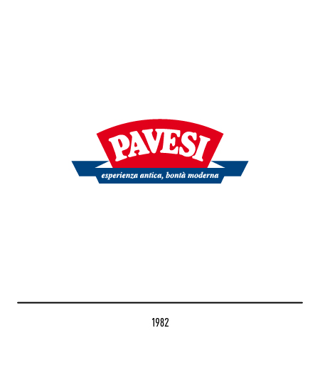
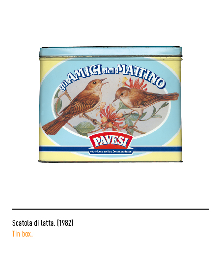
In 1982 a restyling of the logo was carried out, introducing new Italian signage values of tradition and modernity. In 1989 Pavesi became part of the Barilla food group and therefore a new “arched” logo was designed that emphasized the renewed dynamism of the company, an ideal bridge between past and future; the lettering lost its grace and returned to being linear, like the first logo.


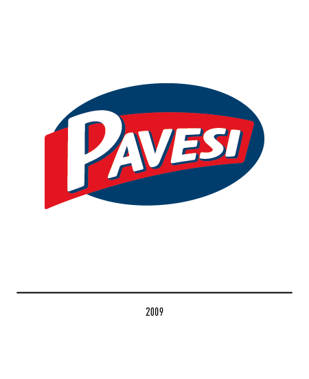
In 1999 the logo became oval, always keeping the same colors. In 2009, a further restyling privileges the three-dimensional effect.