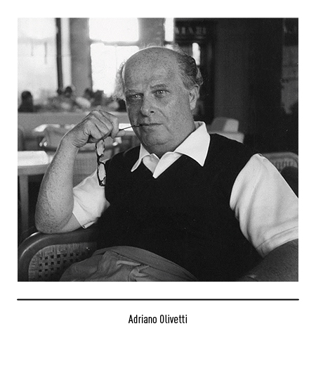
OLIVETTI
1 Logos and restyling over time

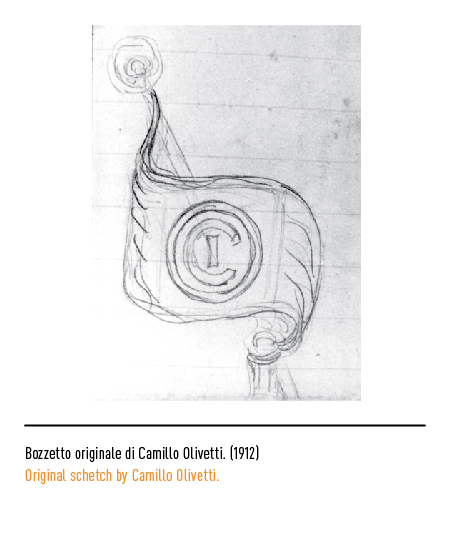

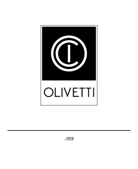
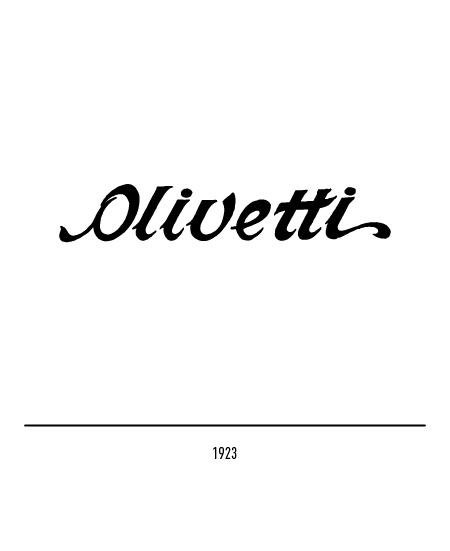
In addition to the acronym “ICO”, the first logo was designed in 1923, also designed by the founder himself, made with a floral-derived character.


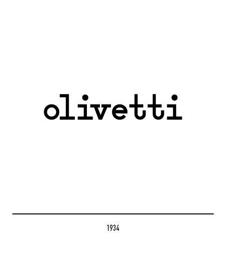
In 1934 the logo was designed by Xanti Schawinski, a pupil at the Bauhaus and collaborator of the Boggeri studio, and provided for the use of very tiny, absolute avant-garde for that time; the typeface used was derived from the Pica typeface and from a version of the Universal, designed by Herbert Bayer in 1928 at the Bauhaus.


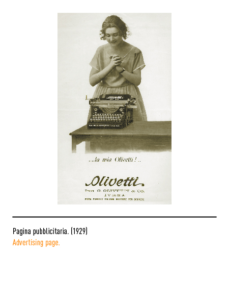
After the war, production began to differentiate itself with the introduction of Synthesis files and with calculation machines; in 1947 the logo was reformulated by Marcello Nizzoli by dilating the spaces between the letters. The immediate reference to typing was replaced by a font that preferred, to roundness, a rectification of curves and the elimination of graces. In 1954 the latter also designed a symbol, confidentially called the Greek spiral.


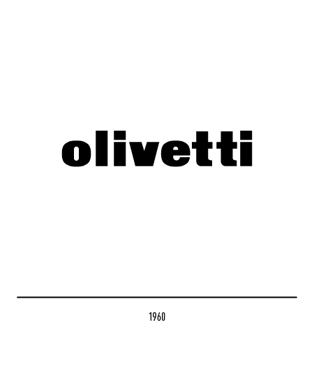
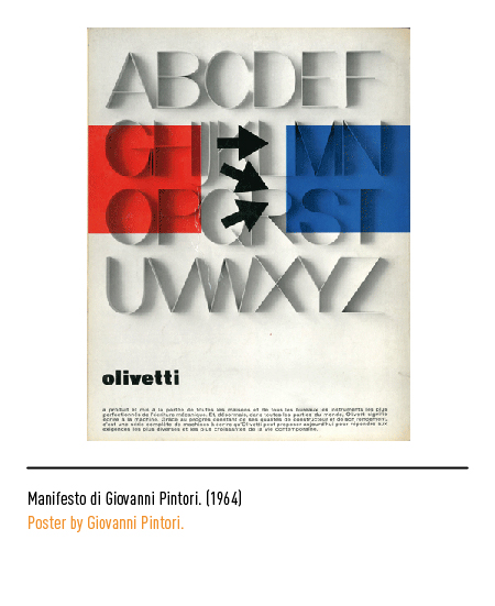
In 1960 Giovanni Pintori designed the new logo by retouching a “very black Etruscan” font; the letters acquired a greater auction force and all the spaces were recalibrated in function of a new readability. To put an end to a disorder in the use of the logo, at the end of the 1960s the “Cultural Relations, Industrial Design and Advertising Department”, led by Renzo Zorzi, took on the task of formally defining the logo and the rules for its use.

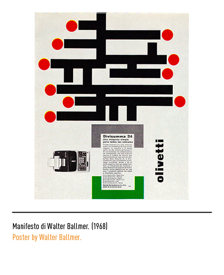

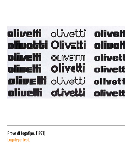
In 1971 the new logo was designed by the Swiss Walter Ballmer who reorganizes the distances and thicknesses by defining the geometric design with mathematical criteria with the result of accentuating the image of solidity of the company and giving greater visibility to the writing, thanks also to a lettering which almost assumes the value of a graphic symbol, solidity without hardness, fullness but not static. The only cutting element was the letter “v”; otherwise, the points of the “i” rounded in the upper corners but not in the lower ones meet a rod where there is the same ratio, but inverted. Rounded corners mean ease and rounded corners on rich thicknesses mean ease and strength. Hans von Klier, Clino Trini Castelli and Perry A. King created the Identification Systems between 1971 and 1977, manuals now commonly known as the Red Books (10 issues), each dedicated to a specific topic, which, when well explained, help to understand the role and importance of the individual issues within the overall Corporate Identity project, still taken as a model today for their completeness and relevance. In 1983, the logo was designed for the dealership signs.


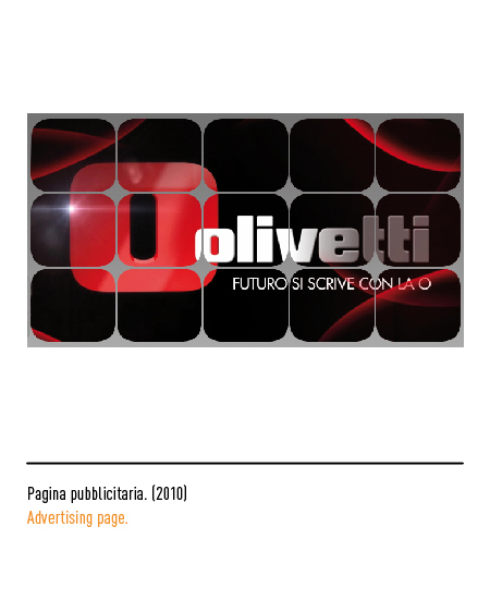
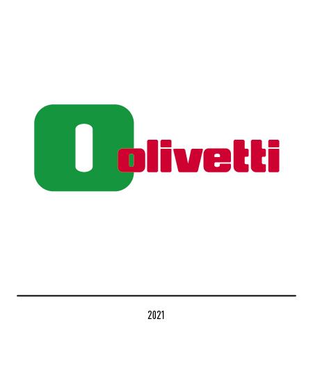
In 2009, in relation to a repositioning process due to the merger into the TIM group, the logo underwent a restyling with the isolation of the letter “o” which becomes the protagonist of the composition and advertising slogans. In 2021, the new corporate color scheme was presented with the national tricolor to evoke the importance of “Made in Italy” with a sign capable of being immediately and universally recognizable throughout the world and a symbol of Italian industrial history. The restyling was handled by the Tim group’s “Brand Strategy, Media & Multimedia Entertainment” function in collaboration with Olivetti’s “Communication & External Relations” function.