


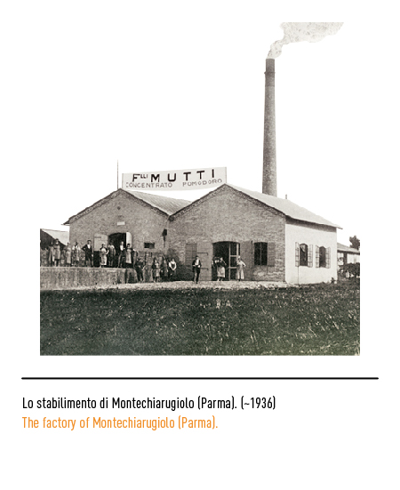
Family business producing tomato concentrate founded in 1899 in Basilicanova, a hamlet of Montechiarugolo (Parma). The founder, Marcellino Mutti, son of farmers, devoted all his efforts to the nascent tomato industry; the first awards came in 1911 with the medals received and were impressed on the cans, increasing the authority of the product and the prestige of the logo.

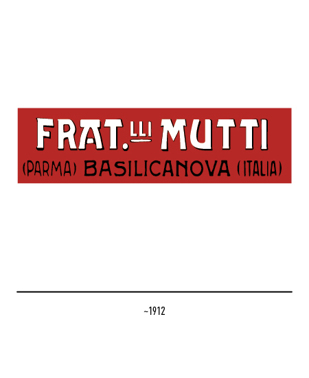


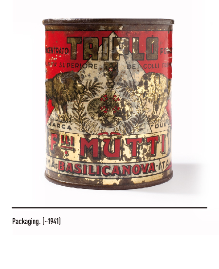
The first logos bore the wording “Fratelli Mutti” in abbreviated and dotted methods, typical of the time. The tin, on the other hand, had two gold lions on the sides of the medal on a red background (originally the company was known as “Great brand of two lions”); in some labels the honors were surrounded by palm branches as well as the name of the municipality where the company was founded, namely Basilicanova.


Success, however, came in 1951 with the launch on the market of tomato concentrate in aluminum tubes with the new logo depicting the signature with the tomato; this innovation aroused perplexity at the beginning because the shape was known exclusively for the teeth but, once the first doubts passed, consumers recognized the ease of use and the considerable advantages of conservation. It was nicknamed the “thimble tube” due to its closure with a red plastic thimble, which was then widely used for sewing. At the end of the 1960s, the company launched another totally innovative product which it called “Tomato pulp”; the innovation consisted in having chopped the peeled tomatoes into pieces, greatly increasing the yield and making it ready for use.


In 1979 the company was transformed into a joint stock company and, for the occasion, decided to change the logo: a red rectangle with a curved side together with the two yellow lions and the name of the company. Over the years, advertising communication has always been considered an important aspect: from entertaining TV commercials, to large advertising formats, to press campaigns.


In 2001 the company decided to change the logo and packaging by entrusting the restyling to the Vittorio Mancini & Associati agency in Milan. The new packaging comes with the historic logo that bears the same lions as always, modernized, with the pay-off “Tomato only. For passion ”, which is the company mission.


In 2013 the restyling was entrusted to the Robilant Associati agency in Milan; the old pay-off is reduced to “Only tomato.” and incorporated into the logo while the golden lions take on more defined forms: the perfect combination of tradition and innovation.


