LAMBORGHINI
1 Logos and restyling over time
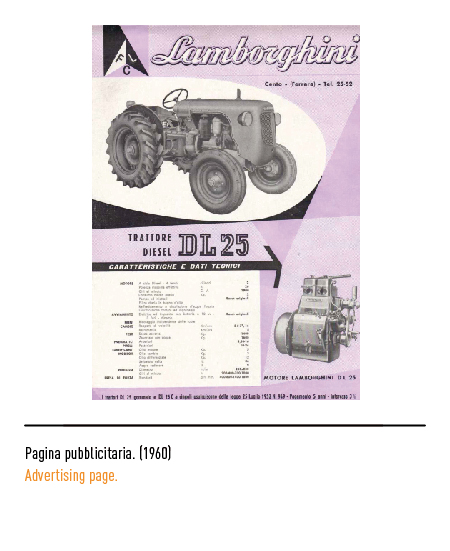
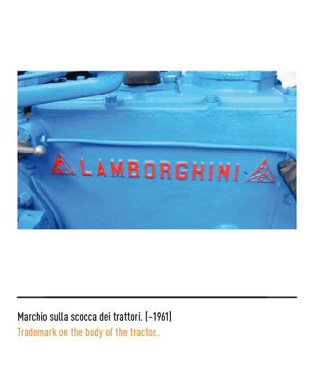
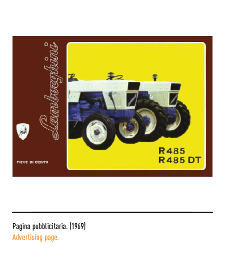
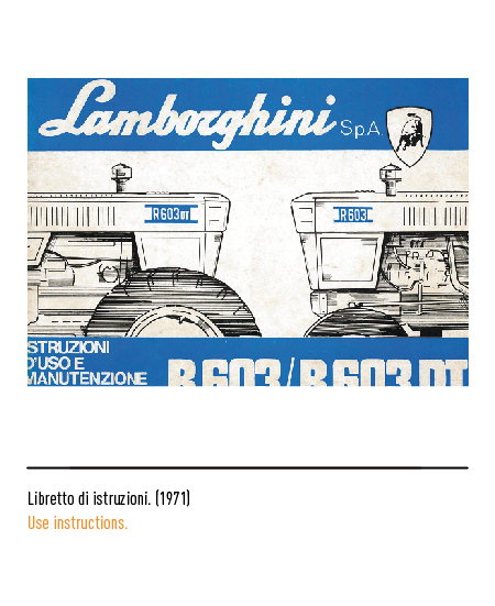
The mechanical engineer Ferruccio Lamborghini founded a tractor factory in Cento (Ferrara) in 1948, an activity born from the acquisition of a batch of advanced military engines from the Second World War. The historic sector of the house and the relative “Lamborghini Tractors” logo were sold in 1971 to another industrial group specialized in the sector, Same.

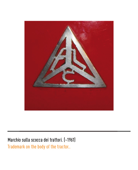
The first logo of 1952 consisted of a triangle in which three internal sectors lived the initials of “Ferruccio Lamborghini Cento”; in the absence of graphic rules, the logo was composed with different characters. In 1959 the passion and technical competence of the founder went so far as to conceive the production of helicopters; Unfortunately for him, and fortunately for car enthusiasts, the government did not grant the authorization and Lamborghini fell back on the production of sports cars.


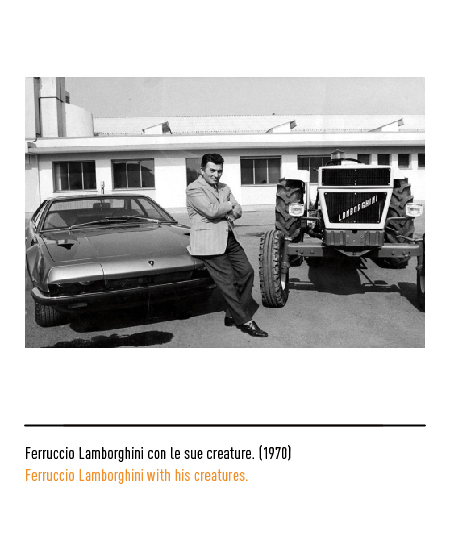
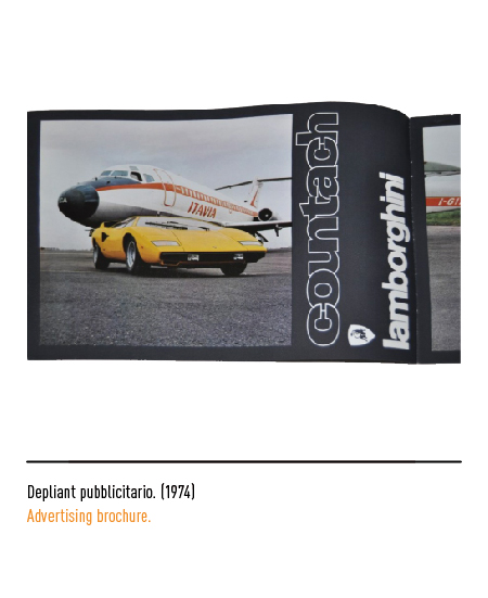
In 1963, “Automobili Ferruccio Lamborghini SpA” was born in Sant’Agata Bolognese (Bologna); the great success of these powerful machines was due to important collaborations with the designer Bertone and the engine designer Bizzarrini. For this new activity, the logo project, which will also be used on tractors, was entrusted to Paolo Rambaldi; The bull, the founder’s zodiac sign but also a symbol of aggression, was identified in a fighting position and placed inside a red shield bordered in black with the calligraphic logotype, typical of the time. The legend fuels even more the rivalry with Ferrari for the replacement of the prancing horse with the bull. After the first models with alphanumeric denomination in vogue at the time, even the nomenclature of cars was inspired by the world of bullfighting: for example, the name Miura was taken from the breed of bullfighting bulls of Don Eduardo Miura Fernandez, of which Lamborghini also visited breeding in Seville. The exceptions to this tradition were few but significant: “Countach” is an exclamation of amazement from the Piedmontese dialect that Nuccio Bertone uttered when he saw the prototype of the car for the first time.


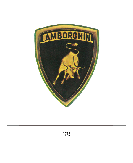
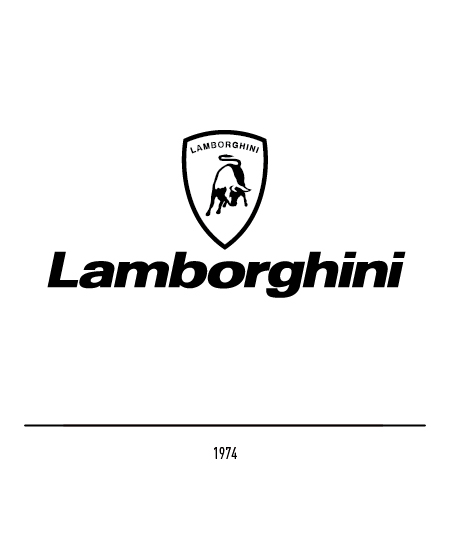
In 1972 the logo underwent a restyling operation: the Lamborghini name, composed in capital letters, was incorporated within the shield in a yellow rectangle; in the absence of binding rules, a version of the same shield appeared in 1974 with the external logo and composed with the Universe Black Oblique. After years of family management, the oil crisis and that of the automobile industry of the mid-1980s forced the property to sell its shares in 1987 to the Chrysler group.

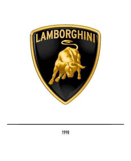
In 1998, after being acquired by Audi, the challenge was to strengthen the logo’s appeal once again by bringing the Lamborghini legend back to life; therefore, the restyling of the logo is entrusted to the German agency KMS Team which revises the proportions of the shield and, inside, the golden bull becomes more corpulent. For restricted uses only the logo is used.


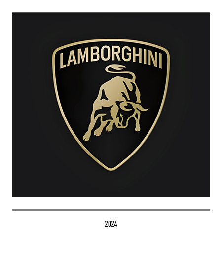
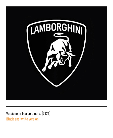
The new corporate approach, focused on sustainability and decarbonisation, led to the restyling of the logo in 2024 which embraced a flatter and more minimalist design as per contemporary customs. The frame of the shield is thinner while the bull is more simplified and with less detail. The gold color is presented with a lower intensity while the visual communication can have a customized font.