


Motorcycle manufacturer founded in 1909 in Milan by Giuseppe Gellera; the founder did not like this surname to the point that, in 1939, he decided to change it to Gilera, which he had been doing for some time with his creations called “Moto Gilera”. From an artisanal company it developed considerably with the construction of a large factory in Arcore (Milan) in 1925, establishing itself not only on the national but also on the international market.

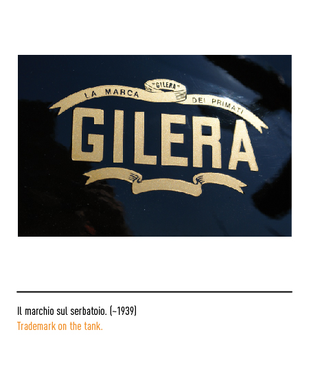
The first logo of 1926, clearly inspired by Art Nouveau, depicted the name “Moto Gilera” with the two symbols of Milan: the Visconti snake and the red cross. The victories and records achieved in the following years were reported in the 1934 logo which depicted the single word Gilera with the flourishes and the words “the logo of primates”.



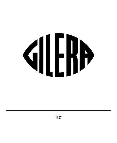
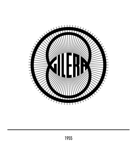
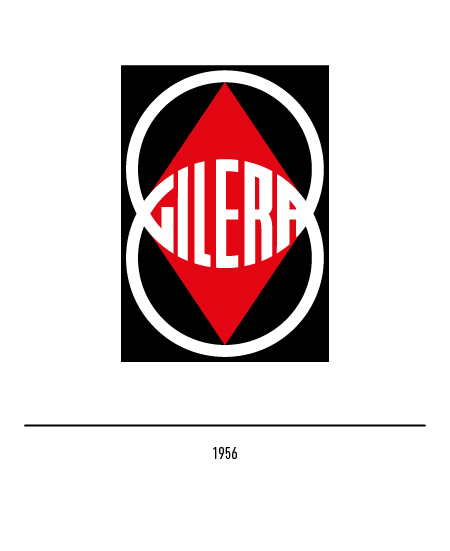
In 1947 the logo appeared with the name in the shape of a pointed oval and, in 1954, in the intersection of two rims as a clear allusion to the world of two wheels; this logo was represented in different ways but only in 1956 did it appear with an inscribed rhombus and with the institutional colors: red and black. In 1969 the company, failing to overcome the crisis that affected the entire Italian motorcycle industry, was absorbed by Piaggio.



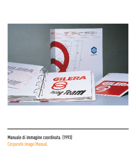
In 1993, with the transfer of production to Pontedera (Pisa), Andrea Brunazzi carried out the redesign of the logo of the two rings: the graphic intervention was radical even if the image of the two partially overlapping circles was preserved. The logo, composed with the Eras character, has taken on greater body and the whole, through a slight inclination, has taken on a dynamic trend, a sign of speed.

In 1998 the logo underwent a new restyling in tune with the new means of communication: the chiaroscuro logo, a new extended character and the orthogonal trend, that is, without inclinations.


In 2008, on the occasion of the centenary of its foundation, the 1954 logo was reintroduced, albeit with some modifications to the shapes of the letters.

