GENERALI
1 Logos and restyling over time
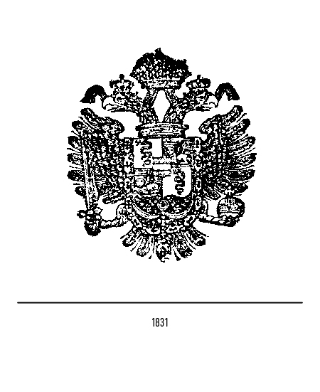
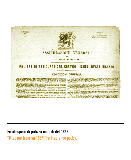
Insurance company founded by a group of Trieste, Venetian and Austrian economic operators in 1831 in Trieste, a city that was the natural outlet for the sea traffic of the Austro-Hungarian Empire and was favored by the “free port” regime granted by the Empress Maria Teresa in 1775. The Company, then called “Assicurazioni Generali Austro-Italiche”, had created a double structure since its establishment: a central management in Trieste for operations in the Habsburg Empire and a management for the Lombard-Venetian kingdom in Venice, linked to the coordination of activities in the states into which the Italian peninsula was then divided. The Austro-Hungarian imperial eagle with the symbols of the Lombard-Venetian Kingdom in the central part was adopted in 1831, namely the Visconti snake and the Venetian winged lion. The riots of 1848 led to the provisional establishment in Venice of the Republic of San Marco and induced the Compagnia, close to patriotic and liberal demands, to better characterize its Italian identity: the central management moved to Venice, the name ” austro-italiche ”from the company name and was changed to“ Assicurazioni Generali ”.
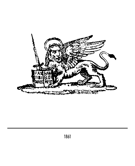
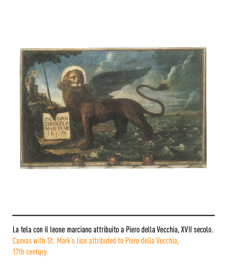
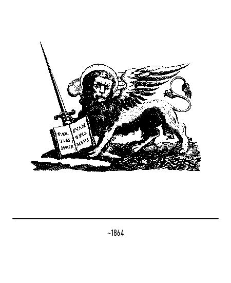
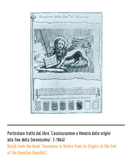
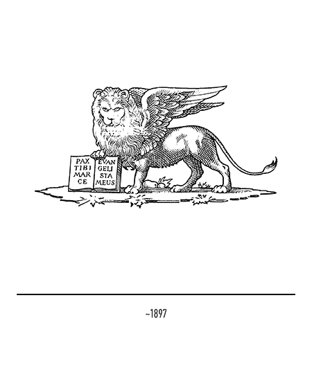
Starting in 1861, the lion of St. Mark was adopted to replace the Hapsburg double-headed eagle, which was the emblem of the Serenissima, a centuries-old symbol of entrepreneurship and solid economic systems. This lion, which recalled the one adopted for the flag of the Republic of San Marco in 1848, was going to the left, placed in majesty (ie with the face in front), with a halo, with a double-volute or “S-shaped” tail. ”And with the sword drawn in defense of the open Gospel with the phrase“ pax tibi Marce evangelista mevs ”. This symbol coexisted with other winged lions, with or without a sword.
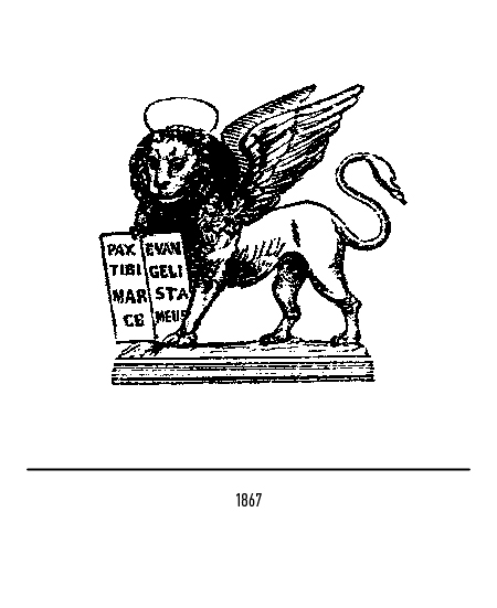
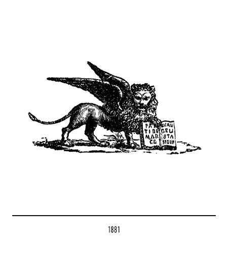
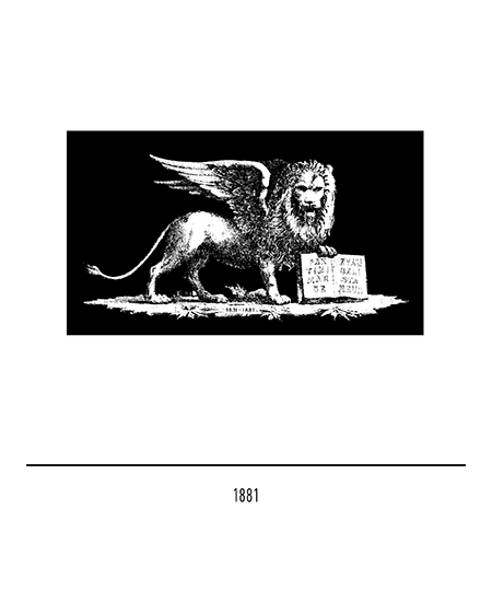
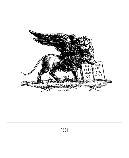
In 1881, on the occasion of the fiftieth anniversary, the Company decided to adopt a single representation of the lion: going to the right, placed in majesty, without a halo and with a single volute tail; strangely, there was the same version going to the left. In some cases at the base of the lion, between the front and hind legs, the dates of the fiftieth anniversary were shown.
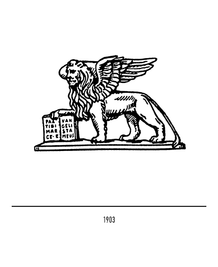
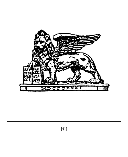
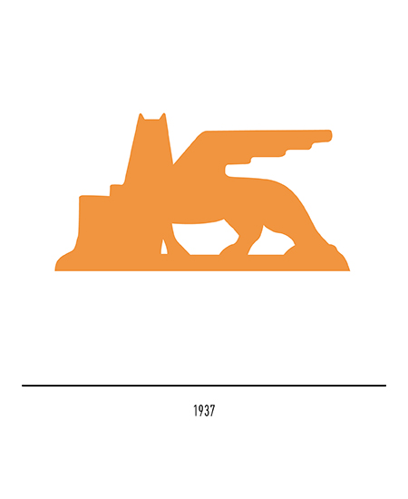
In 1903 the lion going left on a base was readopted; a wing appeared behind the head, for the first time represented almost in profile, disturbing the very regality of the lion’s almost human face. Then, this “defect” disappeared in 1911 when a representation of the lion appeared with the year of foundation which remained in force for about 60 years, except for an episodic stylization in the Fascist period; the 1911 logo, without the date of foundation, is still visible on the plaques of the buildings owned by the Company. The great variety of lions was due to the fact that famous artists reproduced it in the style of the time and according to their own inspiration.
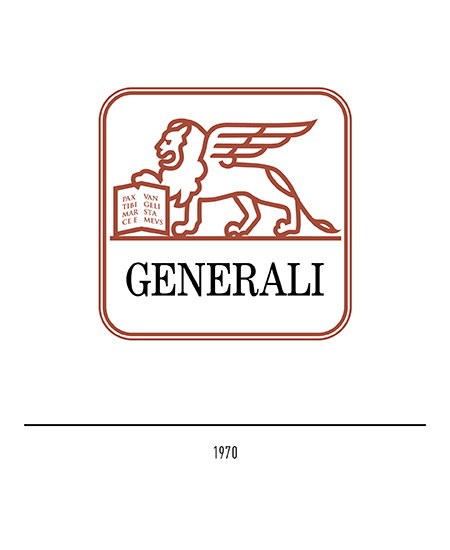
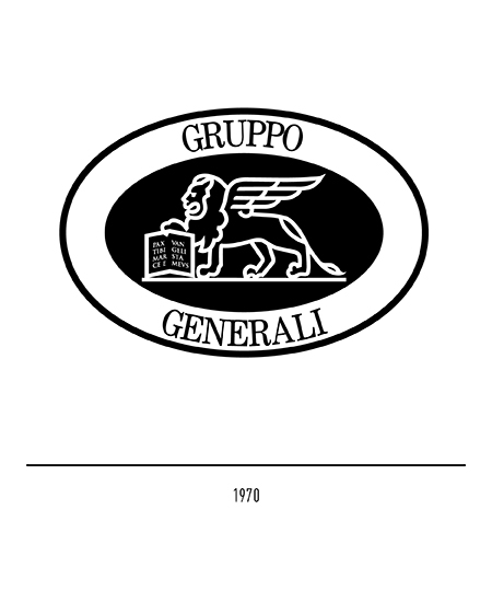
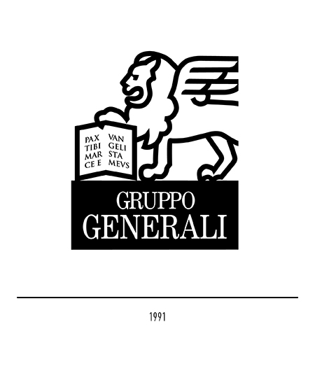
At the end of the Second World War, the corporate brand no longer had an image function but was the primary tool for identifying products and therefore an element of competition. The old Marcian lion therefore needed restyling and rules for its use also because it was adopted, with variations, by other Venetian companies. In 1970 Bob Noorda made the restyling with the lion inside a frame in which lived the company name abbreviated to “Generali” composed in capital Century; in the restyling, the order of geometrization enhanced the representation of the lion that appeared for the first time in profile. In the same year the logo of the Group was also designed, further reworked in 1991 by the Publicis Étoile of Paris.
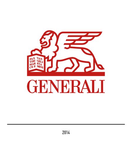
In 2014 the restyling of the logo was entrusted to Landor; the new lion, in a more modern key, will be unique for the entire global Group. The graphic intervention involved some iconographic elements: the muzzle to improve the profile of the head, the area of the wings and the text of the Gospel reduced to lines for better rendering in small dimensions; the legs and tail have also been simplified and redefined.