GALBANI
1 Logos and restyling over time
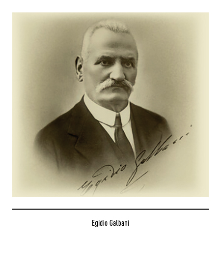
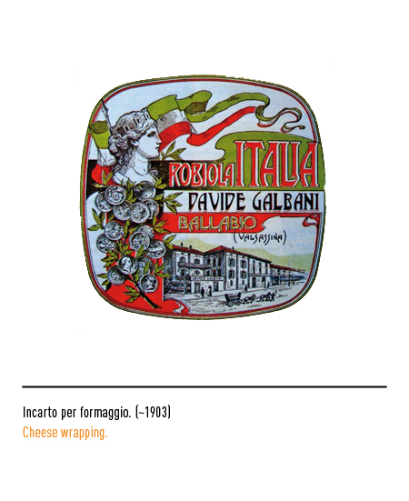
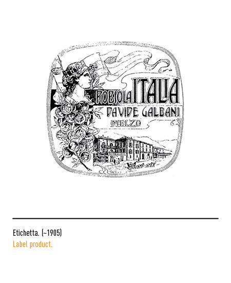
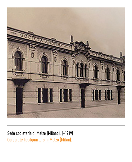
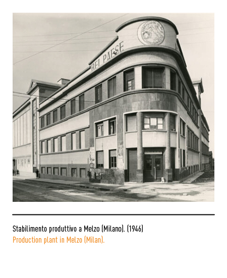
The origin of the company dates back to 1882 when Egidio Galbani, with the help of his father Davide, began the production of cheeses capable of facing the competition of French products in Ballabio (Como); in the following years the number of factories increased and a national commercial network was created. In 1915 the “Dairy Davide Galbani” was born in Melzo (Milan); the name was chosen by Egidio in honor of his father.
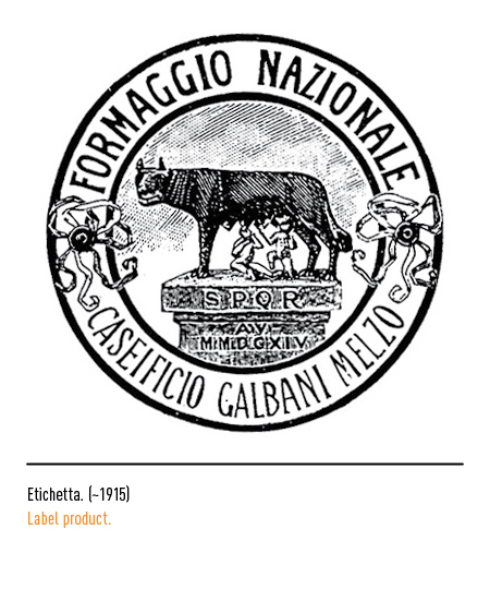
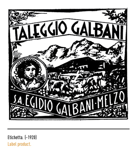
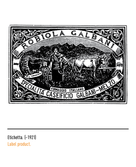
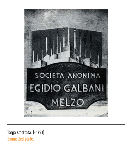
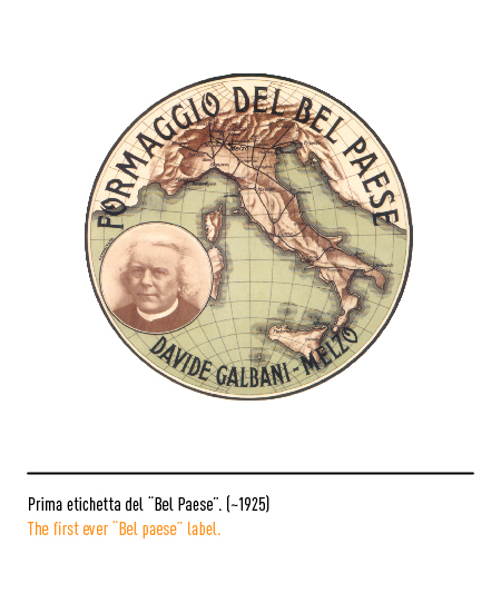
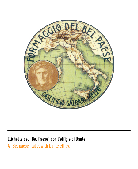
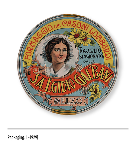
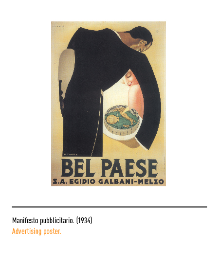
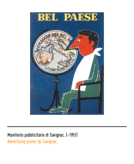
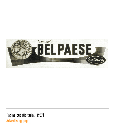
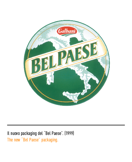
At the end of the Great War, the “Egidio Galbani anonymous company” was established, whose logo consisted of the enameled plate with character and shape typical of the time. In the mid-1920s, the “Bel Paese” cheese was created, the name of which derived from the title of a book written by Abbot Stoppani, from Lecco and friend of the Galbani family; the label presented, as was inevitable, the geographical map of Italy, the portrait of the abbot himself and the full name. Curious detail: the use of the effigy of Dante Alighieri was planned but then it was discarded.
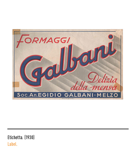
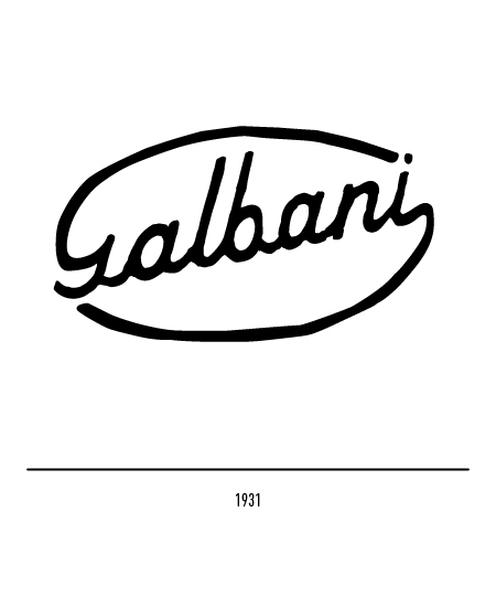
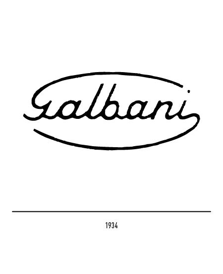
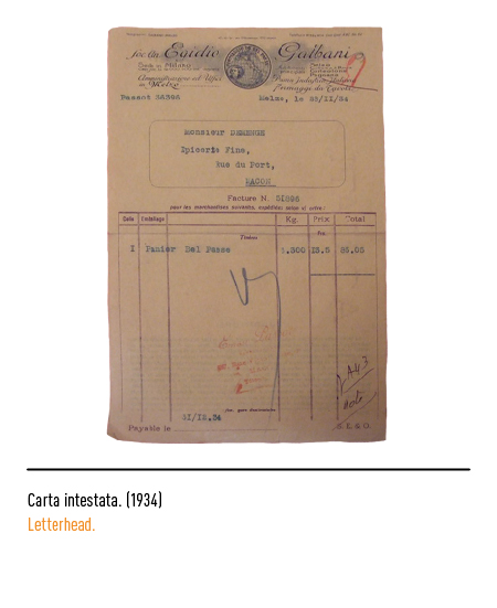
The first real logo of 1931 was formed by the oblique calligraphic inscription, typical of the time, in which the offshoots of the “G” and “i” had ovoid movements; in 1934 the writing became horizontal.
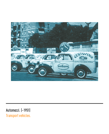
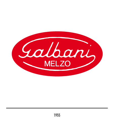
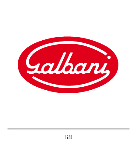
In the 1950s the surname was inscribed in a red oval; In 1955 the name of the town of Melzo also appeared, to which a large part of the company’s history will be linked. After the war it became the largest dairy company in the country and, in 1960, the headquarters were moved to Milan. In that year the logo underwent a slight restyling: in the oval, made less horizontal, there was a more full-bodied and decisive lettering. All products were marked with “Galbani means trust”, one of the best known advertising slogans to Italians.
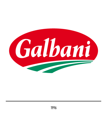
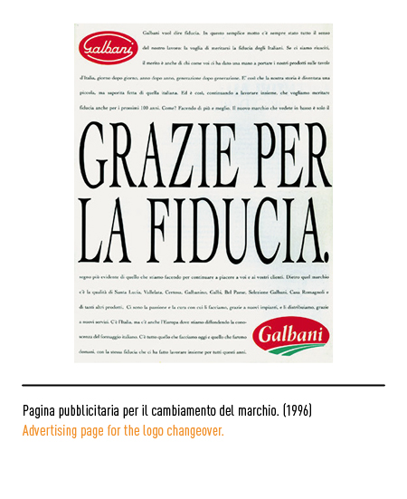
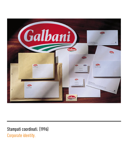
In 1989 the company was taken over by the French multinational group Danone and therefore, in 1996, the company decided to adopt a new graphic design. Maurizio Di Robilant designed the logo which, respectful of the ovoid shape, depicts the word Galbani in a font with graces and two green strokes to symbolize the fields, nature. The coloring, on the whole, strongly recalls the strong Italian gastronomic identity to thus increase the knowledge of our cheese abroad.
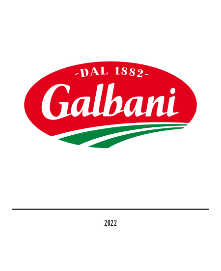
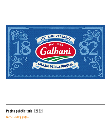
In 2022, for the 140th anniversary of its foundation, the logo bears the date of its foundation as evidence of the long-standing relationship of trust with the Italians with a still significant presence on the market. The logotype has ligatures between the letters.