


The first logo of 1899 consisted of a brass “parchment” mounted on the hood, inspired by the tastes of the time with hand-engraved lettering; in the first advertising poster of Carpanetto the acronym appeared dotted. In 1901 the logo was affected by the sinuous movements of the Art Nouveau style.


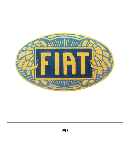
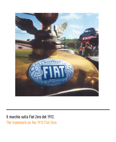
In 1903 another logo-plate appeared with two stylized olive branches on a rising sun, a probable allusion to the biblical phrase “Fiat lux”, and was placed near the pedals; for the first time, the acronym appeared in great evidence. In 1908 the well-known oval logo made its first appearance on the radiator, perhaps the most beautiful Italian logo in Art Nouveau style with the writings and decorations in gold on the Prussian blue background that will last on FIAT cars until the 1920s.

With participation in sports competitions, the series of round logos with the laurel wreath began in 1921; it was regularly used on all cars for nearly a decade.


In 1932, the rectangular FIAT logo made its first appearance and became famous with the release of the Balilla. It is interesting to note how, for the sake of modernity, an elongated stick font was chosen, without frills and with the characteristic letter “A” with a crooked shape; this logo with the name FIAT on a red background was the expression of the architecture of the thirties. Except for small variations in the design of the letters and in the profile of the edges, it did not change for almost thirty years; in 1955 the letter “A” alone became angular.


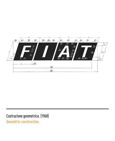
Coinciding with the 70th anniversary of the foundation, in 1968 the logo was substantially renewed to become the basic element of the whole FIAT identity; it was designed by Armin Vogt of the Swiss agency Reiwald. According to the principle of simplifying the communication of the complexity, vastness and differentiation of the Company’s products and sectors, it was decided to bring everything back to a unifying element: the rhombus, that is, to an architectural unit of measurement. Basically it consisted of four black rhombuses inclined by 18 degrees and silver-colored capital letters in the font Univers; in 1972 the four diamonds became blue and the letters in white. In practice, it was thus that the FIAT brand was born from a very simple assembly or assembly operation, just as it happened in the factory. Starting in 1981, 5 parallel and oblique lines appeared on the hoods of cars, obtained from the intersection of the 4 diamonds of the logo; in the 1990s, lines reduced in size on automobiles.



In 1999, among the many initiatives designed to celebrate the centenary, the round shield with the laurel wreath that distinguished FIAT cars in the 1920s returned, albeit stylistically updated; this restyling only affected the bonnet-logo of the new cars but not the official logo which, in 2000, only underwent a modernization by Maurizio Di Robilant.


During the early 2000s, the Turin-based company managed to recover from the worst financial crisis in its history; as a seal of the progress made, in 2006 it was decided to renew the brand by re-entrusting the task to Maurizio Di Robilant in collaboration with the Fiat Style Center. The new logo is conceived taking a cue from the famous shield that stood out on the front of cars from 1932 to 1968, characterized by the red background and the elongated characters of the writing. All set in a round chromed frame with a three-dimensional effect that evokes an idea of Italian technology and design, as well as paying homage to the round logo with laurel from the 1920s.


In 2020 a minimal logo is introduced to keep up with international graphic trends: the sole wording “FIAT” in capital letters that once again recalls that of the 1930s. This logo was initially presented on some models offered in South America and then also arrived in Europe and around the world.


