


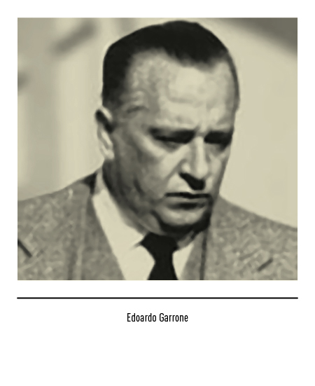
Edoardo Garrone founded a company for the trading of petroleum products in Genoa in 1938. An anecdote has it that, in 1950, by putting on a dice (Dado was also the affectionate diminutive of Edoardo) the initials of the company name “Edoardo Raffineria Garrone” the ERG logo was born. The nut was reproduced in the refinery as well as in the first stores until the end of the 1960s.


With the organizational division between “Garrone Spa, petroleum products” and “Edoardo Garrone Raffinerie Petroli”, the latter took on the logo in 1972 with the three panthers (blue, white and orange) and the white logo inscribed in a blue semicircle. In 1984, with a brilliant graphic intervention of figure-background, the three panthers (blue, white and red) lived within a vertical rectangle; now present on all roads in Italy, this symbol also marked the acquisitions of the Elf and Chevron service stations. This logo presented a lettering problem: the first two letters E and R were abruptly interrupted by the roundness of the G; therefore, in 1989, this letter was made more consistent with the others.


ERG, at the beginning of 2000, from an oil company becomes an energy producer in the broad sense; the new strategic positioning and, at the same time, the need to review the image of the service stations make it necessary to evolve the logo. Thus was born in 2001 the “ripple”, the new symbol of ERG energy; “Ripple” is the Anglo-Saxon expression that defines that effect (known to all but which in our language has no name) of birth and infinite propagation of concentric circles in a liquid that occurs when a stone is thrown into the water. From that harmonic energy with a single center comes the inspiration for the new ERG logo with blue ripple and blue logo composed with the retouched Handel font.


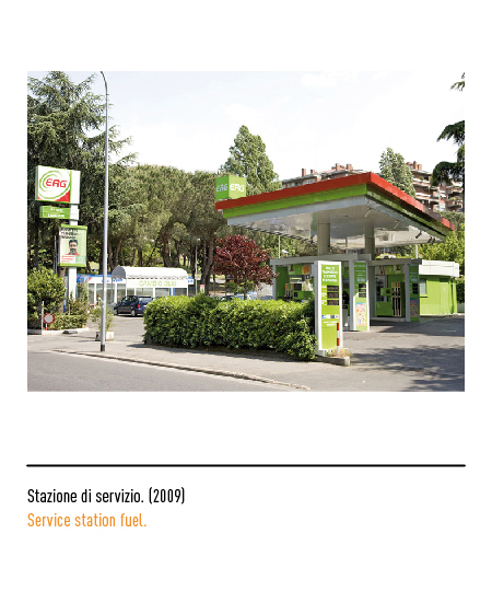
In 2008, a further evolution in the positioning of the ERG group, which for some time has also been involved in the renewable energy sector, leads to the communication and awareness of the new mission also through the logo, with the ripple turning green. In 2009 another variation: the red writing to emphasize the Italian character.


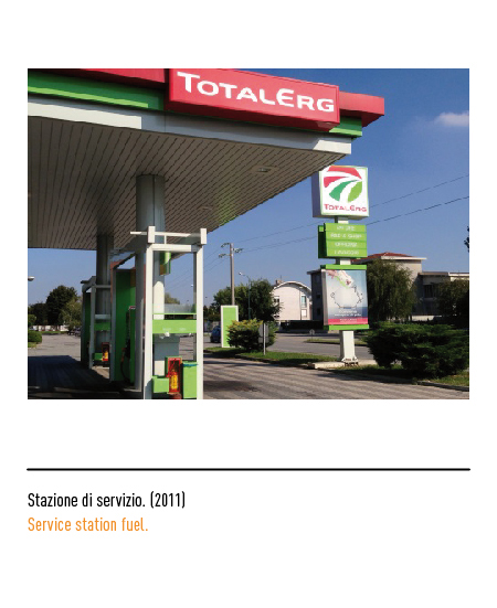
Starting from 2009 Total and ERG have decided to take a new path together with their respective logos, but in 2010 TotalErg was born, a joint venture that will be the protagonist of future scenarios; the logo that represents this union is an immediately recognizable, dynamic and modern sign with the logo composed with the Total characters. The colors are those of Total, ERG and Italy, the territory where the two realities have chosen to meet: white outlines the roads that converge towards the same point which represents both the moment of union of the two realities, and the future horizon focused on research, experimentation and innovation in the world of energy. The oil group in 2017, with the sale of TotalErg and the acquisition of Forvei, definitively left the Oil sector and at the same time entered the photovoltaic sector.


In 2018 the new logo as an evolution of the group’s development process for positioning as a primary green electricity operator; in detail, the graphic sign is made up of three elements derived from the letter “E” while the logo has been preserved. The great ability to renew itself over time and to evolve without ever losing its distinctive features is visible in the payoff “Evolving Energies”.

