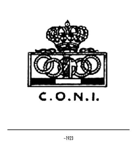
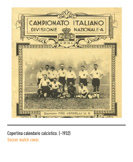
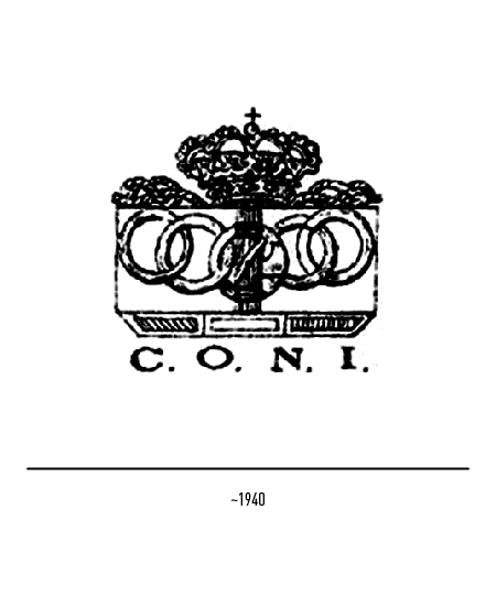
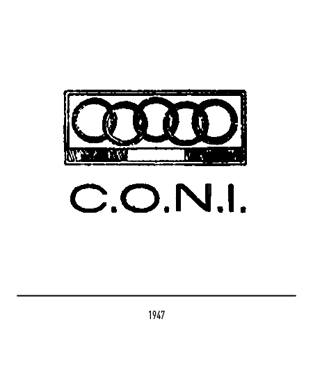
In liberal and republican Italy of 1947 the royal crown and the fasces necessarily disappeared from the logo. With the consequent suppression of state contributions, to finance itself, Coni promoted the management of competitions with predictions on sporting events (Totocalcio and Totip) through Sisal.
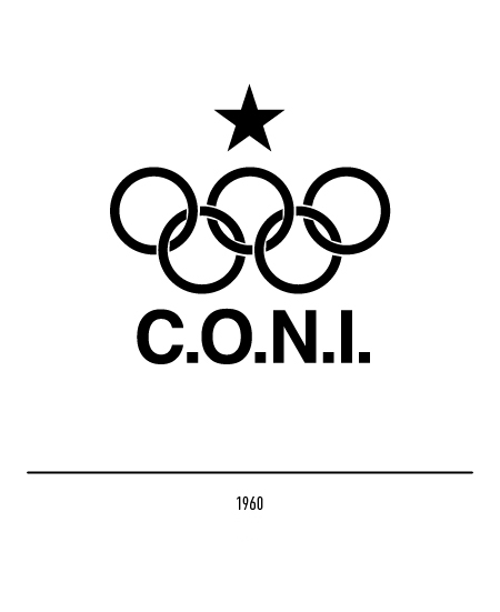
On the occasion of the 1960 Rome Olympics, it was decided to change the logo, purging it of rhetoric from past eras: the only acronym pointed with the Olympic circles and a star. In the absence of rules, this acronym appeared indifferently both with linear and graceful characters and even without the Olympic circles.
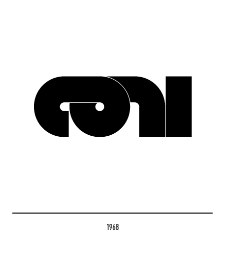
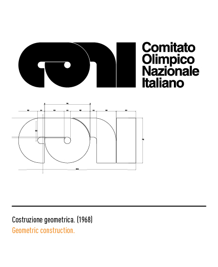
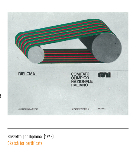
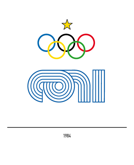
In 1968, with the birth of the “Youth Games”, Coni entrusted the restyling of the logo to Mimmo Castellano; an essential and rigorous logo where the first three letters were generated by a single ribbon. This logo suffered, in the strong reductions, the cancellation of the white fillets; for this reason in 1984 a physiological restyling was made, lightening the structure with blue lines.
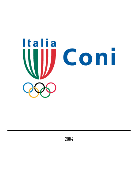
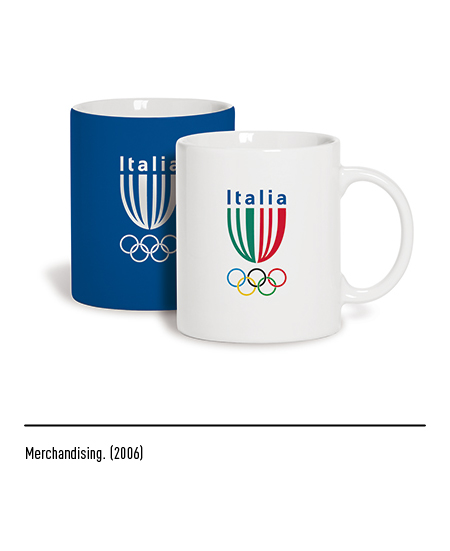
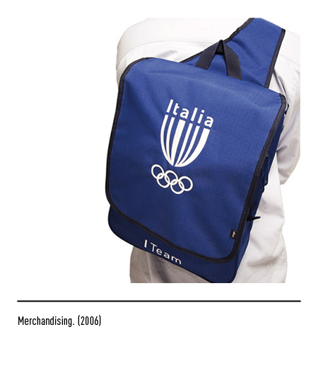
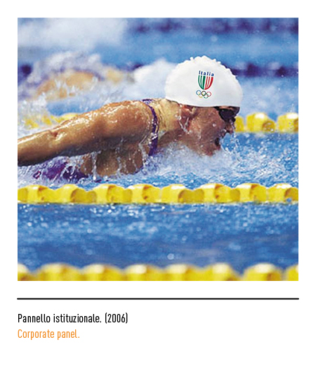
In 2004 the Italian sports federations were preparing to face an Olympic cycle that started from “Athens 2004” and ended in “Turin 2006”. The Inarea agency is in charge of the identity of the Italian Olympic national team, I-team, which will later also become the identity of Coni; a shield consisting of lines the thickness of the individual letters of the word “Italy”, the first three green and the other red. The Coni logo was composed with the capitalized Frutiger font. A century after its foundation, Coni has accumulated a very rich medal table for the achievements of our athletes and represents Italian sport in everyone’s life.
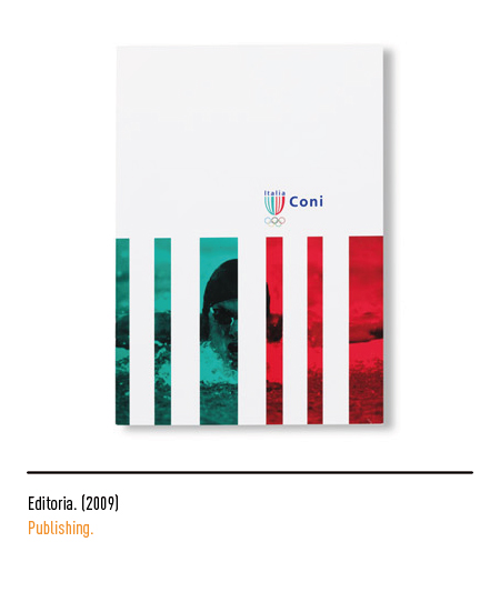
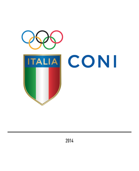
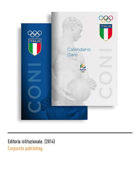
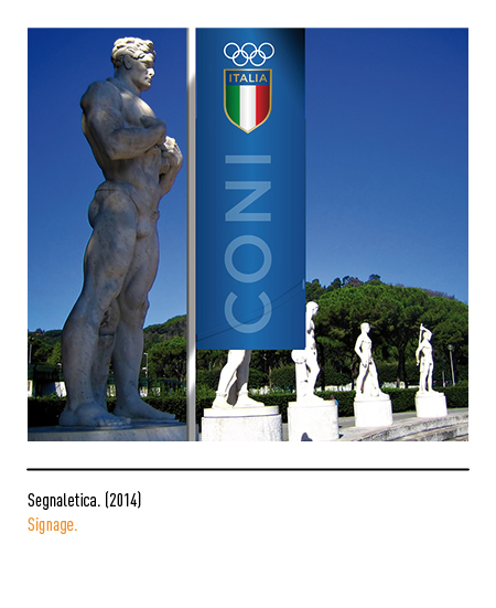
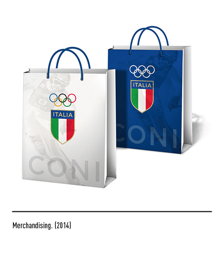
From these values was born, in 2014, the sense of restyling to which Coni wanted to give life, once again choosing the Inarea agency, to redefine its own identity. The logo is the recovery of the famous tricolor shield that everyone remembers sewn on the jersey of our athletes (see FIGC); it comes with an elegant gold border, the writing Italy surmounted by the 5 Olympic circles and the Coni logo in capital letters composed with the Gotham font.