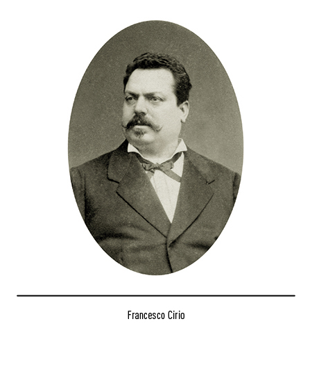
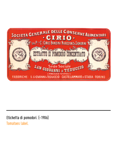
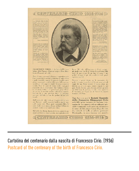
Company founded in 1875 by Francesco Cirio in Turin; occupies a prominent place in the history of the Italian and international canning industry. In 1857 the founder, at the age of 20, had the happy intuition of adopting the nascent appertisation technology, that is the procedure invented in 1802 by the French confectioner Nicolas Appert for the preservation of food, in order to overcome the problems of perishability of fresh products and to extend their availability throughout the year. When the tinplate appeared in 1867, the young Cirio officially presented his method of preservation in cans at the Universal Exposition in Paris, then considered the showcase of industrial progress; in particular, he began to box peas and then continued with peeled tomatoes, which have become a specialty of Italian exports. With the unification of Italy he began to open canning plants also in the South, to which the name Cirio will remain inextricably linked. In fact, after the death of the founder, the company’s headquarters were moved from Turin to San Giovanni a Teduccio, a suburb of Naples, where it remained until the end of the 1980s. The name “Cirio S.p.A.” was adopted in 1993 following the demerger of the “SME Società Meridionale Finanziaria”, a company belonging to the IRI group, as part of the privatization program for state-owned enterprises.
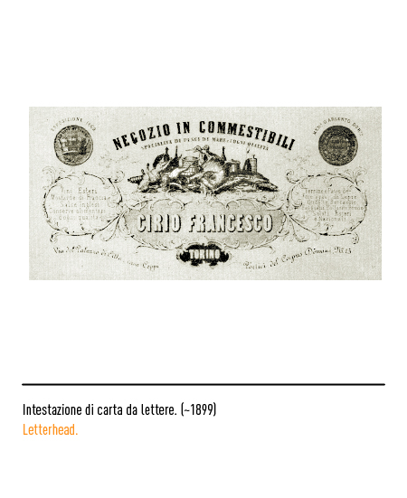
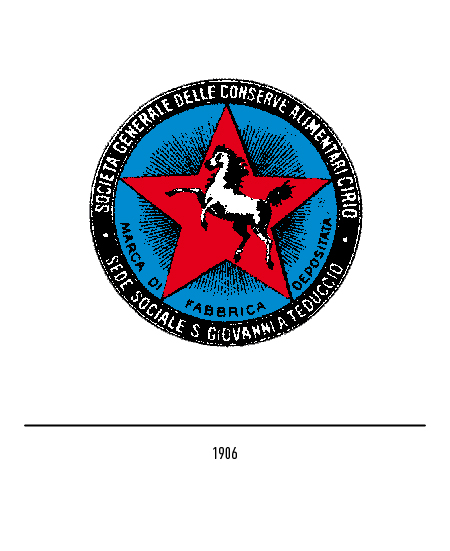
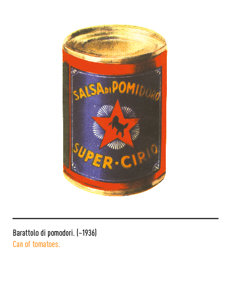
On the first headed cards, the logo, typical of the time, was made up of a set of food products with frames and doodles. Then, in 1906, a circular logo with a horse inside a radiant red star and the official wording “Cirio General Company of Canned Food”.
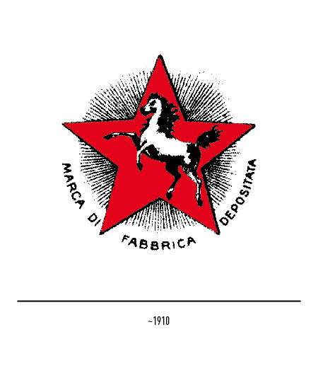
Subsequently, in the absence of binding graphic rules, there was a progressive disappearance of the distinctive elements: first the denomination arranged in a circle, then the horse and finally the star.

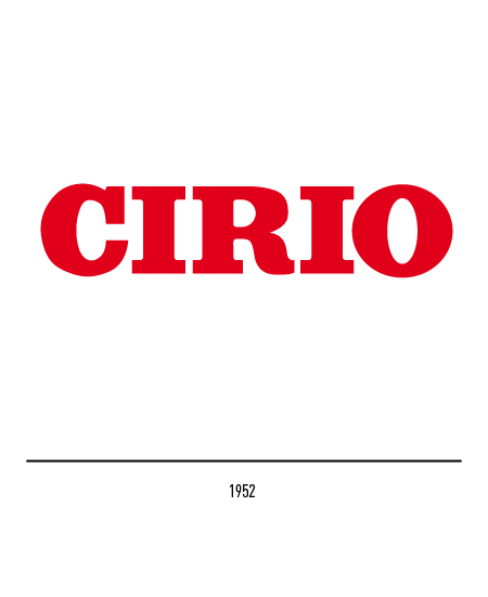
In 1952 the role of distinctive sign was attributed only to the logotype with graced characters.
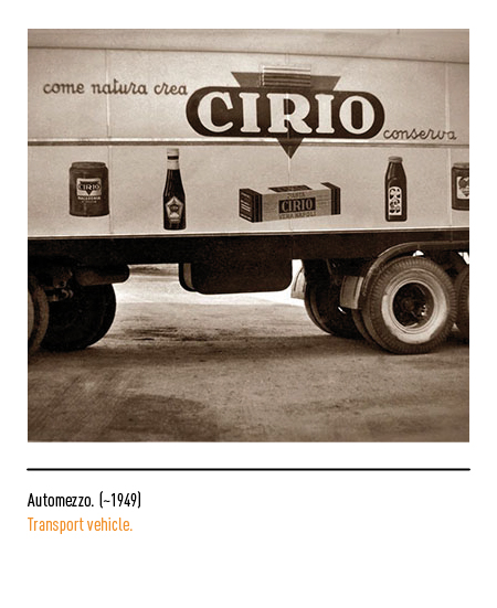
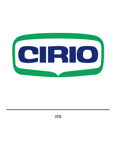
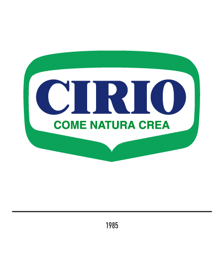
In 1970 Gio Rossi designed a new logo with a stick font inserted in a green frame; it was subjected in 1985, by the same author, to a slight restyling: a new graceful character and the slogan “as nature creates”, the best synthesis of the competence in the transformation and conservation of the products of nature.
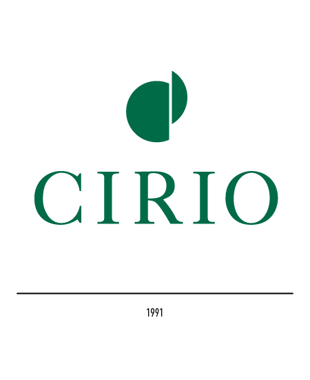
In 1991 Area Strategic created a logo of the financial company of the agri-food group “Cragnotti & Partners”: the graphic sign was intended to refer to the initials C and P of the denomination; when Cirio was acquired by the group, the logogram became the group’s logo.
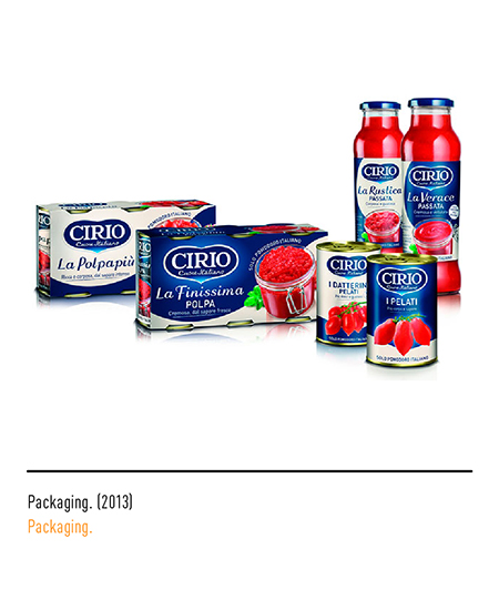
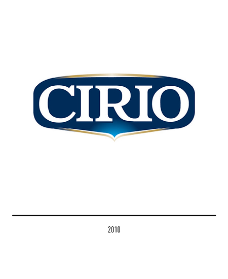
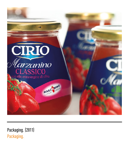
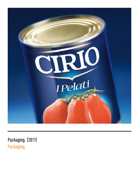
In 2010 Carré Noir elaborates the restyling of the logo with the essentialization of the frame, with the negative transformation of the logo and with the reinterpretation of the graceful lettering; to highlight this shape, there are two gold strokes above and below the logo. Even the packaging undergoes an evolution characterized by new and elegant graphics.
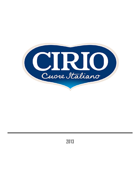
In 2013 the same agency presented the new logo and a new graphic design of the packaging. The evolution of the logo is linked to the new shape that creates a synthesis between the heart symbol and the shape of the tomato thanks to a soft and enveloping silhouette; this shape maintains the blue background of the previous restyling and the font of the logo is unchanged. The “Italian heart” pay-off immediately makes the positioning of the logo explicit: with passion it cultivates and selects the best Italian tomatoes and with great commitment it gives the true flavor of Italian tomatoes to lovers of good food.