BANCO DI SARDEGNA
1 Logos and restyling over time
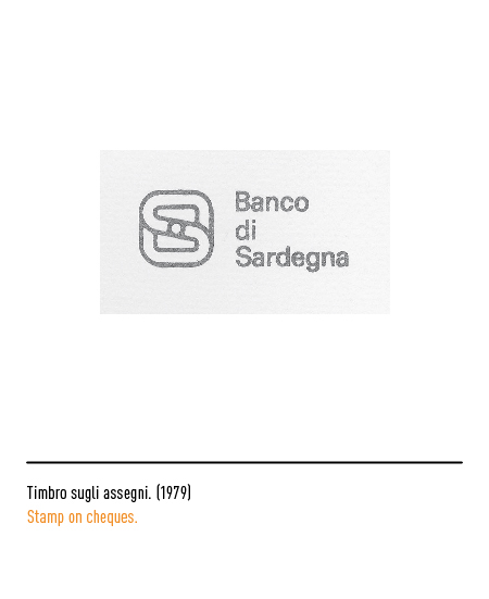
The origins of the public law credit institution date back to the ancient “Monti frumentari” of the Savoy eighteenth century which evolved with various passages, always linked to the credit relationship with agriculture, in today’s “Banco di Sardegna” which was created in 1955 with headquarters in Cagliari. The first logo was designed in 1978 by Giovanni Pintori, a leading man in Olivetti graphics. The two initials “B” and “S” appear superimposed but interdependent and rotate around a pivot which is the optical center of the image.
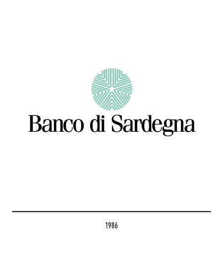
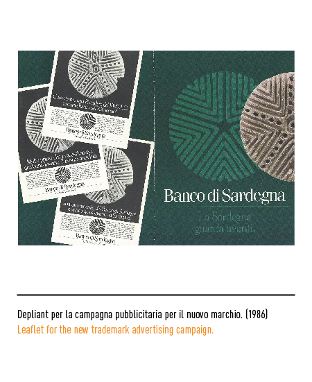
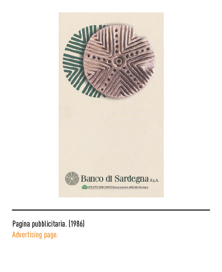
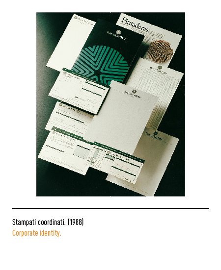
In 1986 the “Banco di Sardegna” adopted a new logo which has no reference to the previous one but which was based on an ancient terracotta instrument used in the Nuragic era to decorate and “brand” the bread: the pintadera. With this mold, bread and focaccia, at the time a bargaining chip, were decorated as archaic stamps. The reinterpretation of the pintadera wants, on the one hand, to reconnect to the remote and more authentic traditions of Sardinia and, on the other, to refer to the origins of the Banco which date back to the aforementioned “Monti frumentari” which arose from 1624 by the will of Philip IV, king of Spain, with the task of exercising agricultural credit in kind.
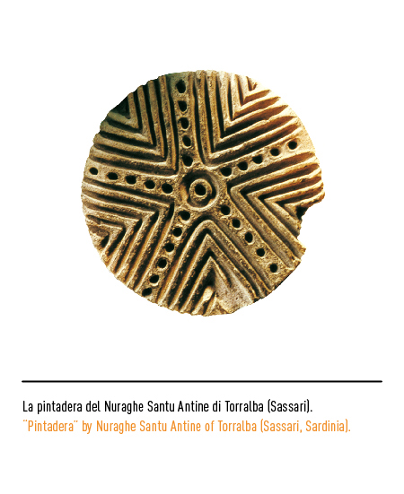
The pintadera used to redesign the bank’s logo is the most famous of Nuragic Sardinia, found in the deep layer of the Nuraghe Santu Antine di Torralba (Sassari). It is made up of five groups of corners inscribed one in the other, divided by five ridges decorated with large points that branch off from a concentric circle to a hole made in the socket. The graphic intervention by Maurizio di Robilant has essentialized the lines by eliminating the decorative points. There are different combinations between the graphic sign and the logotype which is composed with the Phoenix character.