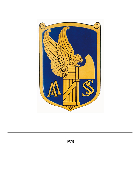
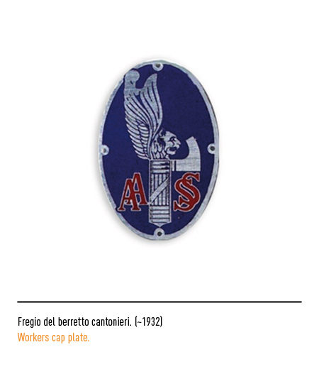
Public company founded in 1928 with the name of AASS (Autonomous State Company of the Road) in order to modernize the viability of an agricultural and pre-industrial society; transformed the disastrous Italian road network into a modern transport network with permanent paving, rectified routes, modern signs. The first logo was inscribed in a shield and featured the usual symbols of a state company from the fascist period: the acronym AASS, the fascist fasces and the winged lion to represent strength; blue was the background color and the pictogram yellow.


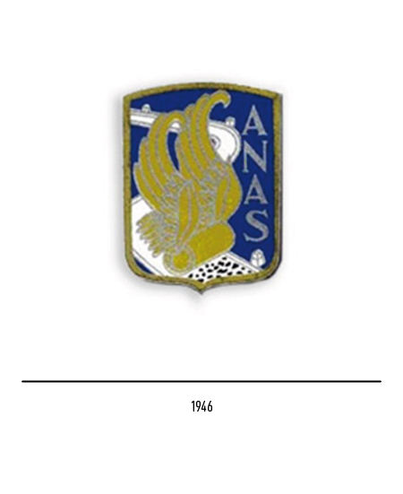
Immediately after the war, in 1946, the company changed its name to ANAS, (National Autonomous Company of State Roads), whose primary task was to rebuild the road system destroyed by the war. The company took part in a technological leap that will see the construction of roads, highways, bridges and viaducts for the entire Italian road network; the logo also changed which, far from the propaganda, depicted only the wings attached to a steamroller that gradually flattened a dirt road, creating a modern pavement; the edge of the road and the milestones are also clearly visible, conveying a sense of order and orientation. The white color appeared which identified the “modern” road that the winged roller was building; within the logo lived the acronym written vertically.


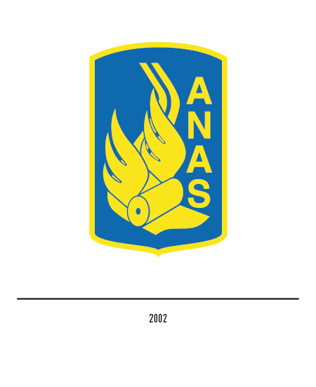
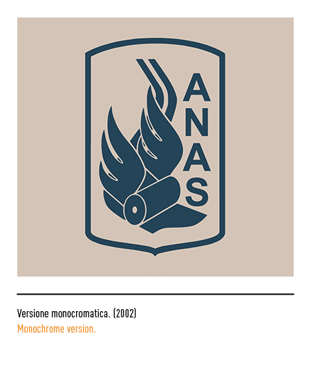
In 2002 ANAS became a joint stock company; the logo underwent restyling by Pietro Magoni. The lines of the pictogram became simpler and more modern, while maintaining the graphic elements that made it up. The road took on a more iconic and minimalist shape becoming a modern two-lane road, relieved of the previous pictorial elements such as milestones and edges.

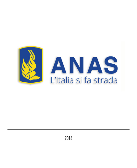
In 2016 there is a restyling that allows the pay-off “Italy makes its way” to find its full dignity as a constitutive element of Anas’s visual identity; in fact, in the new composition, the acronym comes out of the graphic sign to act as a logotype.

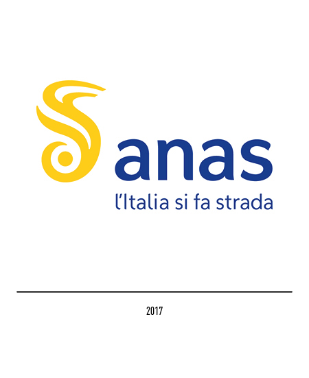
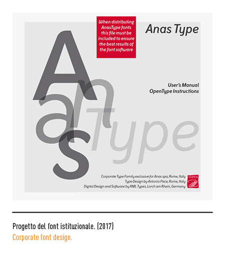
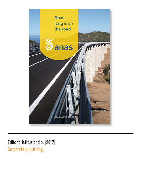
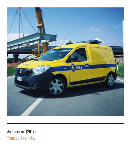
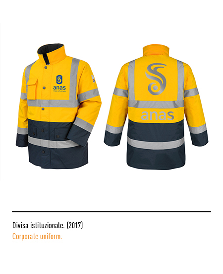
In 2017 the Inarea agency subjected the logo to a further restyling based on a concept in which history, tradition, essentiality and openness to modernity coexist; the historic winged roller gives way to a new symbol that represents a road that wraps around a circle, a metaphor for the centrality of the customer-user of the road. The logotype, for the first time, is presented with the whole in small letters to communicate proximity and openness towards the users; the colors are also confirmed. The pictogram as a whole is modern, dynamic, finally free to come out of its “container”.


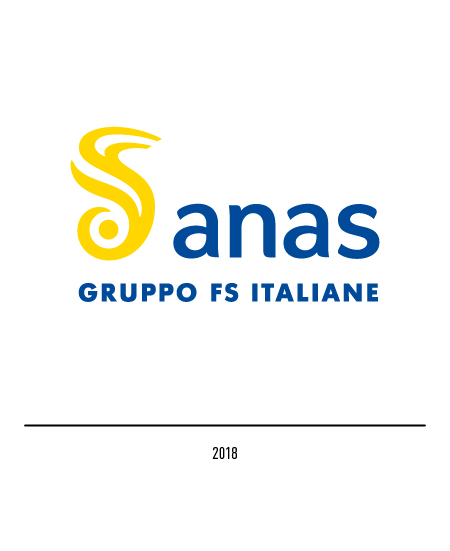
In 2018 Anas celebrates 90 years of history; this anniversary coincides with the entry into the FS Italiane Group which constitutes a further phase of the transformation process already started in recent years. This membership is made explicit with the logo which therefore bears the wording “FS Italiane Group”.