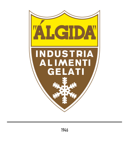
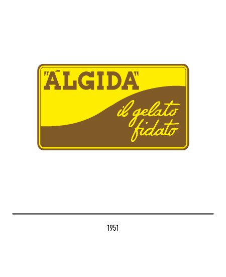
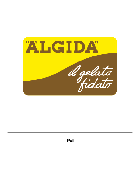
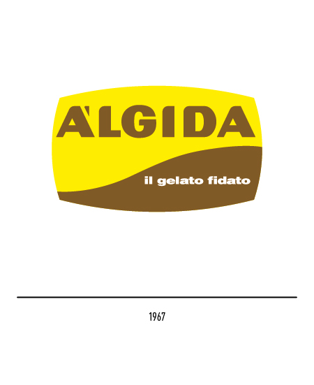
In 1951 Enzo Mazzilli created a new logo characterized by an ascending sinusoid that separated the two colors; applied to the first packaged ice cream counters, it represented the symbol of an era. In 1960 there was also a version of the logo without the frame and with the slogan in white. Yellow and brown were the basic colors associated with the traditional flavors of ice cream: cream and chocolate. During the full economic boom, the Algida achieved great notoriety; in 1967 the logo was slightly modified: the logotype made up of a stick and the rounding of the sides confirming the originality of the shape and colors.
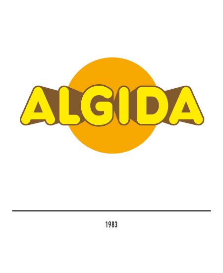
A new logo was designed in 1983 by Bob Noorda: it featured the orange sun as a central element and the yellow lettering in perspective with brown outlines. This expressed the synthesis of Álgida’s peculiar values: the values of summer, freedom and holidays. The unstoppable race towards market globalization breaks down the borders between individual countries and for this reason the need was felt to take a common position in the different realities of the individual markets.
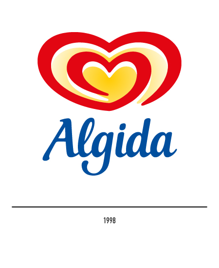
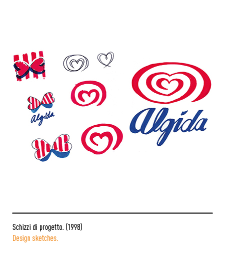
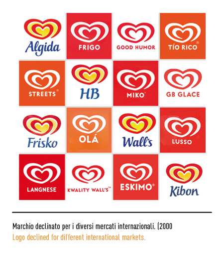
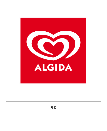
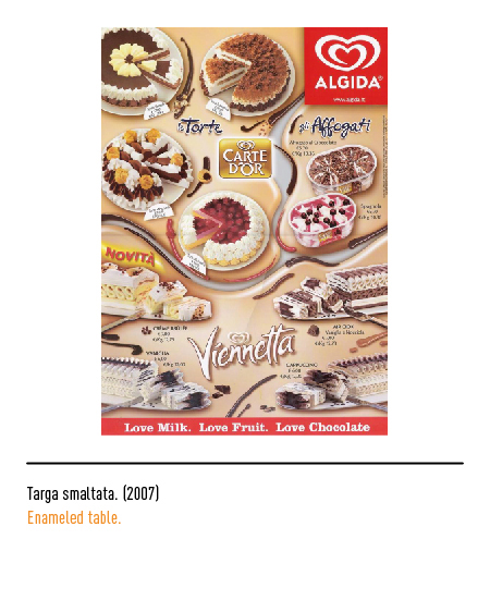
Therefore, in 1998, the only logo that mimicked a famous slogan of the Álgida croissant, namely “cream heart”, designed by Carter Wong Design of London, was developed worldwide. In fact, the logo represents a stylized double heart formed by the same red line that moves in a spiral with a yellow background; the colors are those of summer but also of the heat from which you can get relief by enjoying Algida ice creams. The logotype is made with a blue calligraphic font; in 2003 the new restyling with the replacement of the only character of the logo, the ITC Kabel.